Embed Size (px)
Citation preview
EVALUATION QUESTION 1
In what ways does your media product use, develop or challenge forms and conventions of real media products?
HARMONY WILLSHER 12RP2
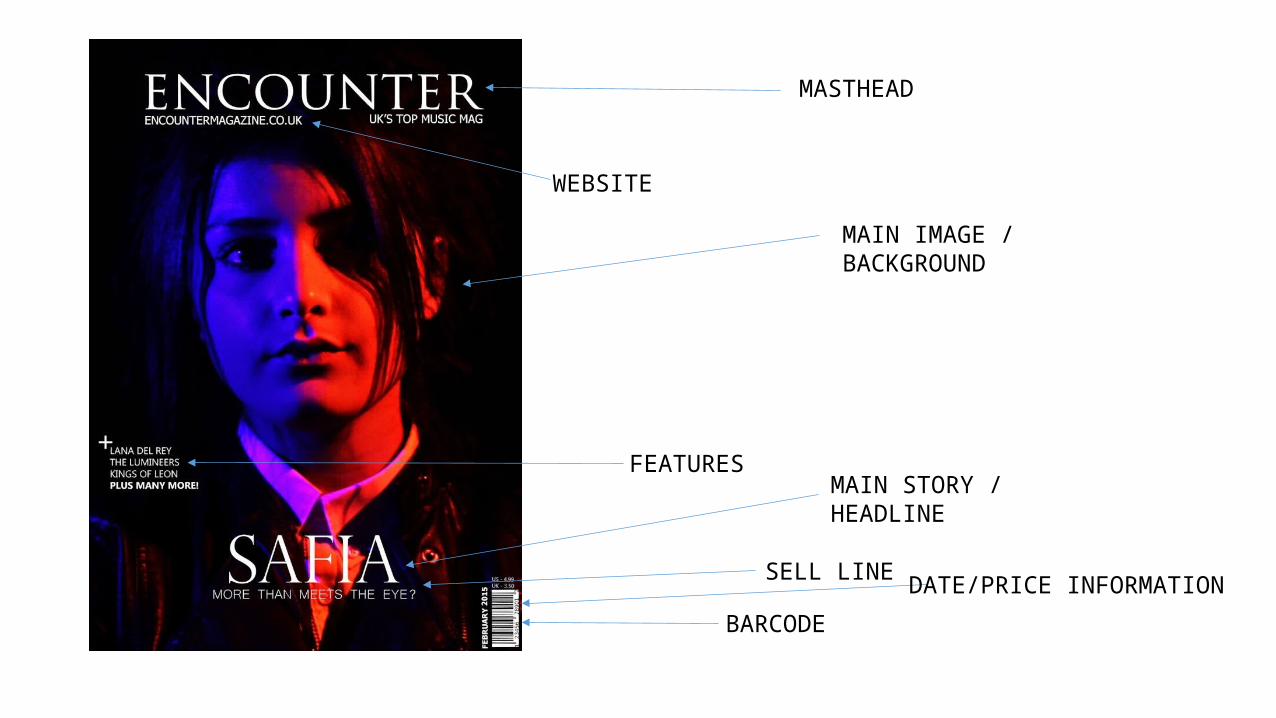
FEATURES
MASTHEAD
SELL LINE
MAIN IMAGE / BACKGROUND
MAIN STORY / HEADLINE
WEBSITE
BARCODE
DATE/PRICE INFORMATION
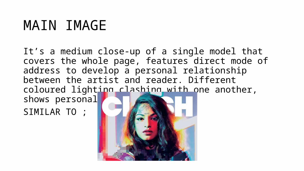
MAIN IMAGE
It’s a medium close-up of a single model that covers the whole page, features direct mode of address to develop a personal relationship between the artist and reader. Different coloured lighting clashing with one another, shows personality of artist.SIMILAR TO ;
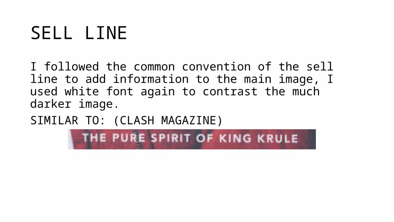
SELL LINE
I followed the common convention of the sell line to add information to the main image, I used white font again to contrast the much darker image.SIMILAR TO: (CLASH MAGAZINE)
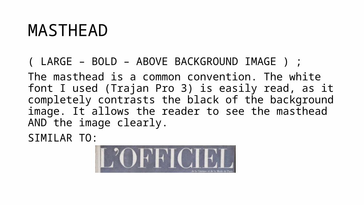
MASTHEAD
( LARGE – BOLD – ABOVE BACKGROUND IMAGE ) ; The masthead is a common convention. The white font I used (Trajan Pro 3) is easily read, as it completely contrasts the black of the background image. It allows the reader to see the masthead AND the image clearly.SIMILAR TO:
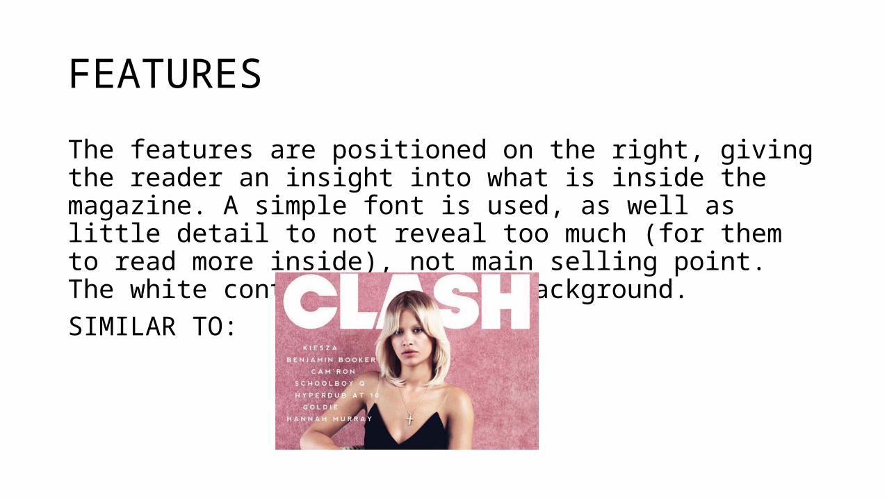
FEATURES
The features are positioned on the right, giving the reader an insight into what is inside the magazine. A simple font is used, as well as little detail to not reveal too much (for them to read more inside), not main selling point. The white contrasts the dark background.SIMILAR TO:
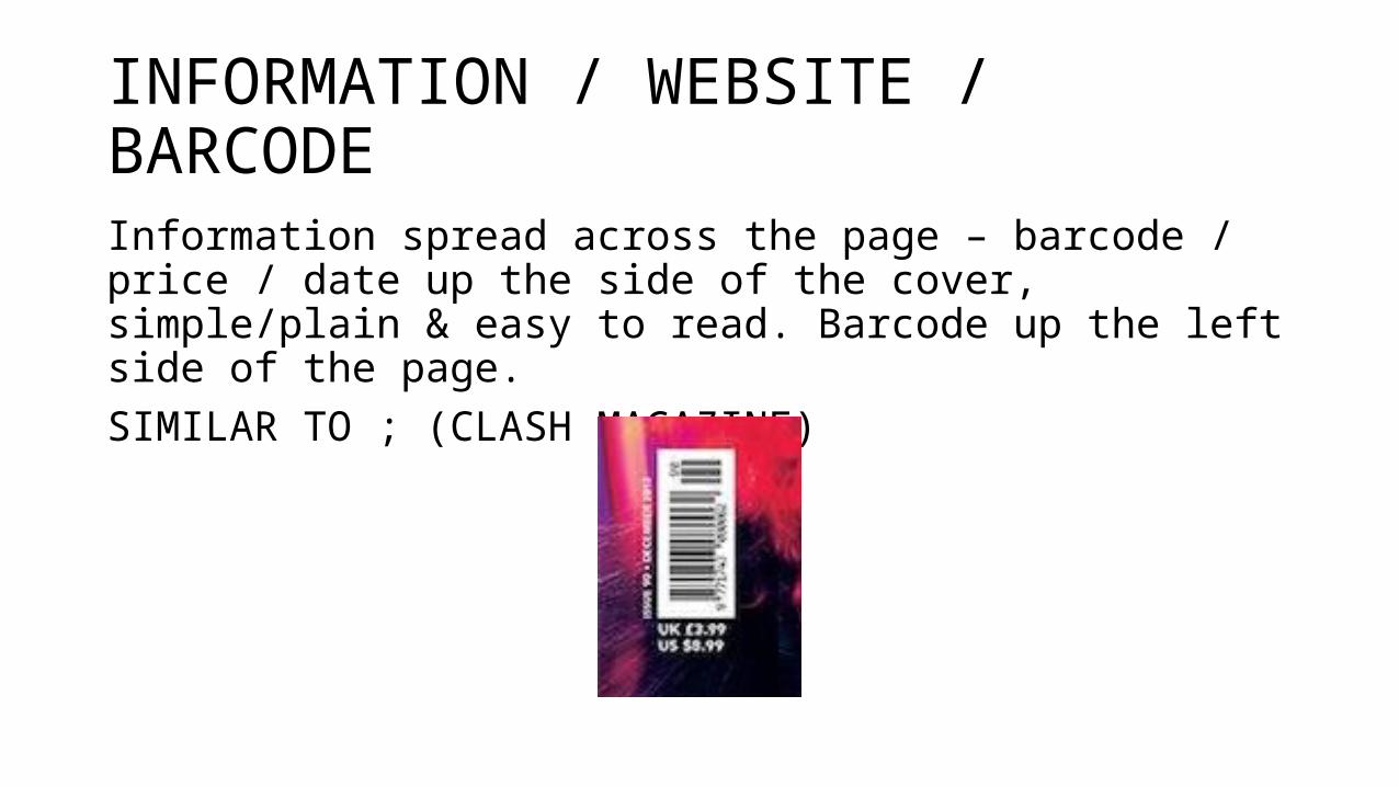
INFORMATION / WEBSITE / BARCODE
Information spread across the page – barcode / price / date up the side of the cover, simple/plain & easy to read. Barcode up the left side of the page.SIMILAR TO ; (CLASH MAGAZINE)
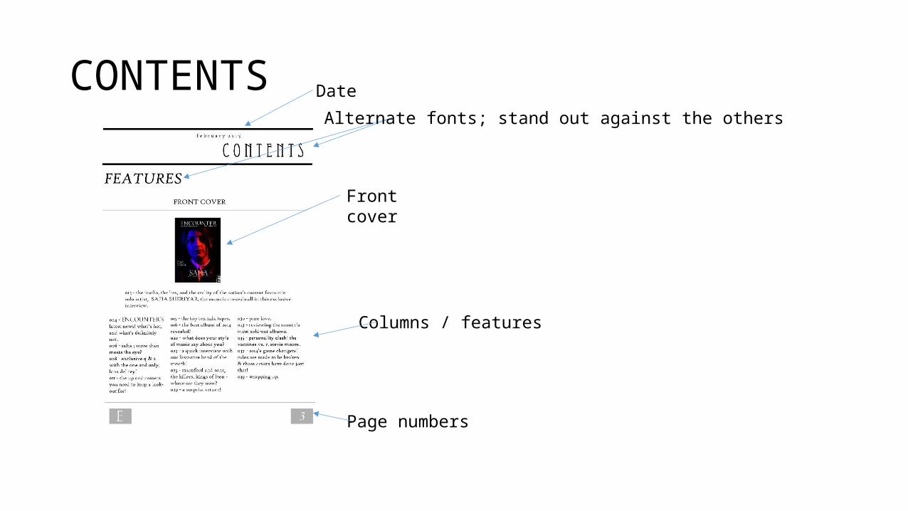
CONTENTS
Front cover
Alternate fonts; stand out against the others
Date
Columns / features
Page numbers
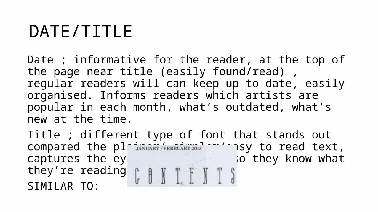
DATE/TITLE
Date ; informative for the reader, at the top of the page near title (easily found/read) , regular readers will can keep up to date, easily organised. Informs readers which artists are popular in each month, what’s outdated, what’s new at the time. Title ; different type of font that stands out compared the plainer/ simpler/easy to read text, captures the eye of the reader so they know what they’re reading. SIMILAR TO:
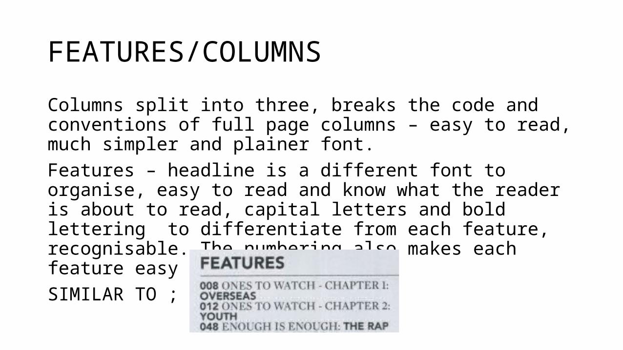
FEATURES/COLUMNS
Columns split into three, breaks the code and conventions of full page columns – easy to read, much simpler and plainer font. Features – headline is a different font to organise, easy to read and know what the reader is about to read, capital letters and bold lettering to differentiate from each feature, recognisable. The numbering also makes each feature easy to find.SIMILAR TO ; CLASH MAGAZINE
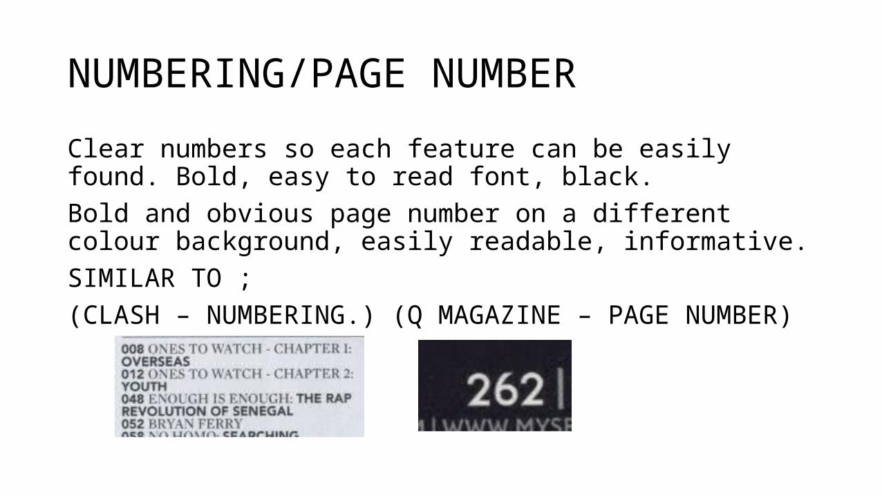
NUMBERING/PAGE NUMBER
Clear numbers so each feature can be easily found. Bold, easy to read font, black. Bold and obvious page number on a different colour background, easily readable, informative.SIMILAR TO ;(CLASH – NUMBERING.) (Q MAGAZINE – PAGE NUMBER)
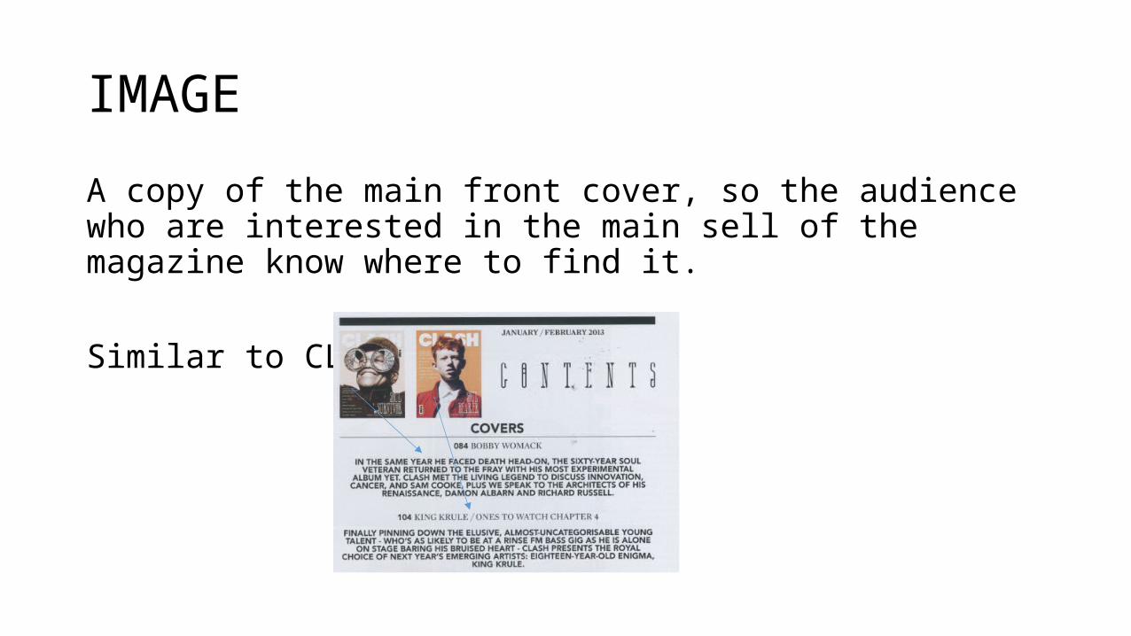
IMAGE
A copy of the main front cover, so the audience who are interested in the main sell of the magazine know where to find it.
Similar to CLASH:
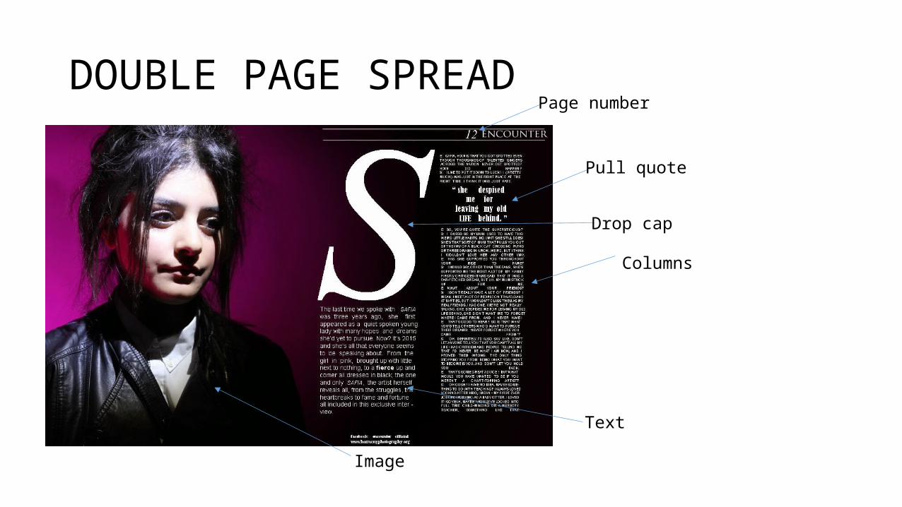
DOUBLE PAGE SPREAD
Pull quote
Page number
Image
Columns
Drop cap
Text
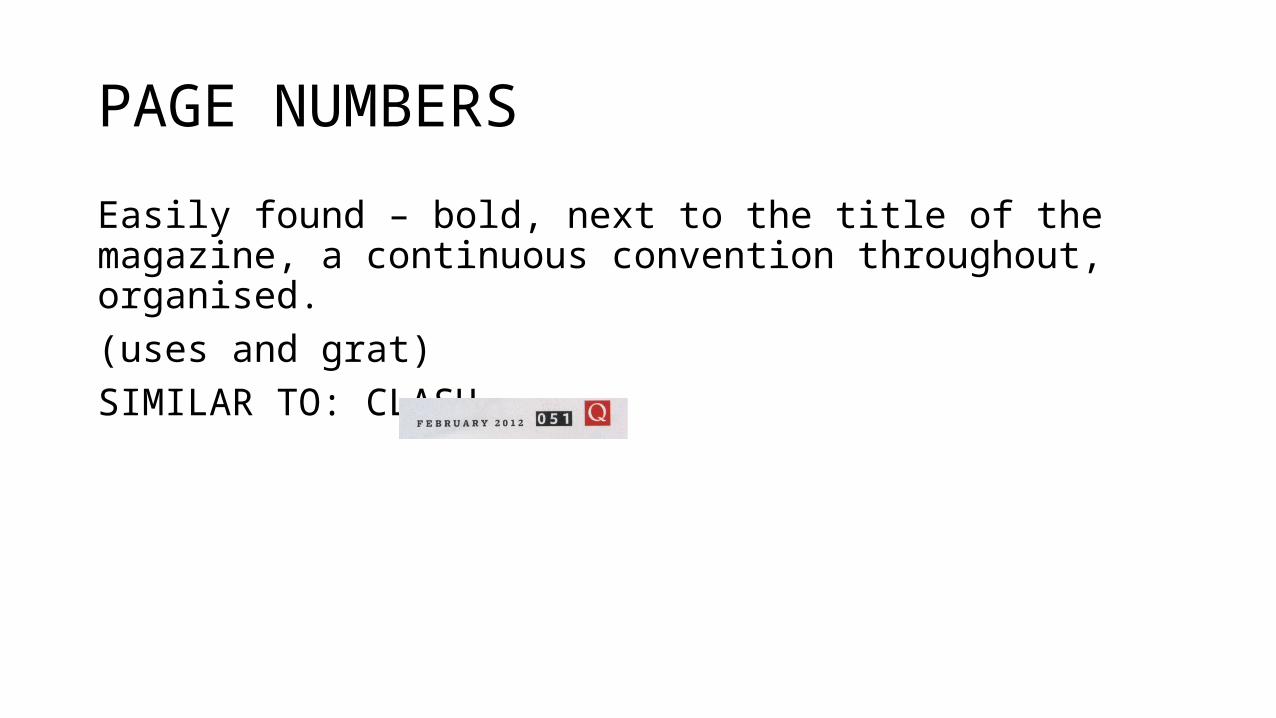
PAGE NUMBERS
Easily found – bold, next to the title of the magazine, a continuous convention throughout, organised.(uses and grat)SIMILAR TO: CLASH
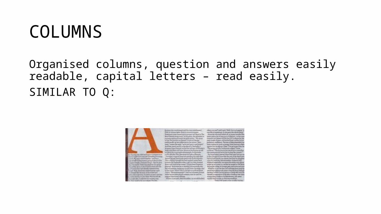
COLUMNS
Organised columns, question and answers easily readable, capital letters – read easily. SIMILAR TO Q:
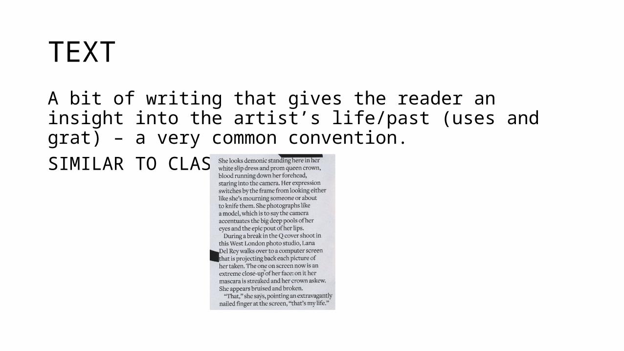
TEXT
A bit of writing that gives the reader an insight into the artist’s life/past (uses and grat) – a very common convention.SIMILAR TO CLASH:
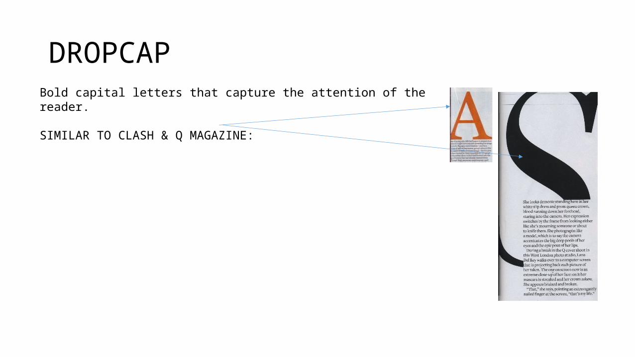
DROPCAPBold capital letters that capture the attention of the reader.
SIMILAR TO CLASH & Q MAGAZINE:
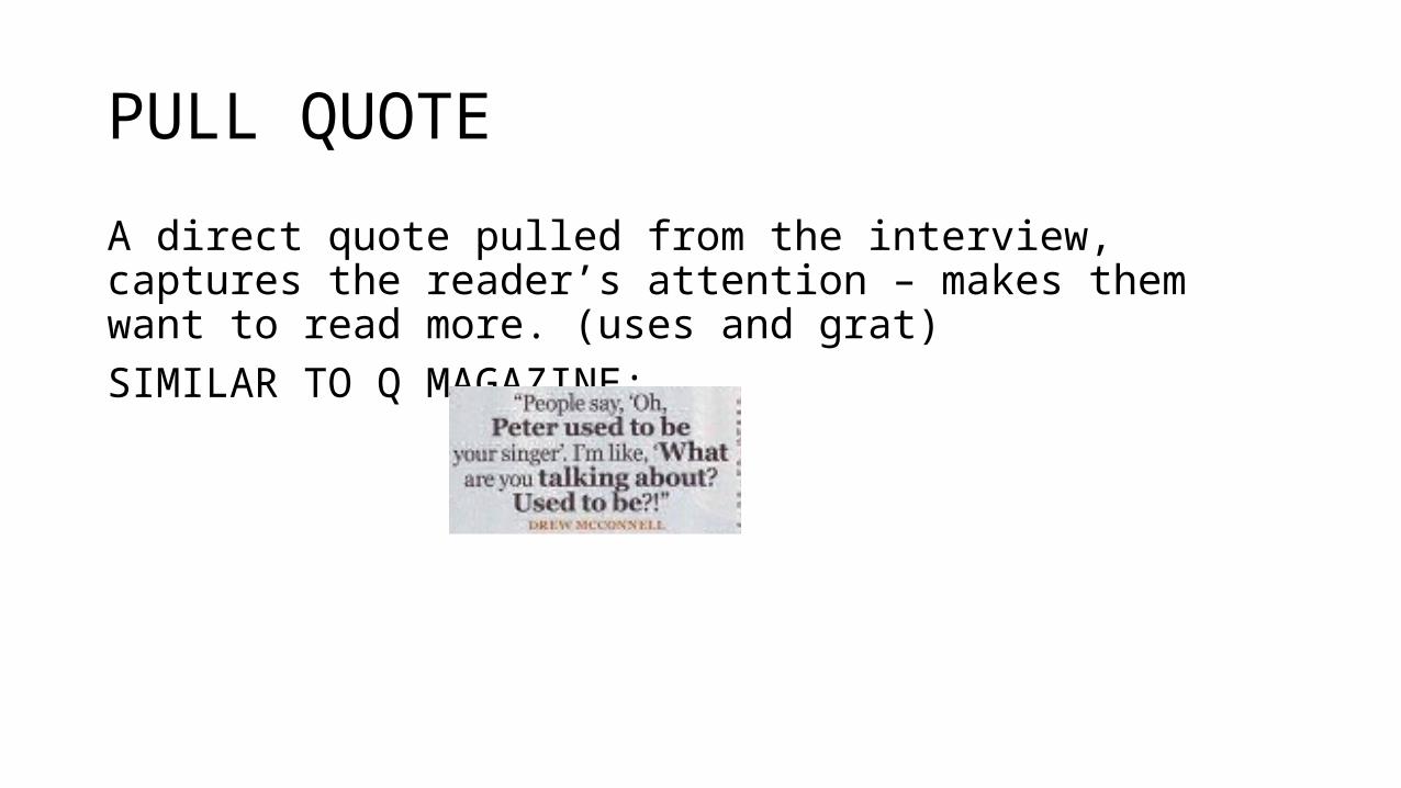
PULL QUOTE
A direct quote pulled from the interview, captures the reader’s attention – makes them want to read more. (uses and grat)SIMILAR TO Q MAGAZINE:
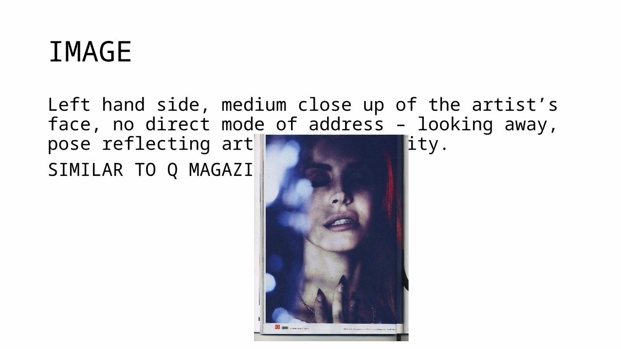
IMAGE
Left hand side, medium close up of the artist’s face, no direct mode of address – looking away, pose reflecting artist’s personality.SIMILAR TO Q MAGAZINE: