Embed Size (px)
Citation preview
Redesign of art.yale.edu
Patricia Wilson, Lauren Muhleman, (Names of group members)
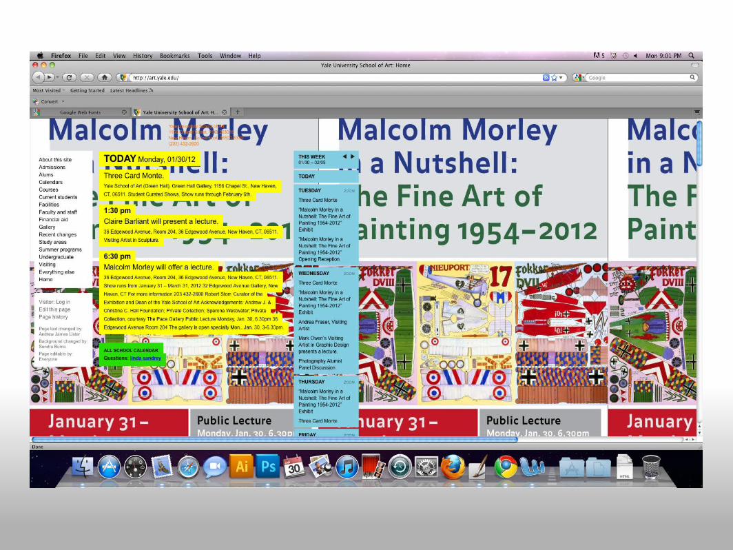
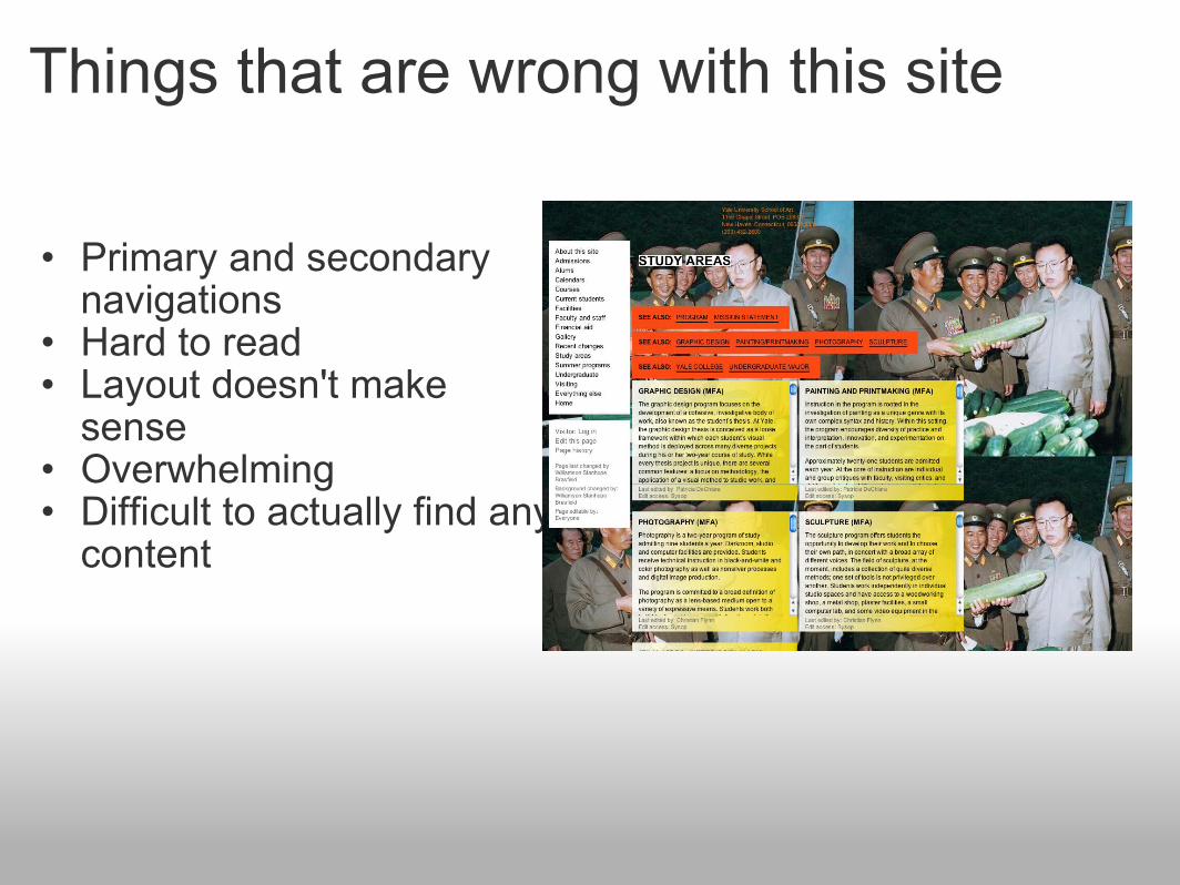
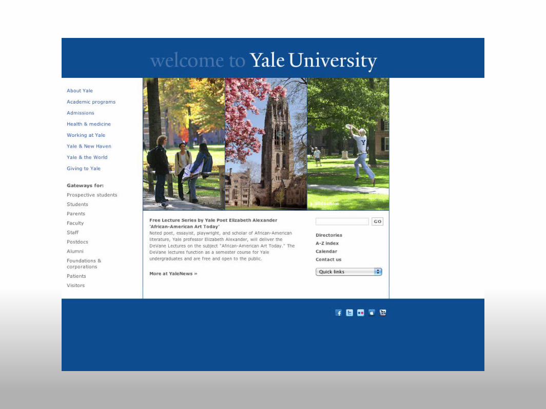
Things that are wrong with this site
• Primary and secondary navigations
• Hard to read• Layout doesn't make
sense• Overwhelming• Difficult to actually find any
content
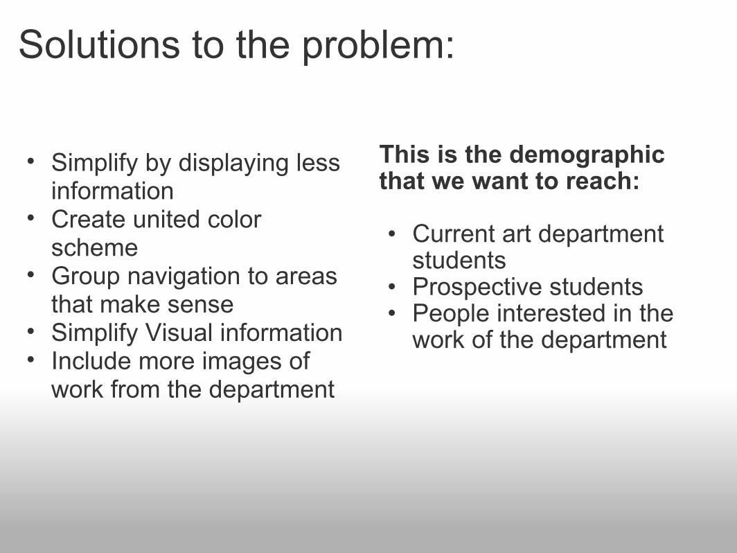
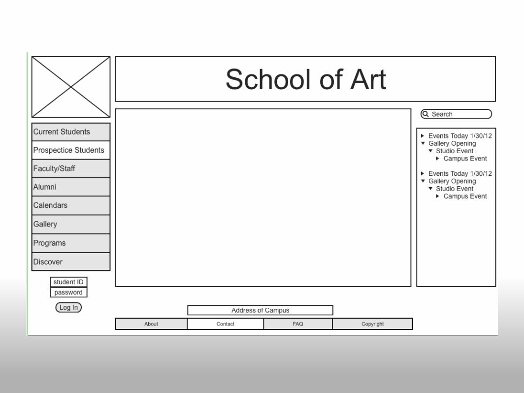
Solutions to the problem:
This is the demographic that we want to reach:
• Current art department students
• Prospective students• People interested in the
work of the department
• Simplify by displaying less information
• Create united color scheme
• Group navigation to areas that make sense
• Simplify Visual information• Include more images of
work from the department


Color palettes
Keeps Yale colors but adds "pop" to make the department stand out
Based loosely on Yale colors but with more warmth and energy.
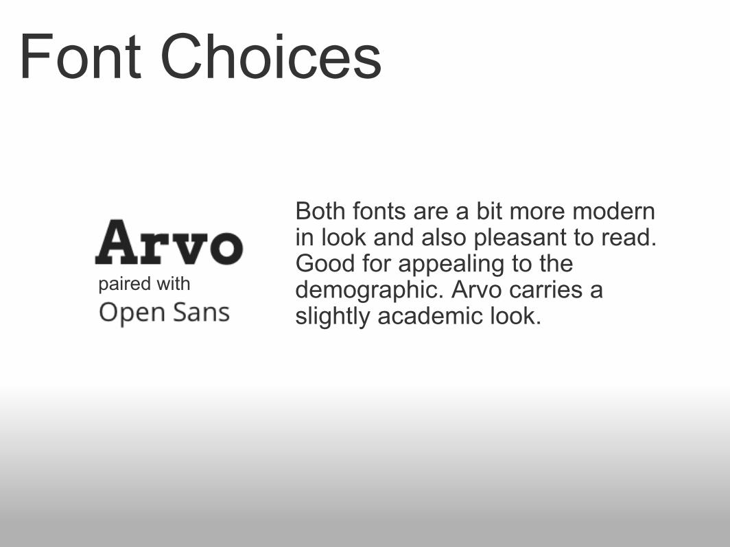
Font Choices
Both fonts are a bit more modern in look and also pleasant to read. Good for appealing to the demographic. Arvo carries a slightly academic look.
paired with
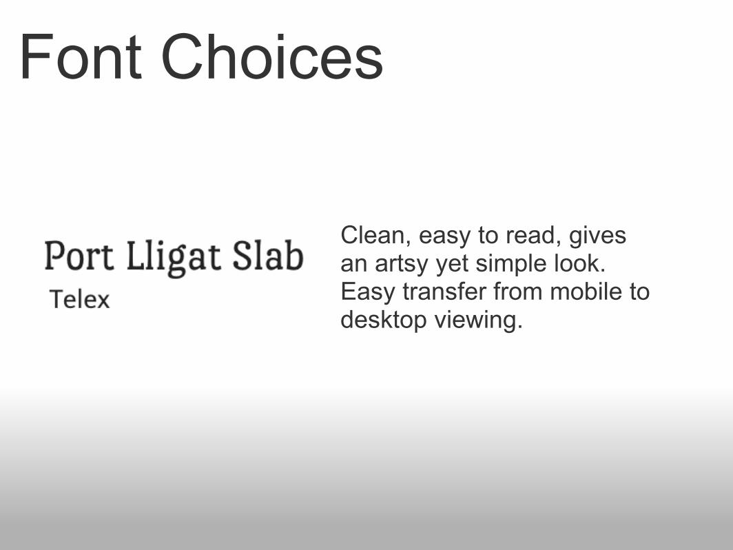
Font Choices
Clean, easy to read, gives an artsy yet simple look.Easy transfer from mobile to desktop viewing.