Embed Size (px)
Citation preview
IN WHAT WAYS DOES YOUR MEDIA PRODUCT
USE, DEVELOP OR CHALLENGE FORMS AND CONVENTIONS OF REAL
MEDIA PRODUCTS?By Lauren Schofield
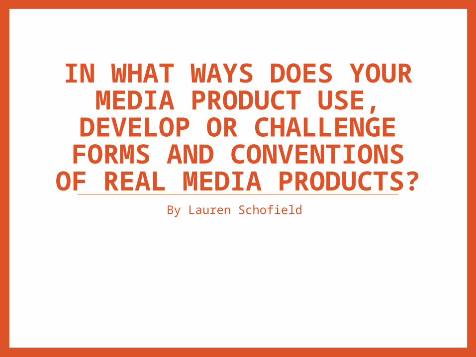
FRONT COVER
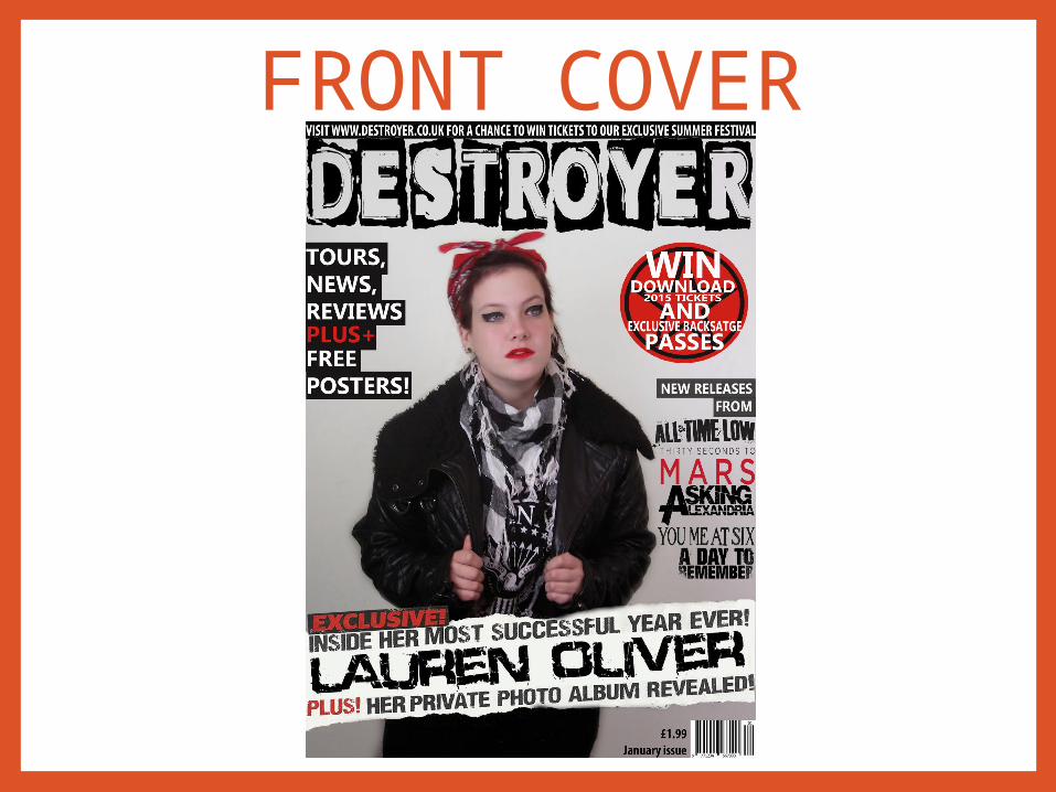
CONTENTS PAGE
DOUBLE PAGE SPREAD
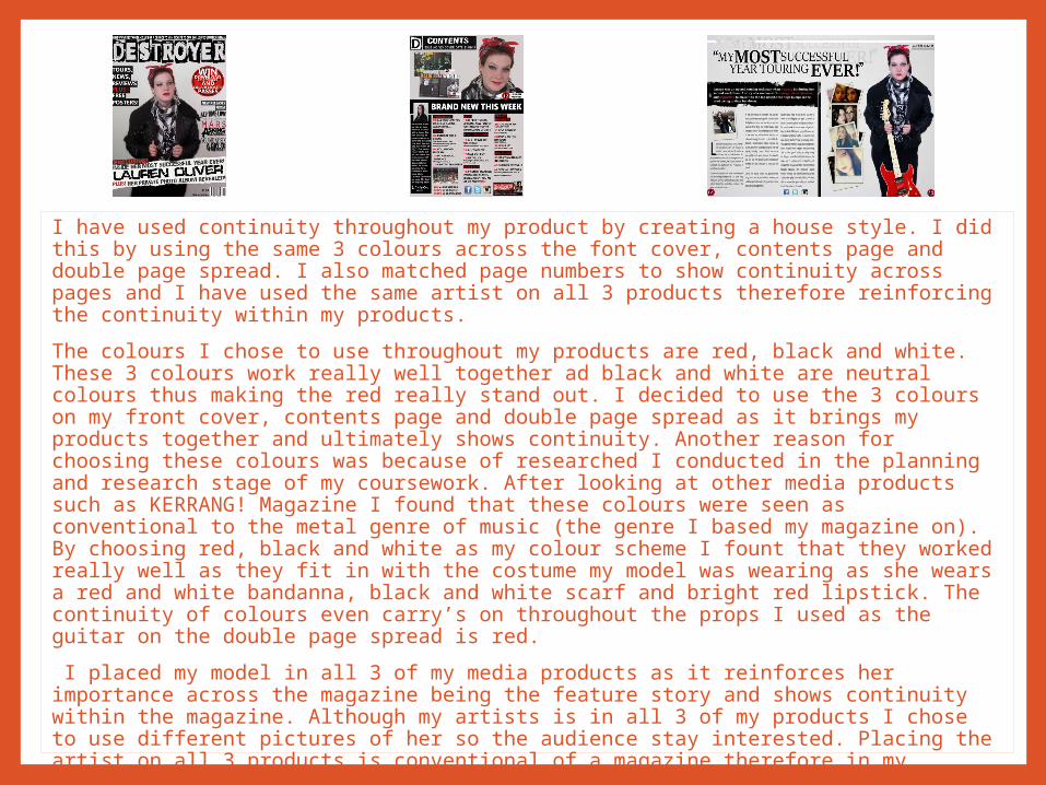
I have used continuity throughout my product by creating a house style. I did this by using the same 3 colours across the font cover, contents page and double page spread. I also matched page numbers to show continuity across pages and I have used the same artist on all 3 products therefore reinforcing the continuity within my products.
The colours I chose to use throughout my products are red, black and white. These 3 colours work really well together ad black and white are neutral colours thus making the red really stand out. I decided to use the 3 colours on my front cover, contents page and double page spread as it brings my products together and ultimately shows continuity. Another reason for choosing these colours was because of researched I conducted in the planning and research stage of my coursework. After looking at other media products such as KERRANG! Magazine I found that these colours were seen as conventional to the metal genre of music (the genre I based my magazine on). By choosing red, black and white as my colour scheme I fount that they worked really well as they fit in with the costume my model was wearing as she wears a red and white bandanna, black and white scarf and bright red lipstick. The continuity of colours even carry’s on throughout the props I used as the guitar on the double page spread is red.
I placed my model in all 3 of my media products as it reinforces her importance across the magazine being the feature story and shows continuity within the magazine. Although my artists is in all 3 of my products I chose to use different pictures of her so the audience stay interested. Placing the artist on all 3 products is conventional of a magazine therefore in my product I am conforming to conventions of a music magazine.
Conventionally in a metal music magazine the fonts used are bold as metal music is raw and likes to get to the point therefore I have used fonts that adhere to that idea of raw boldness in my magazine. in my products the fonts I used are Calibri and Calisto MT for my main text, they are bold fonts thus reinforce the genre and dominance of my magazine.

I followed the convention of having feature stories on my front cover as it tells the audience what else is in my magazine as readers are not always interested in the main feature story, although may be interested in the rest of the content. Readers do not have the time or chance to look at the contents page when browsing magazines so feature stories on the front cover makes it easier for the to see then hopefully buy.
On my front cover I created a plug as this stands out and catches the readers eye hopefully making them take another look at my magazine as there is always deals and chances to win good prizes. This may make the reader want to buy the magazine for the deal or competition. A plus is not always used ion a magazine but can be seen as conventional as a lot of magazines do have the.
I followed the convention of a header at the top of my front cover to give the audience an incentive to buy my magazine as they are able to have a chance at winning good prizes. Although I followed the convention of a header I challenged conventions by not creating a footer as I did not want to overcrowd my front cover and I have both a header and plug advertising competition.
I used a bold masthead to catch the eyes of my readers. I placed the masthead is important as it reinforces the company and is places near the top of the page as it is conventional of most music magazines. The masthead can tell you the type of genre of the magazine, especially with well known ones such as Kerrang! Being a metal music magazine and is one of the first things, besides the main feature story that the audience sees.
My main feature story is used to attract readers to my magazine, I created this story as an exclusive to make my audience want to by my magazine as they will not get this story in any other magazines. Main feature stories are usually big things that have happened, this attracts readers as people like to read about celebrities lives. Main feature stories follow conventions as all magazines have main feature stories as a selling point.
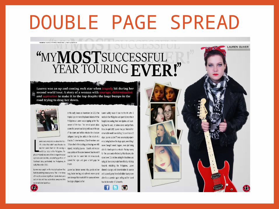
in regards to my main images I followed conventions by using a medium close-up so you can really see who the artist is. My model is wearing a black leather jacket and a red bandanna to represent the metal genre. A leather jacket is rather conventional of the metal genre as it is seen as tough and powerful, this stems from the representation of youth ‘rockers’ in the 1960’s who listened to rock and metal music, wore leather jackets and were seen as ‘yobs’ and deviant. This representation therefore creates a powerful image for my magazine. The main image is important as it show’s the reader who the main feature story is about thus enticing them to want to find out more about why the artists in the magazine and ultimately making the reader want to buy the magazine.
I followed the convention of having a barcode on my music magazine front cover as it tells the reader what issue the magazine is, the date and the cost of the magazine. This helps people decided if they can afford the magazine and helps collectors stay up to date for example if they missed an issue without knowing, the issue number will tell them.
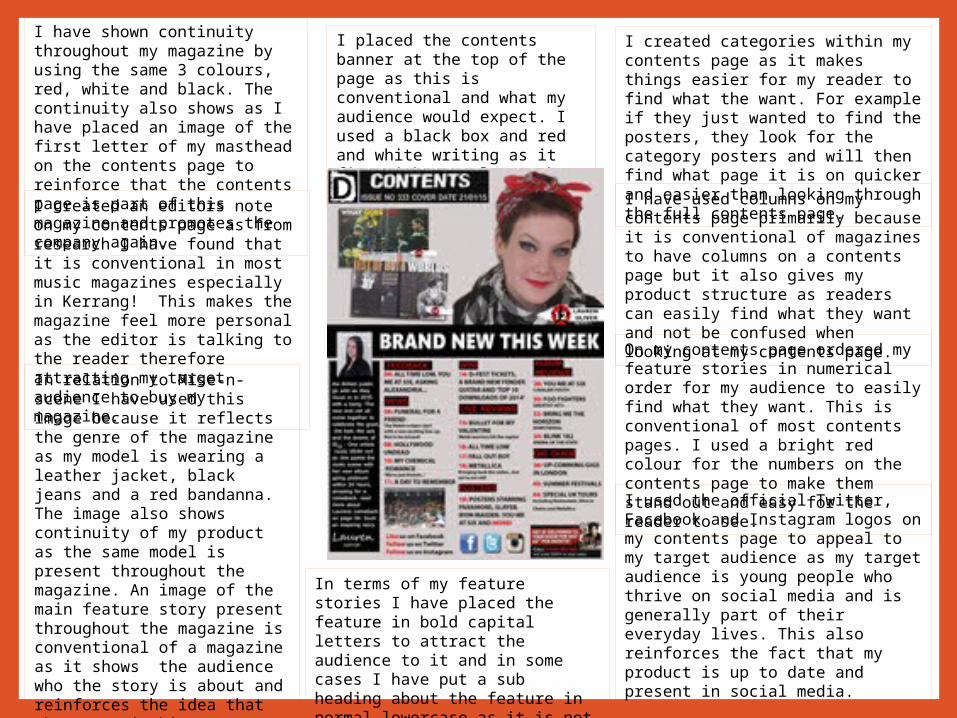
I have shown continuity throughout my magazine by using the same 3 colours, red, white and black. The continuity also shows as I have placed an image of the first letter of my masthead on the contents page to reinforce that the contents page is part of this magazine and promotes the company again. I created an editors note on my contents page as from research I have found that it is conventional in most music magazines especially in Kerrang! This makes the magazine feel more personal as the editor is talking to the reader therefore attracting my target audience to buy my magazine.
I used the official Twitter, Facebook and Instagram logos on my contents page to appeal to my target audience as my target audience is young people who thrive on social media and is generally part of their everyday lives. This also reinforces the fact that my product is up to date and present in social media.
I have used columns on my contents page primarily because it is conventional of magazines to have columns on a contents page but it also gives my product structure as readers can easily find what they want and not be confused when looking at my contents page.
I created categories within my contents page as it makes things easier for my reader to find what the want. For example if they just wanted to find the posters, they look for the category posters and will then find what page it is on quicker and easier than looking through the full contents page.
In relation to Mise-n-scene I have used this image because it reflects the genre of the magazine as my model is wearing a leather jacket, black jeans and a red bandanna. The image also shows continuity of my product as the same model is present throughout the magazine. An image of the main feature story present throughout the magazine is conventional of a magazine as it shows the audience who the story is about and reinforces the idea that the story is big news.
On my contents page ordered my feature stories in numerical order for my audience to easily find what they want. This is conventional of most contents pages. I used a bright red colour for the numbers on the contents page to make them stand out and easy for the reader to see.
I placed the contents banner at the top of the page as this is conventional and what my audience would expect. I used a black box and red and white writing as it fits with my colour scheme and stands out
In terms of my feature stories I have placed the feature in bold capital letters to attract the audience to it and in some cases I have put a sub heading about the feature in normal lowercase as it is not as important as you can read about that on the page.
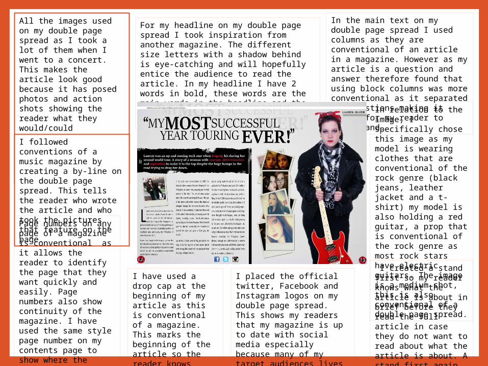
All the images used on my double page spread as I took a lot of them when I went to a concert. This makes the article look good because it has posed photos and action shots showing the reader what they would/could experience at a concert if they went and giving them a sense of actually being there. I followed conventions of a music magazine by creating a by-line on the double page spread. This tells the reader who wrote the article and who took the pictures that feature on the page.
In the main text on my double page spread I used columns as they are conventional of an article in a magazine. However as my article is a question and answer therefore found that using block columns was more conventional as it separated the questions making it easier for my reader to understand. In relation to the
image, I specifically chose this image as my model is wearing clothes that are conventional of the rock genre (black jeans, leather jacket and a t-shirt) my model is also holding a red guitar, a prop that is conventional of the rock genre as most rock stars have electric guitars. The image is a medium shot, this is also conventional of a double page spread.
For my headline on my double page spread I took inspiration from another magazine. The different size letters with a shadow behind is eye-catching and will hopefully entice the audience to read the article. In my headline I have 2 words in bold, these words are the main words in the headline and the boldness of the letters highlight this.
Page numbers on any page of a magazine is conventional as it allows the reader to identify the page that they want quickly and easily. Page numbers also show continuity of the magazine. I have used the same style page number on my contents page to show where the article is reinforcing the continuity.
I have used a drop cap at the beginning of my article as this is conventional of a magazine. This marks the beginning of the article so the reader knows where to start.
I placed the official twitter, Facebook and Instagram logos on my double page spread. This shows my readers that my magazine is up to date with social media especially because many of my target audiences lives revolve around social media.
I created a stand first so my reader knows what the article is about in brief before they read the full article in case they do not want to read about what the article is about. A stand first again is conventional of a magazine.
Challenging conventions with inspiration from other magazines…
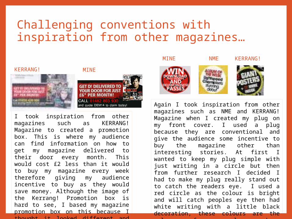
I took inspiration from other magazines such as KERRANG! Magazine to created a promotion box. This is where my audience can find information on how to get my magazine delivered to their door every month. This would cost £2 less than it would to buy my magazine every week therefore giving my audience incentive to buy as they would save money. Although the image of the Kerrang! Promotion box is hard to see, I based my magazine promotion box on this because I thought it looked different and challenged conventions as most contents pages do not have this.
KERRANG! MINE
MINE NME KERRANG!
Again I took inspiration from other magazines such as NME and KERRANG! Magazine when I created my plug on my front cover. I used a plug because they are conventional and give the audience some incentive to buy the magazine other than interesting stories. At first I wanted to keep my plug simple with just writing in a circle but then from further research I decided I had to make my plug really stand out to catch the readers eye. I used a red circle as the colour is bright and will catch peoples eye then had white writing with a little black decoration, these colours are the colours of my colour scheme therefore showing continuity of my magazine. In my plug I placed a black star, this shows continuity with my contents and double page spread as my page numbers have a circle and a star.

Challenging conventions with inspiration from other magazines…
From conducting my research into existing products I found some inspiration for my masthead for my double page spread from KERRANG! Magazine. I thought that the shadow behind the text was quirky and different that could reflect my article as it is about my artist turning over a new leaf but her dark past is still there. I also thought this might catch the readers eyes and make them want to read the article. The different size text and some words being bold are quite conventional in a mast head as the boldness of some words shows that there is emphasis on them.
MINE
KERRANG!
Challenging conventions with inspiration from other magazines…
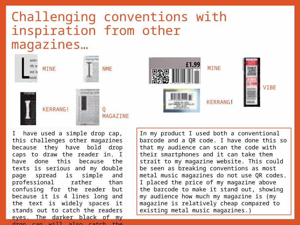
I have used a simple drop cap, this challenges other magazines because they have bold drop caps to draw the reader in. I have done this because the texts is serious and my double page spread is simple and professional rather than confusing for the reader but because it is 4 lines long and the text is widely spaces it stands out to catch the readers eyes. The darker black of my drop cap will also catch the readers eyes because it stands out and has no obstructions such as the box shadow round it as seen on NME’s drop cap.
MINE
KERRANG!
NME
Q MAGAZINE
MINE
KERRANG!
VIBE
In my product I used both a conventional barcode and a QR code. I have done this so that my audience can scan the code with their smartphones and it can take them strait to my magazine website. This could be seen as breaking conventions as most metal music magazines do not use QR codes. I placed the price of my magazine above the barcode to make it stand out, showing my audience how much my magazine is (my magazine is relatively cheap compared to existing metal music magazines.)
Challenging conventions with inspiration from other magazines…
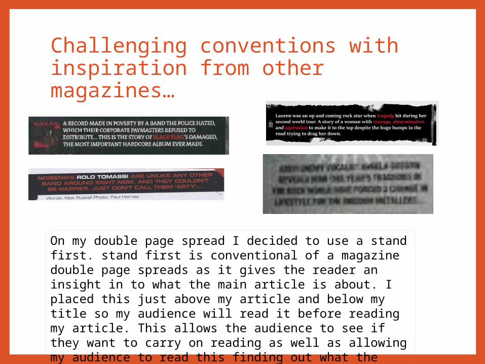
On my double page spread I decided to use a stand first. stand first is conventional of a magazine double page spreads as it gives the reader an insight in to what the main article is about. I placed this just above my article and below my title so my audience will read it before reading my article. This allows the audience to see if they want to carry on reading as well as allowing my audience to read this finding out what the article is about making the audience want to buy my magazine.