Embed Size (px)
Citation preview
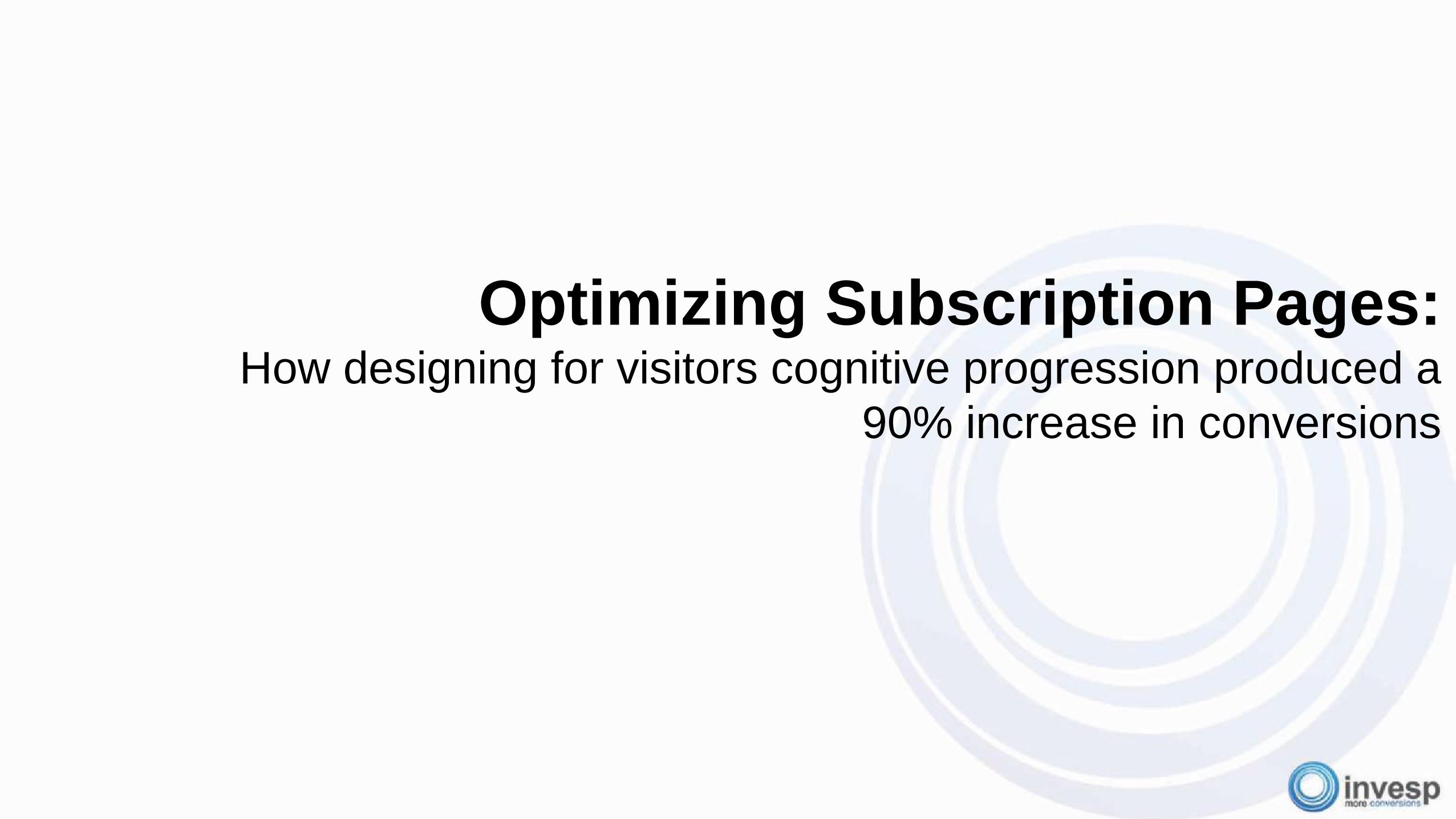
Optimizing Subscription Pages:How designing for visitors cognitive progression produced a
90% increase in conversions
Join the conversation
@invesp
#invespCRO

Your Speakers
Khalid SalehCEO
A recognized expert of marketing strategy, Khalid has been a frequent guest in
key media outlets, including CNN, BBC, SKY, France 24, MSNBC, New York
Times, National Public Radio, and more. He is an in-demand speaker who has
presented at marketing conferences across the globe.
Ayat ShukairyCo-founder, Managing Partner
400+ conversion optimization projects, She has worked with some of the world
top brands such as, 3M, O’Reilly, the Special Olympics, Discovery, helping
them increase online revenue by creating successful marketing campaigns.
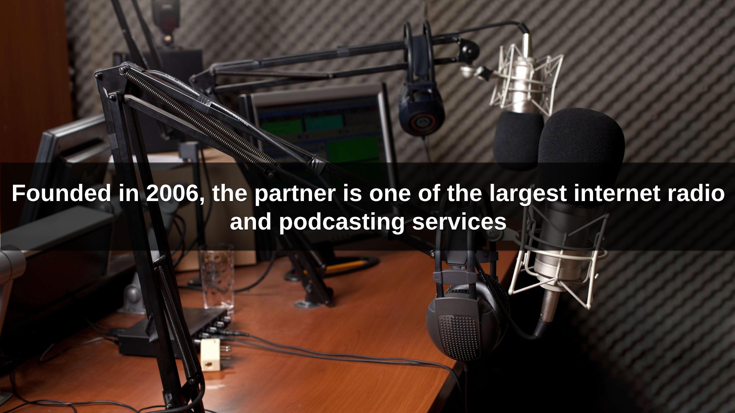
Founded in 2006, the partner is one of the largest internet radio
and podcasting services
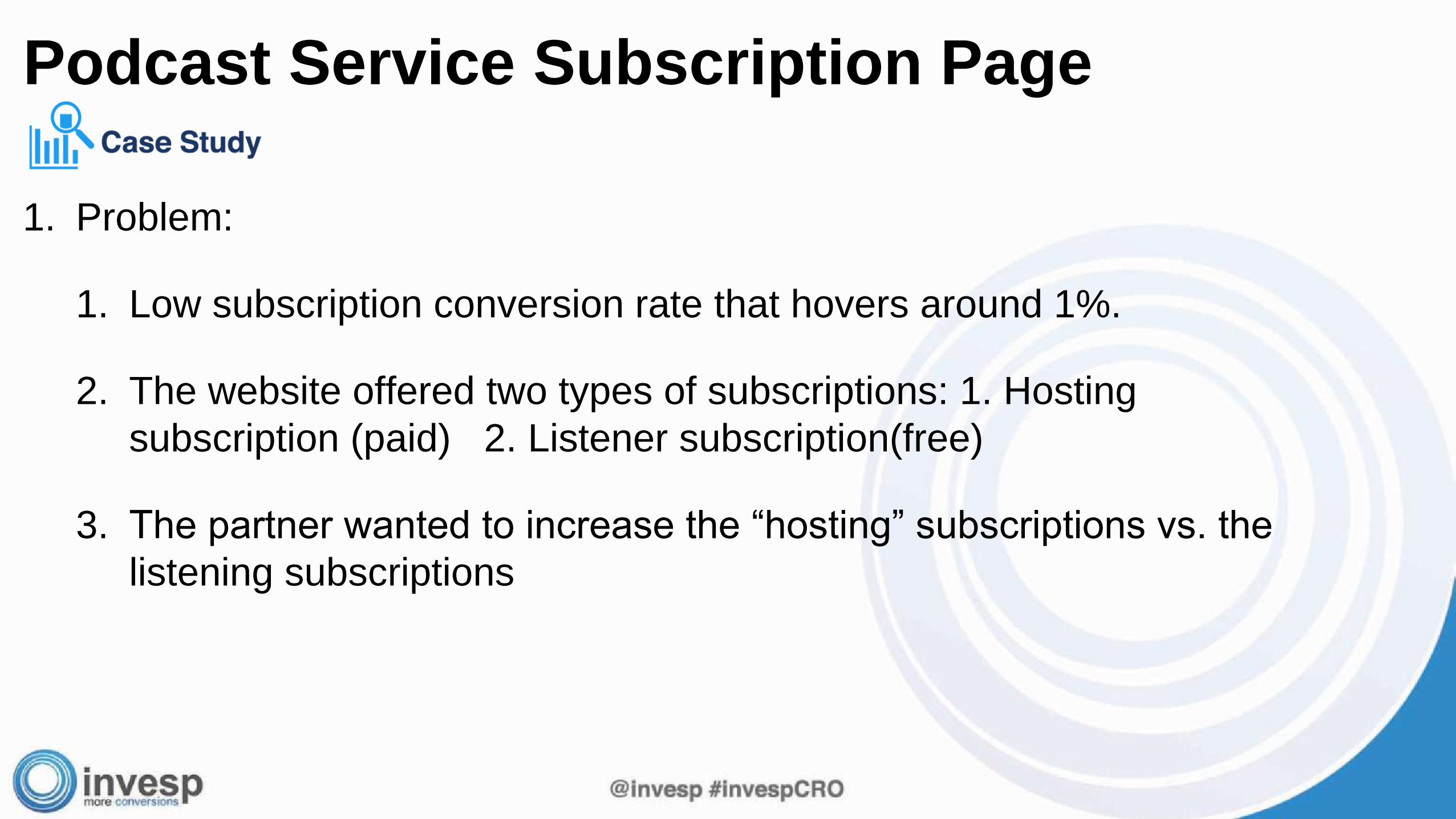
1. Problem:
1. Low subscription conversion rate that hovers around 1%.
2. The website offered two types of subscriptions: 1. Hosting
subscription (paid) 2. Listener subscription(free)
3. The partner wanted to increase the “hosting” subscriptions vs. the
listening subscriptions
Podcast Service Subscription Page
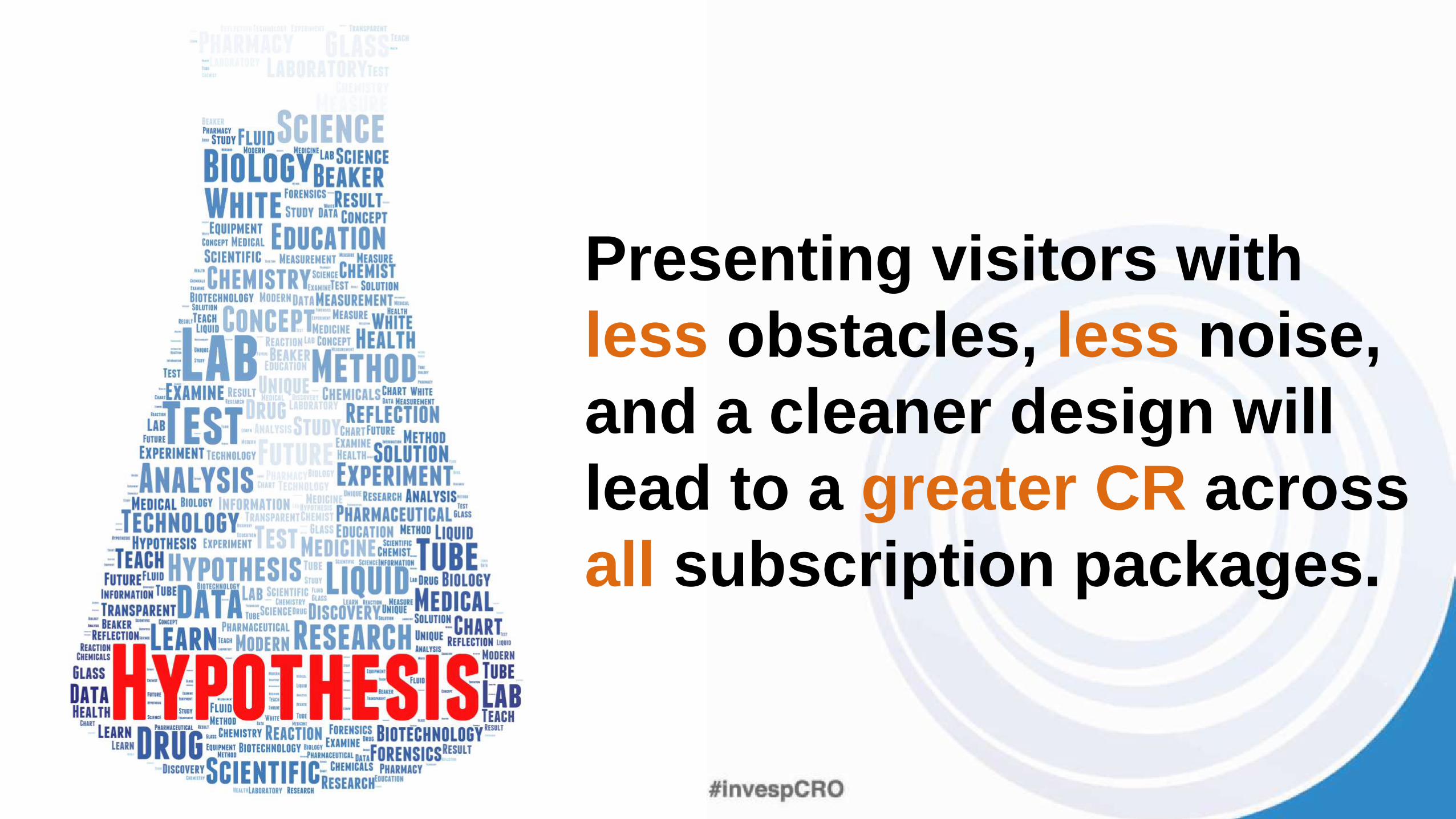
Presenting visitors with
less obstacles, less noise,
and a cleaner design will
lead to a greater CR across
all subscription packages.
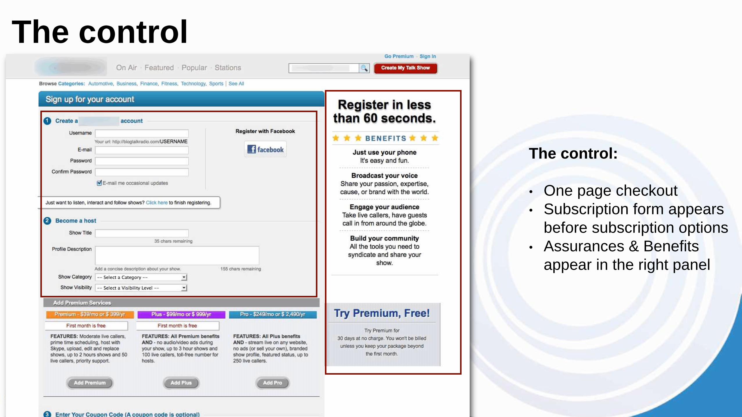
The control:
• One page checkout
• Subscription form appears
before subscription options
• Assurances & Benefits
appear in the right panel
The control
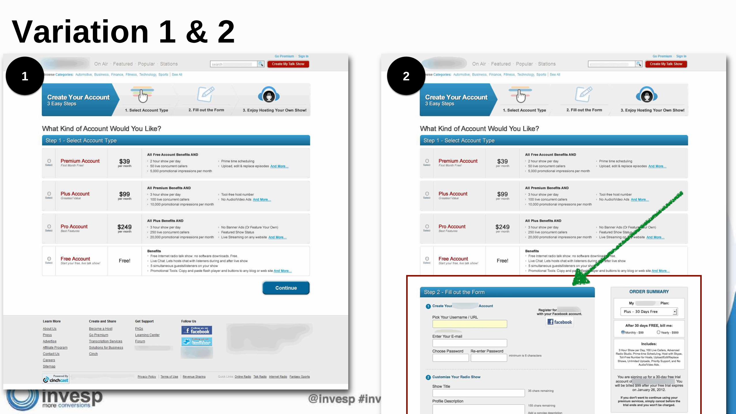
Variation 1 & 2
1 2
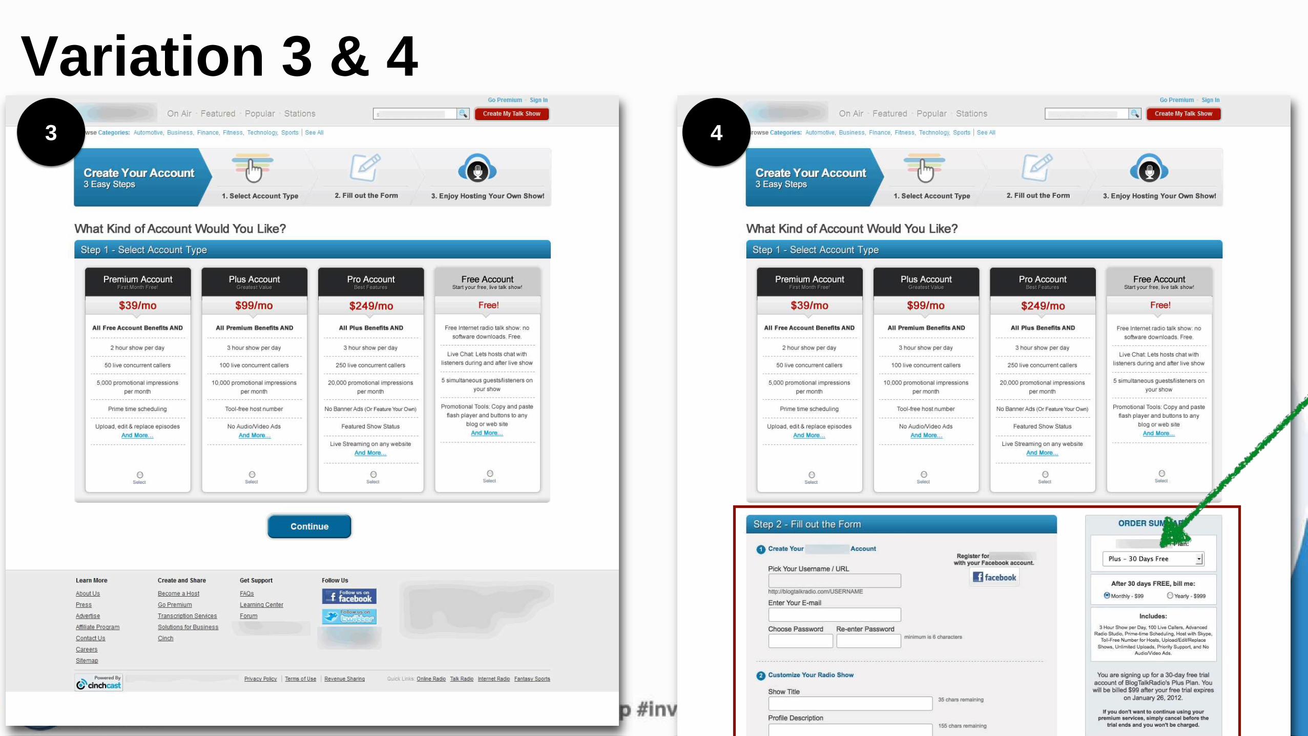
Variation 3 & 43 4
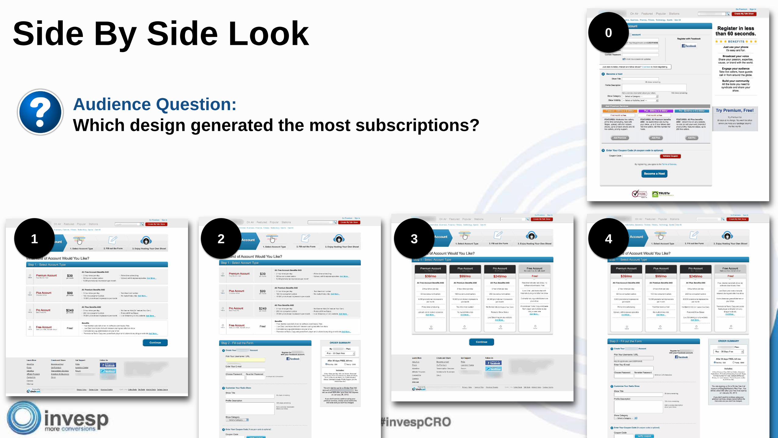
Side By Side Look 0
1 2
Audience Question:
Which design generated the most subscriptions?
43
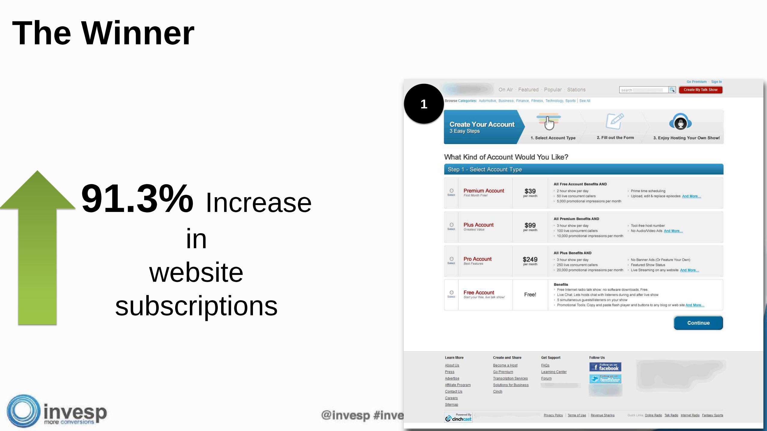
The Winner
91.3% Increase
in
website
subscriptions
1

Audience Question: why did removing the sign-up form
increase subscriptions?

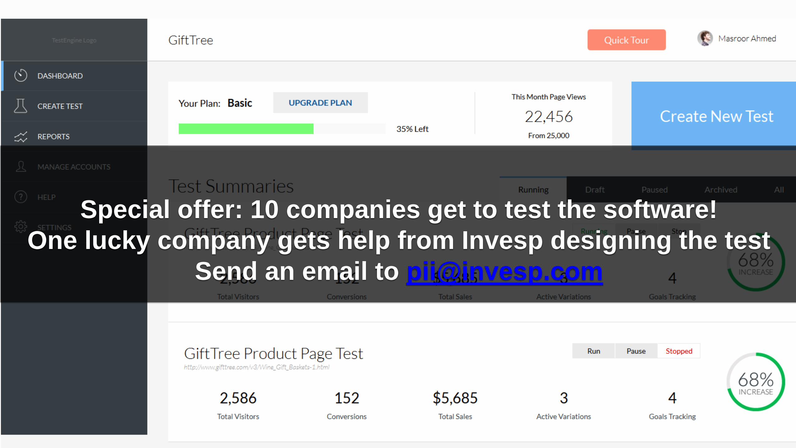
Special offer: 10 companies get to test the software!
One lucky company gets help from Invesp designing the test
Send an email to [email protected]
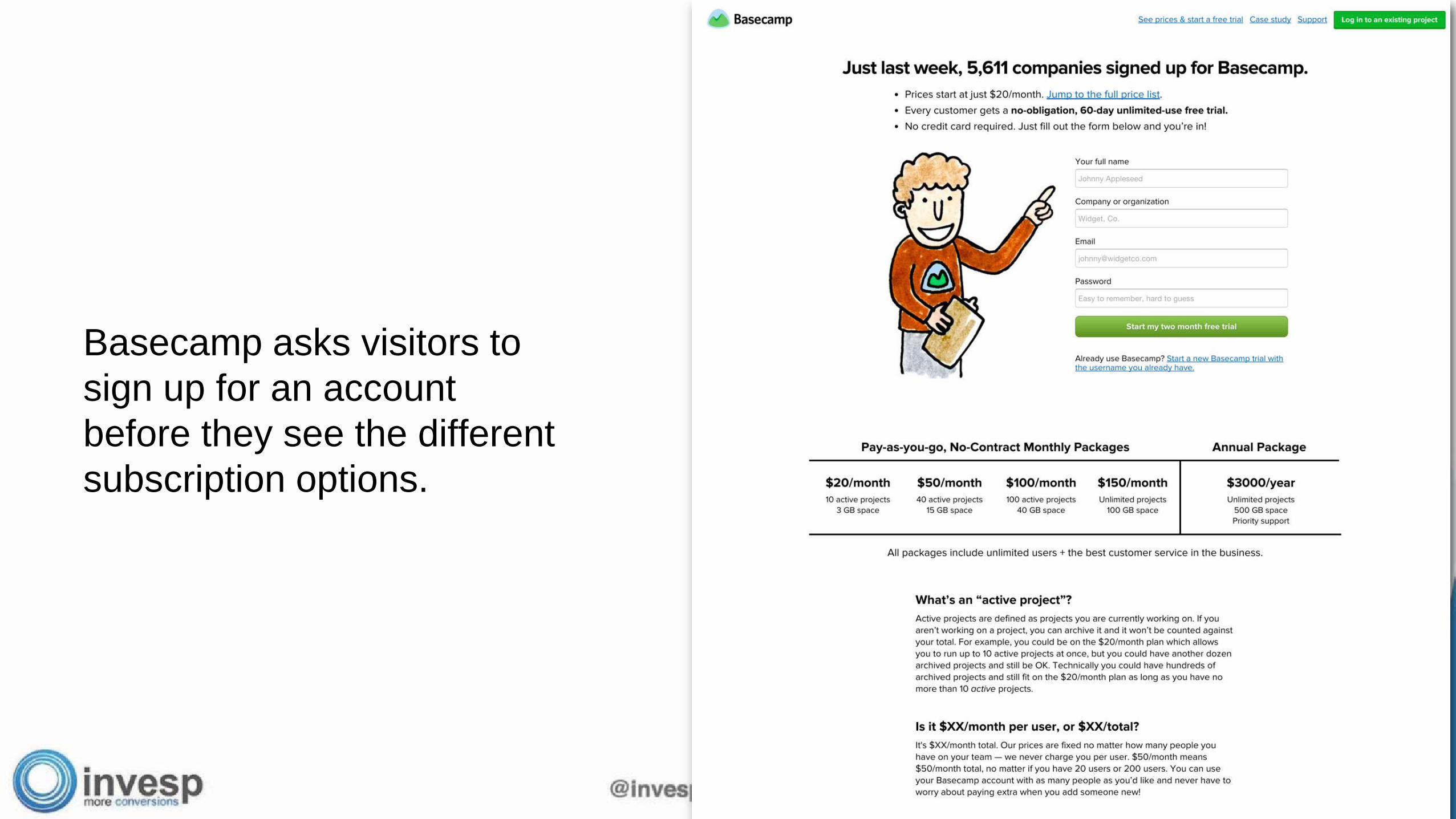
Basecamp asks visitors to
sign up for an account
before they see the different
subscription options.
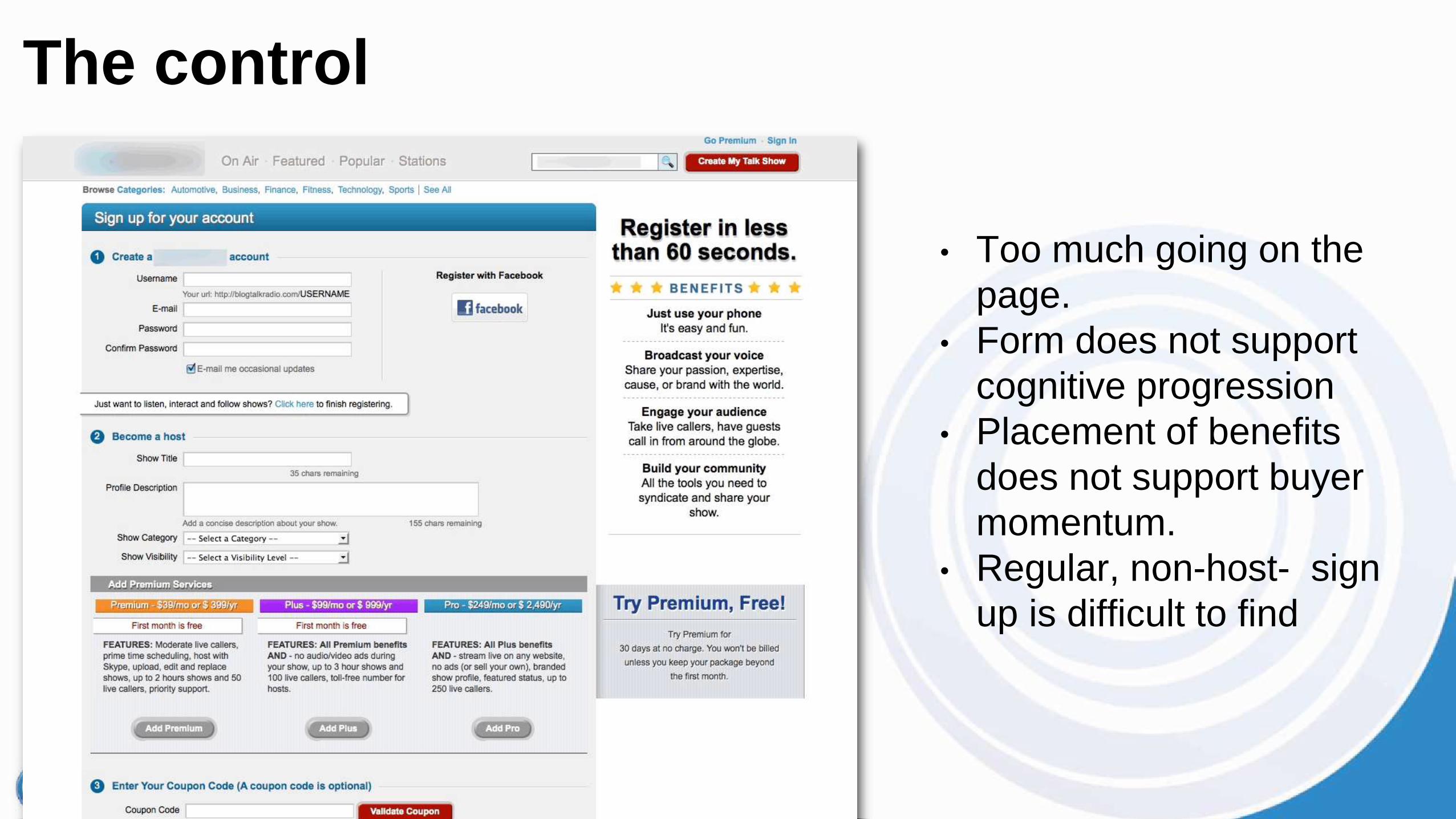
• Too much going on the
page.
• Form does not support
cognitive progression
• Placement of benefits
does not support buyer
momentum.
• Regular, non-host- sign
up is difficult to find
The control
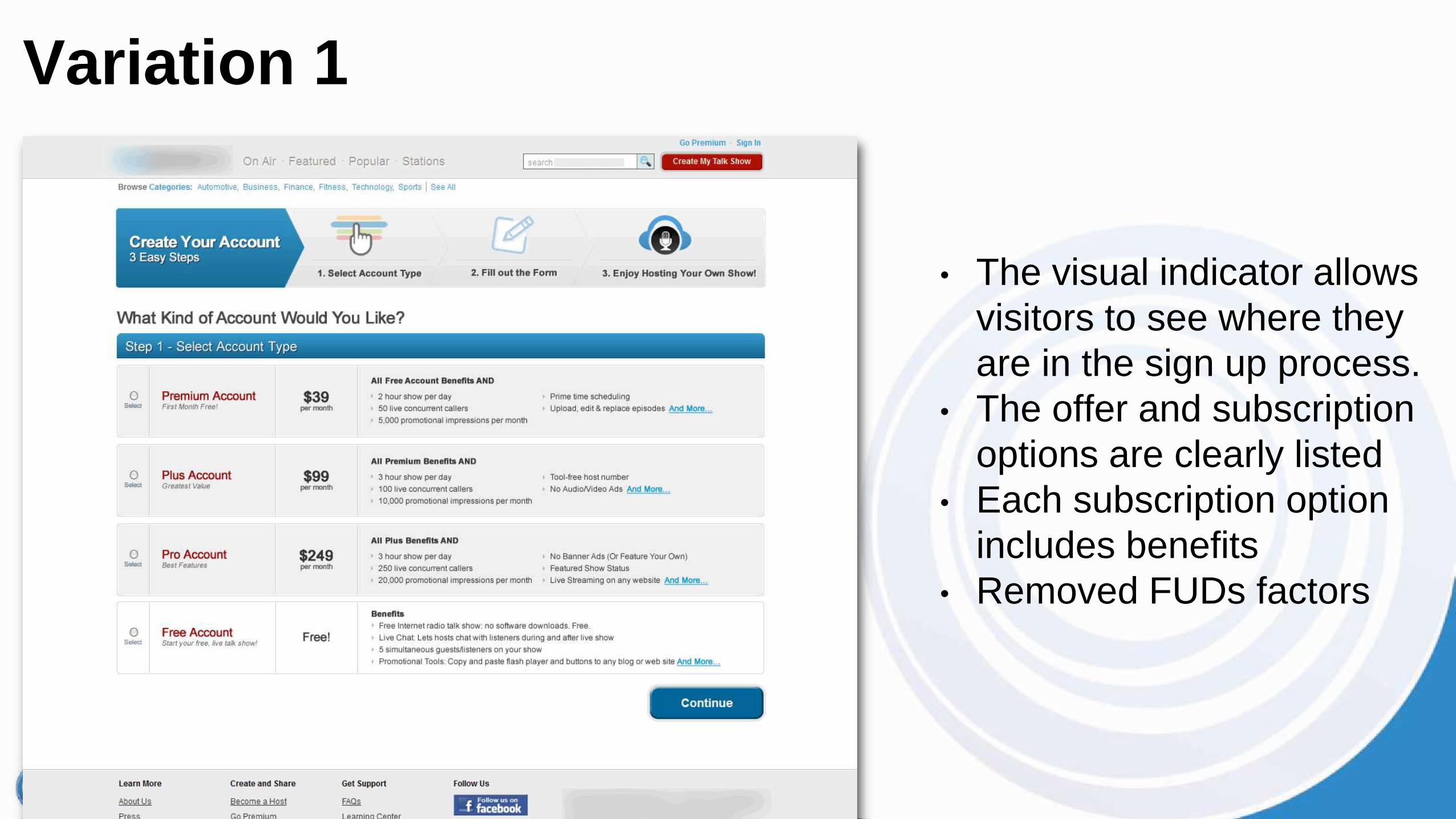
• The visual indicator allows
visitors to see where they
are in the sign up process.
• The offer and subscription
options are clearly listed
• Each subscription option
includes benefits
• Removed FUDs factors
Variation 1
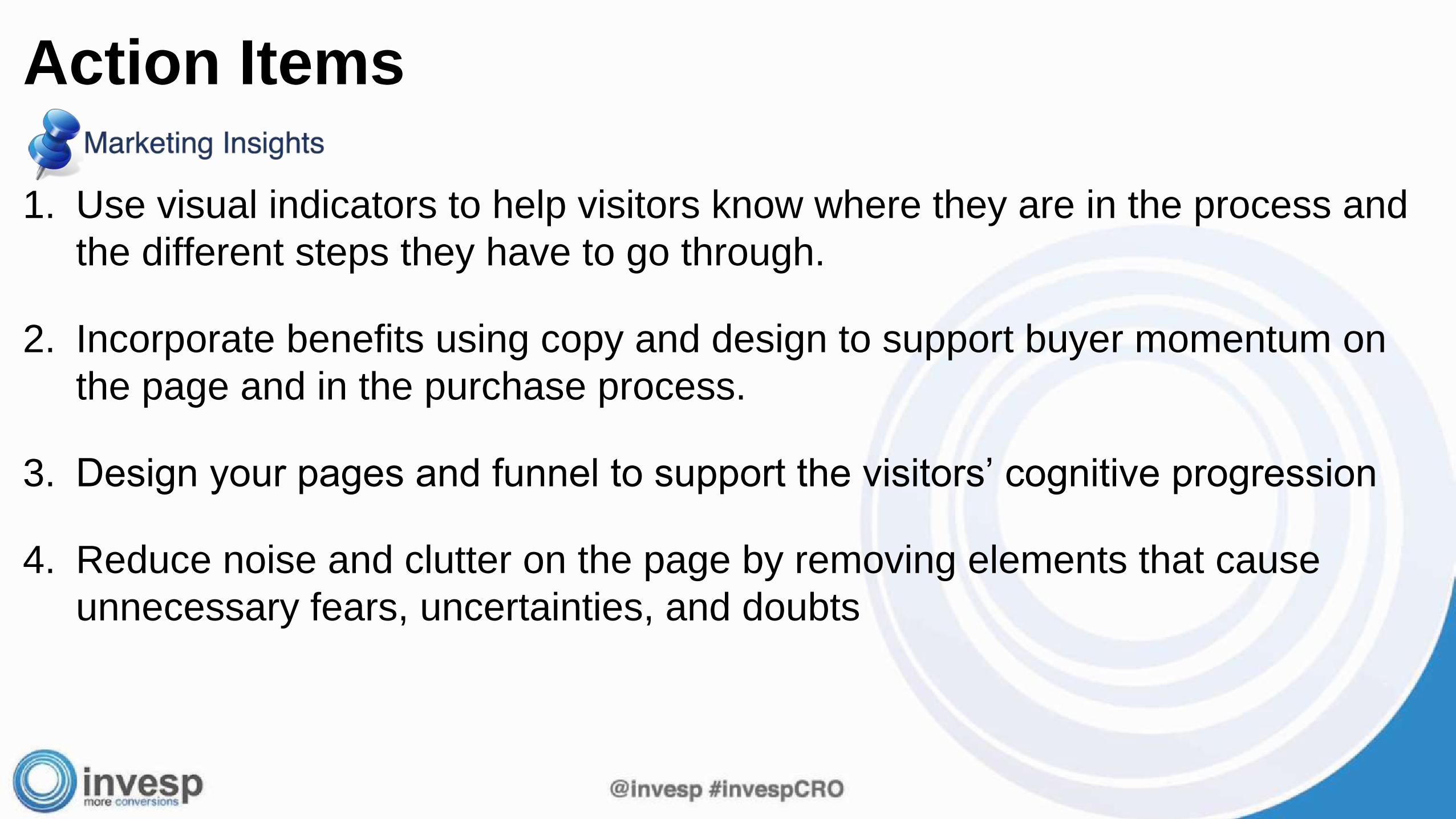
1. Use visual indicators to help visitors know where they are in the process and
the different steps they have to go through.
2. Incorporate benefits using copy and design to support buyer momentum on
the page and in the purchase process.
3. Design your pages and funnel to support the visitors’ cognitive progression
4. Reduce noise and clutter on the page by removing elements that cause
unnecessary fears, uncertainties, and doubts
Action Items
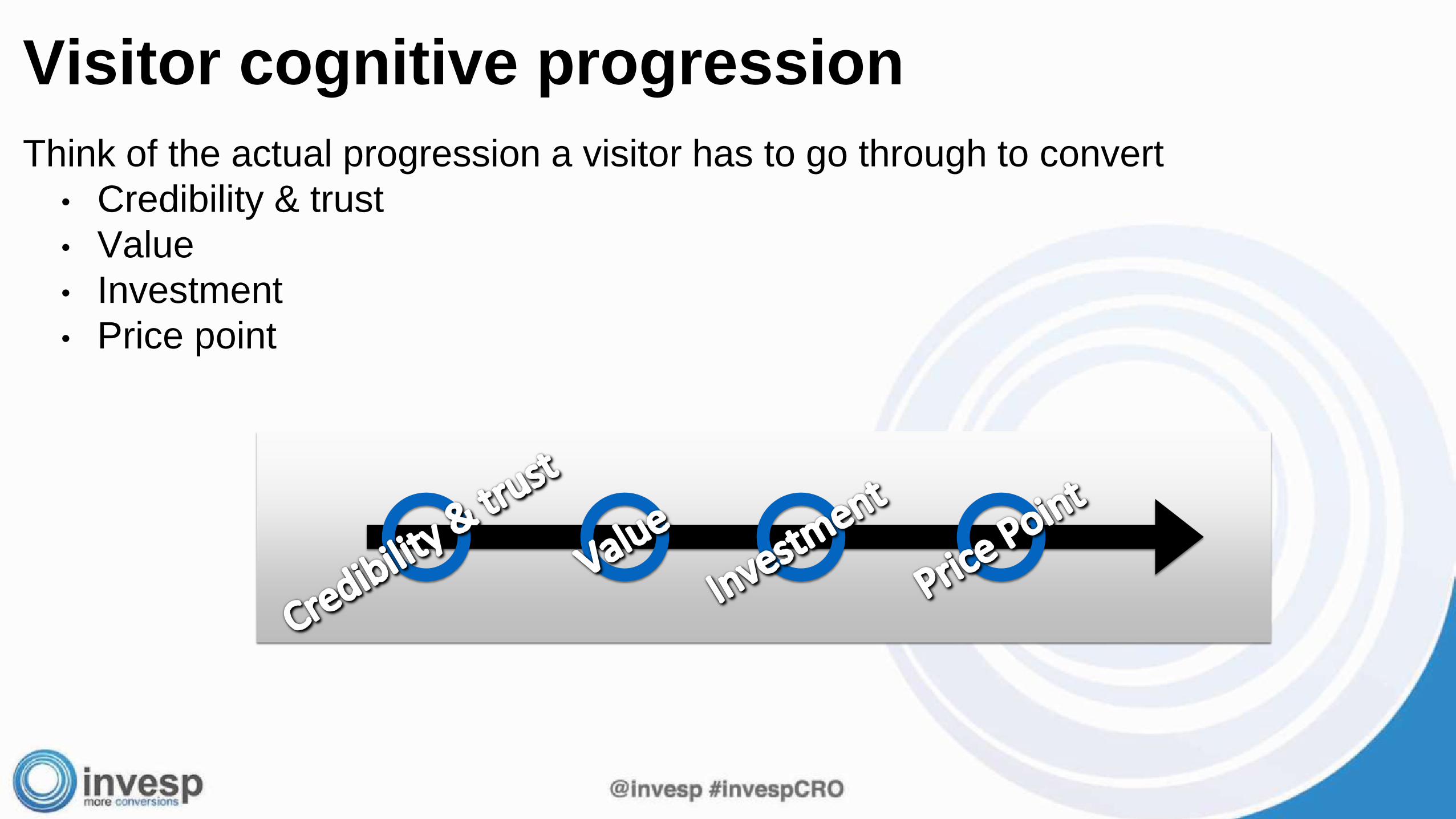
Think of the actual progression a visitor has to go through to convert
• Credibility & trust
• Value
• Investment
• Price point
Visitor cognitive progression
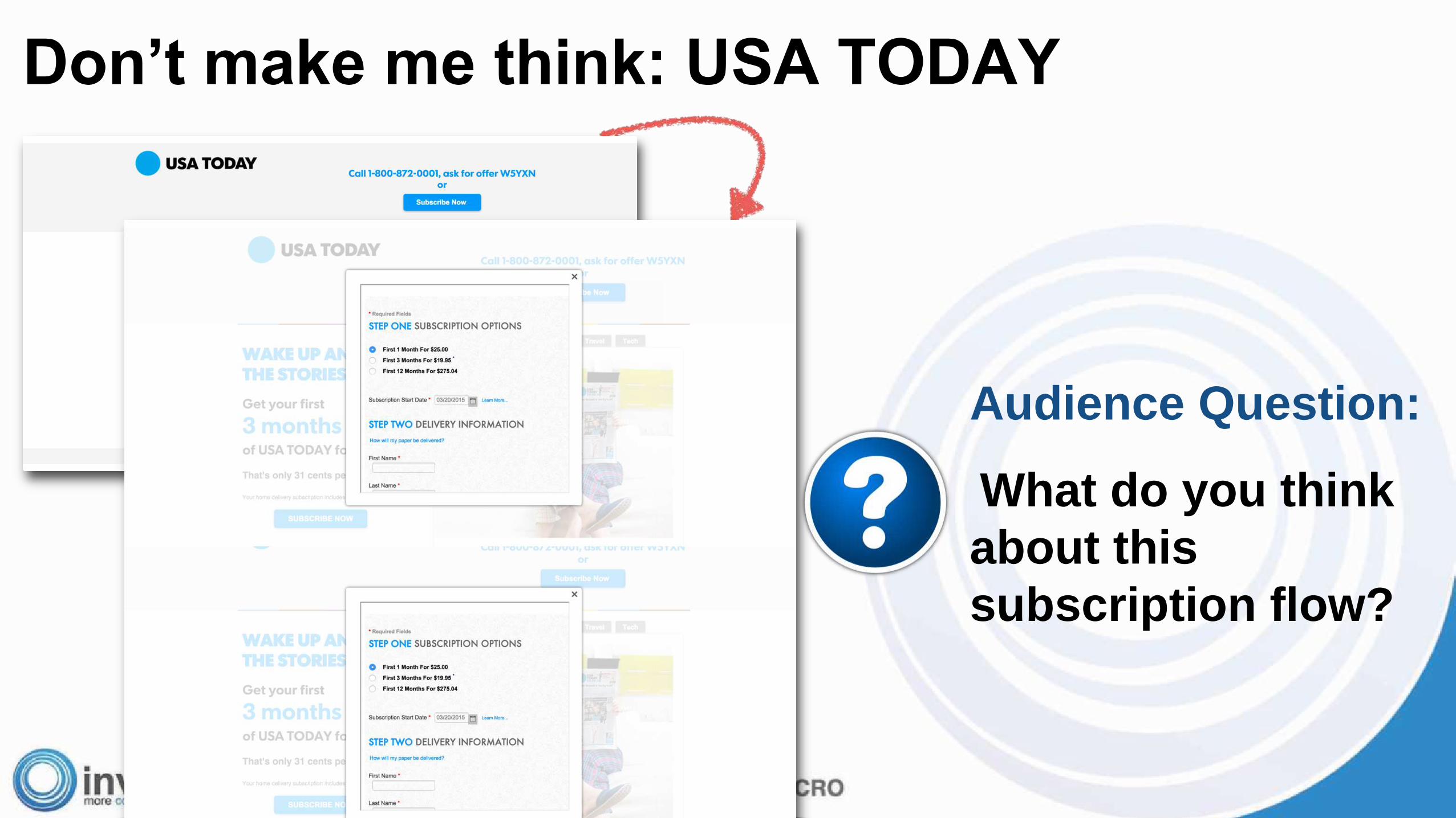
Don’t make me think: USA TODAY
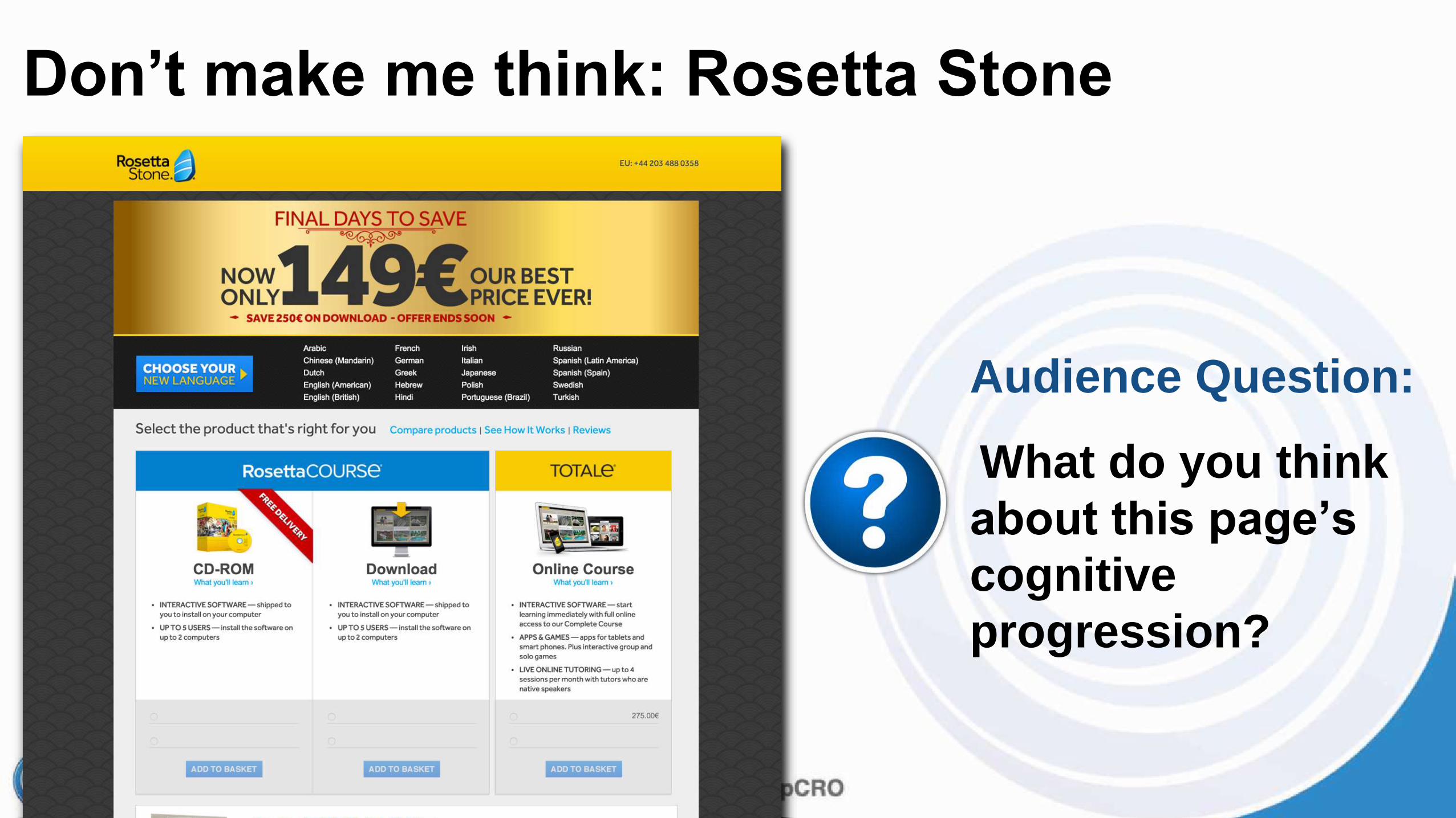
Audience Question:
What do you think
about this
subscription flow?
Audience Question:
What do you think
about this page’s
cognitive
progression?
Don’t make me think: Rosetta Stone
1. By anticipating a visitor clicks, what they will do next, and how they will view
your page, you can have stronger and greater continuity on the page.
Continuity
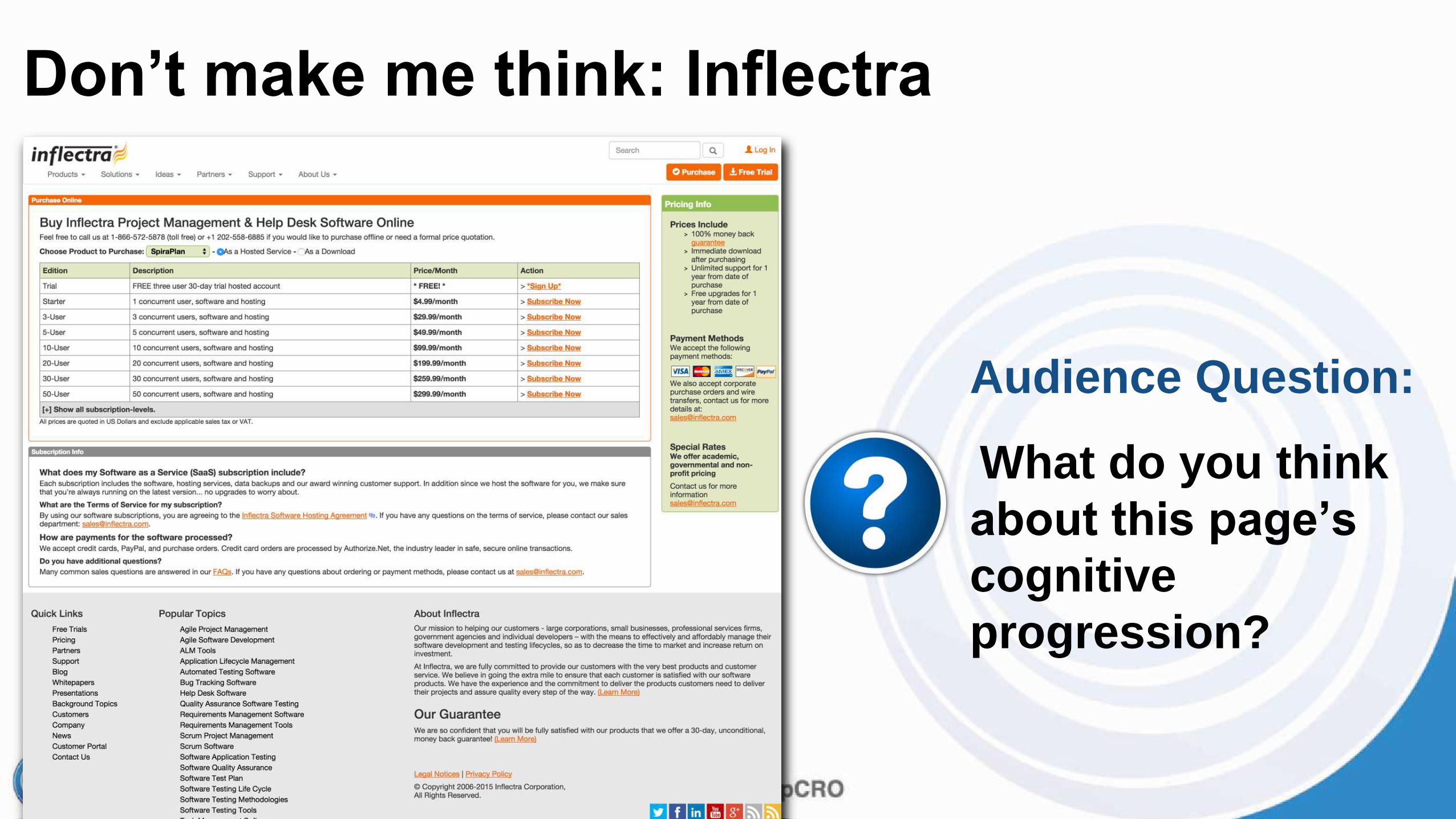
Don’t make me think: Inflectra
Audience Question:
What do you think
about this page’s
cognitive
progression?
1. Use visual indicators to help visitors know where they is in the process and the different steps they have
to go through.
2. Incorporate benefits using copy and design to support buyer momentum on the page and in the purchase
process.
3. Design your pages and funnel to support the visitors’ cognitive progression
4. Reduce noise and clutter on the page by removing elements that cause unnecessary fears, uncertainties,
and doubts
5. Think of the actual progression a visitor has to go through to convert• Credibility & trust
• Value
• Investment
• Price point
6. By anticipating a visitor clicks, what they will do next, and how they will view your page, you can have
stronger and greater continuity on the page.
Summary

Looking to increase your conversions?The Conversion Framework™ successfully used in 3,000+ Test plans , 400+
partners, 11 different countries generating repeatable and sustainable increase
in conversion rates.
• Learn more how we can work
together:
• Select “Partnership Opportunities to
Increase Conversion Rates” on
webinar survey
• or email [email protected]
Special offer: 10 companies get to test the software!
One lucky company gets help from Invesp designing the test
Send an email to [email protected]
More information
Amazon.com


![Optimizing Landing Pages Webinar Slides Hub Spot[1]](https://img.pdfslide.us/doc/110x75/54475006b1af9f0b098b4622/optimizing-landing-pages-webinar-slides-hub-spot1.jpg)