Embed Size (px)
Citation preview

Making of the AdvertisementPart One
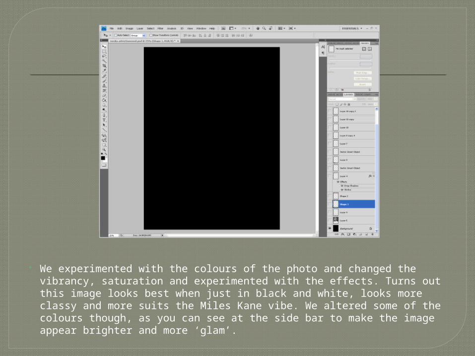
We experimented with the colours of the photo and changed the vibrancy, saturation and experimented with the effects. Turns out this image looks best when just in black and white, looks more classy and more suits the Miles Kane vibe. We altered some of the colours though, as you can see at the side bar to make the image appear brighter and more ‘glam’.
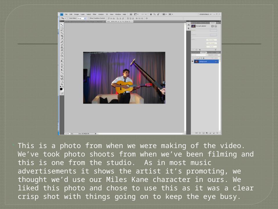
This is a photo from when we were making of the video. We’ve took photo shoots from when we’ve been filming and this is one from the studio. As in most music advertisements it shows the artist it’s promoting, we thought we’d use our Miles Kane character in ours. We liked this photo and chose to use this as it was a clear crisp shot with things going on to keep the eye busy.
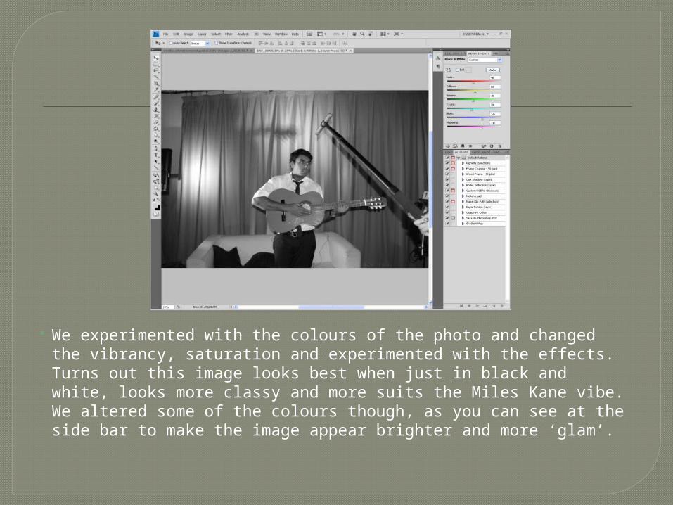
We experimented with the colours of the photo and changed the vibrancy, saturation and experimented with the effects. Turns out this image looks best when just in black and white, looks more classy and more suits the Miles Kane vibe. We altered some of the colours though, as you can see at the side bar to make the image appear brighter and more ‘glam’.
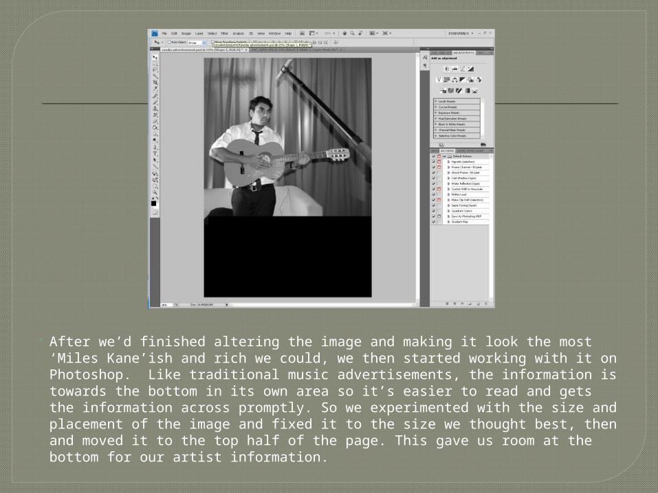
After we’d finished altering the image and making it look the most ‘Miles Kane’ish and rich we could, we then started working with it on Photoshop. Like traditional music advertisements, the information is towards the bottom in its own area so it’s easier to read and gets the information across promptly. So we experimented with the size and placement of the image and fixed it to the size we thought best, then and moved it to the top half of the page. This gave us room at the bottom for our artist information.