Embed Size (px)
Citation preview

(PLUS SIX QUICK-HITTING TIPS TO IMPROVE YOUR SITE DESIGN)

2
LEARNING FROM THE BEST. You never get a second chance to make a first impression. That’s
why your homepage is undoubtedly one of the most important
pages on your website.
If a company homepage is its virtual front door, what happens if the
door is off its hinges? With an average attention span of 8 seconds
online, a new visitor needs a simple, compelling reason to stick
around. If your site doesn’t immediately connect with them, or they
don’t know what to do on your page, their knee-jerk reaction is to hit
the back button and just leave.
Don’t let that happen. If you are considering re-vamping your
website – or just want to see great design – check out these 53
examples of homepages to inspire your own site redesign, each of
which does something worth learning.
SHARE COLLECTION

3
LEARNING FROM THE BEST
Current Section Title
THE PROS GRAPHIC DESIGN EXAMPLES
THE BRANDS RETAIL EXAMPLES
THE ENTERTAINERS CELEBRITY AND MEDIA EXAMPLES
THE TECHIES IT EXAMPLES
THE PROVIDERS PROFESSIONAL SERVICE EXAMPLES
WHAT COMES NEXT?
2
2
16
27
37
46
55
69
4 THE SALESMEN ECOMMERCE EXAMPLES
(CLICK ON A TAB TO JUMP TO YOUR INDUSTRY)

4
THE
SALESMEN. ECOMMERCE HOMEPAGE
EXAMPLES
SHARE COLLECTION
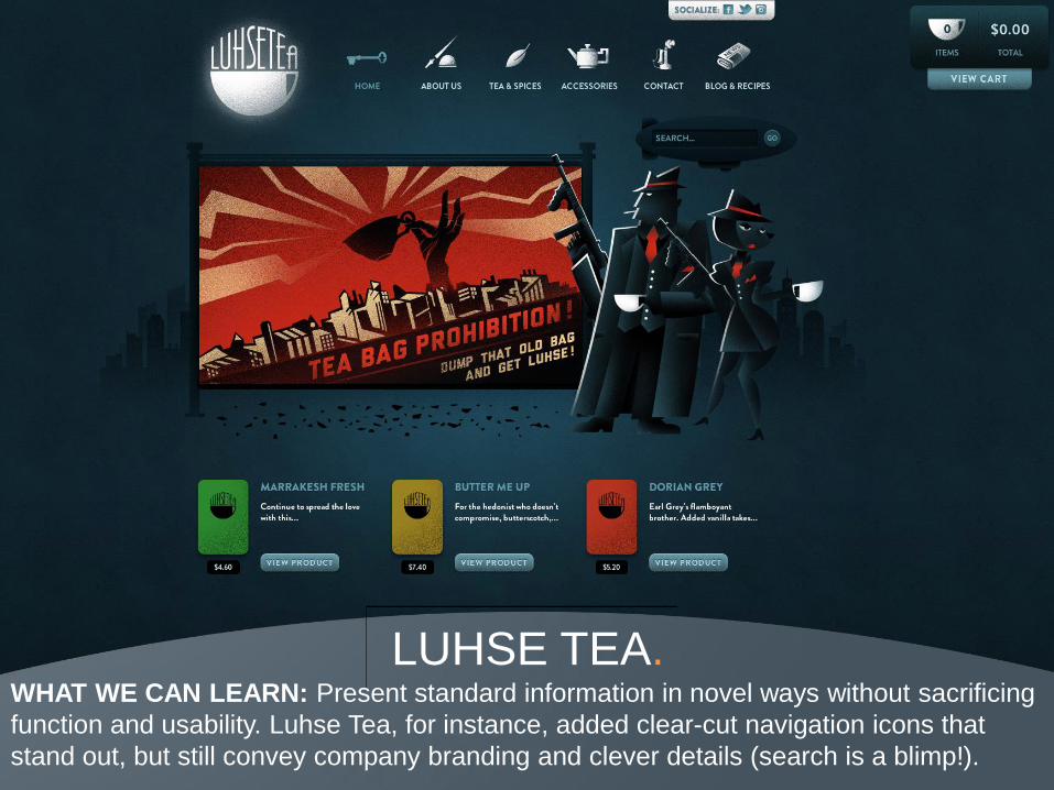
LUHSE TEA. WHAT WE CAN LEARN: Present standard information in novel ways without sacrificing
function and usability. Luhse Tea, for instance, added clear-cut navigation icons that
stand out, but still convey company branding and clever details (search is a blimp!).
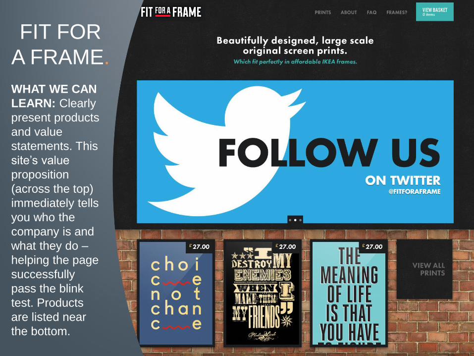
FIT FOR
A FRAME.
WHAT WE CAN
LEARN: Clearly
present products
and value
statements. This
site’s value
proposition
(across the top)
immediately tells
you who the
company is and
what they do –
helping the page
successfully
pass the blink
test. Products
are listed near
the bottom.

SURF RIGHT.
WHAT WE CAN LEARN: Easy navigation and beautiful design can (and should) work
together. An interactive slider and a well-organized set of tiles make this website easy to
surf (pun sadly intended).

SHOP LOCKET. WHAT WE CAN LEARN: Simplicity trumps complexity. Shop Locket presents a simple
yet charming design. Its Facebook Connect and the “Try it” buttons are both clearly
visible and the rest of the site doesn’t distract visitors from taking those actions.

EVEL. WHAT WE CAN LEARN: Grids and columns help guide the eye. This site handles six
different content blocks in a coherent, well-balanced manner. Contrary to the previous
site, there are many calls-to-action. It’s therefore paramount to package them neatly.
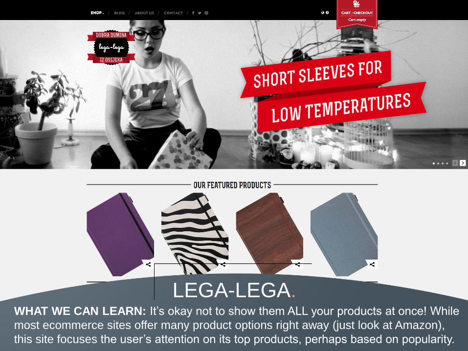
LEGA-LEGA. WHAT WE CAN LEARN: It’s okay not to show them ALL your products at once! While
most ecommerce sites offer many product options right away (just look at Amazon),
this site focuses the user’s attention on its top products, perhaps based on popularity.

URBAN ORIGINALS. WHAT WE CAN LEARN: This is a clean and effective homepage design. The vibrant
background and a simple navigation clearly lead to important product pages.

FANNABEE. WHAT WE CAN LEARN: This website uses parallax scrolling to deliver a unique user
experience. Reaching out to “true fans” on the banner also subtly conveys exclusivity,
compelling the audience to click their call-to-action (CTA) button and see what’s behind
the velvet rope.

UNCRATE. WHAT WE CAN LEARN: Uncrate maintains a single strong aesthetic despite multiple
navigation levels. Even with multiple conversion paths, it focuses on one key product.

SCOTCH
& SODA. WHAT WE CAN
LEARN: The tiled
look of this
homepage
showcases
different areas of
the website while
branded social
icons make the
content easy to
share. The “Latest
Posts” tab offers
viewers more
content if they are
interested in delving
further into the
Scotch and Soda
experience.

15
DESIGN TIP 1
Simplify Your Language. Marketers often change the way they talk online and use
“marketer speak” such as “Buy NOW” rather than a normal
conversational tone. According to MarketingSherpa, clarity
trumps persuasion when writing for the web.
Don’t waste valuable online real estate trying to be clever.
Instead, use your site copy to convey your company message
in a clear, concise manner. For great examples of succinct
copy, look at Galpin, Austin Beerworks and Ride for the Brand.

16
THE PROS. GRAPHIC DESIGN
HOMEPAGE EXAMPLES
SHARE COLLECTION

JIB. WHAT WE CAN LEARN: Great use of a simple illustration, an excellent complimentary
color palate, crystal clear copy and a single call to action all combine to make this
website one of our favorites.

HELLO MONDAY. WHAT WE CAN LEARN: This unique design won the AWWWards for Site Of The Year
and focuses on the page’s overall look. The minimal copy works for this design firm
because their competitive advantage is best conveyed visually, but other industries may
need to include a clearer company value proposition on the homepage.
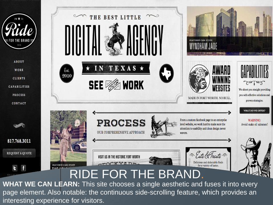
RIDE FOR THE BRAND. WHAT WE CAN LEARN: This site chooses a single aesthetic and fuses it into every
page element. Also notable: the continuous side-scrolling feature, which provides an
interesting experience for visitors.

ANDY PATRICK DESIGN. WHAT WE CAN LEARN: This site uses rare elements including a single accent color
and a “matching” off-white (check out the orange undertone). It also incorporates
excellent iconography and typography for a simple but “slick” web design.

THIS IS
THE
BRIGADE.
WHAT WE CAN
LEARN: This
homepage
succeeds by
including a large
banner to
convey exactly
who the
company is, plus
segmented
sections to break
up the content.

GALPIN.
WHAT WE CAN
LEARN: The
Galpin page
uses
typography to
showcase its
character.
Notice that the
page focuses
less on
graphics, and
instead uses
text to convey
its messaging.

MADE BY VADIM. WHAT WE CAN LEARN: The Vadim site is concise and to the point. Its navigation and
CTAs are both clearly-defined, so the visitor knows exactly where to go next.

ART & CODE. WHAT WE CAN LEARN: Sometimes, less is better. The use of non-traditional icons and
a balanced layout give the Art & Code website a clean, attractive look.

RILEY
CRAN.
WHAT WE CAN
LEARN: Here we
see another
appealing tile-
based website
design. Setting
Riley Cran apart
is the fact that
the entire site is
set within a
single page - no
scrolling
necessary!

26
DESIGN TIP 2
Simplify Your Layout. A clean design is just as important as clear copy. Your site
layout should boost the overall online experience, not distract
from the website’s goals. Even if they’re visually appealing, site
elements that confuse your visitor ultimately reduce the overall
effectiveness of your website.
Avoid common errors such as awkward page hierarchy, non-
existent navigation or anything that creates “friction” on your
page. Check out Shop Locket, Urban Originals and Madwell for
simple designs that still convey a strong message.

27
THE BRANDS. RETAIL COMPANY
HOMEPAGE EXAMPLES
SHARE COLLECTION

REI. WHAT WE CAN LEARN: This REI homepage takes an interesting spin on user-
submitted content by displaying photos in a tile-based layout. It also incorporates
scrollable, interactive elements on the images, further enhancing the visitor’s on-site
experience.

AUSTIN BEERWORKS. WHAT WE CAN LEARN: This site clearly conveys the main goals of a page – telling the
visitor who the company is, and what they do. The clean, white background coupled with
high resolution product images highlight the most important part of the page: the beer!

JAQUET DROZ. WHAT WE CAN LEARN: The Jaquet Droz page relies on one workhorse visual. The
rich, high resolution image draws visitors to the product - clearly the most important
feature on this page.

ITALIO KITCHEN. WHAT WE CAN LEARN: It isn’t often that restaurants focus on homepage design, but
this site did it right. It includes a large, attractive slideshow across the top of the page and
follows that up with more images of delicious food!

GREY GOOSE. WHAT WE CAN LEARN: A homepage should showcase the personality and aesthetic
of a brand. For Grey Goose, it’s about elegant, high resolution images and a polished
layout. Mission: accomplished.

TOYOTA. WHAT WE CAN LEARN: Toyota created a Pinterest-like website for Camry lovers. The
site’s eclectic visual presentation uniquely targets a wide array of potential car buyers.
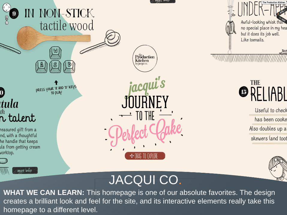
JACQUI CO. WHAT WE CAN LEARN: This homepage is one of our absolute favorites. The design
creates a brilliant look and feel for the site, and its interactive elements really take this
homepage to a different level.
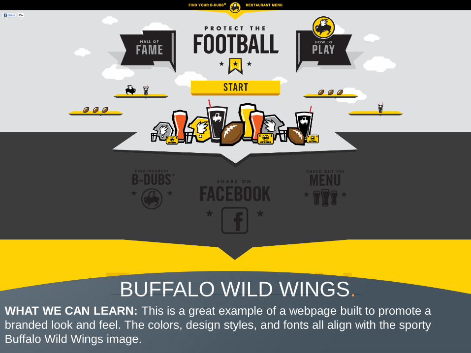
BUFFALO WILD WINGS. WHAT WE CAN LEARN: This is a great example of a webpage built to promote a
branded look and feel. The colors, design styles, and fonts all align with the sporty
Buffalo Wild Wings image.
36
DESIGN TIP 3
Create a Brand Experience.
Your webpage should reflect your company personality.
What’s the best way to reinforce your company branding?
Create a single, unified aesthetic for your website and make
sure every page element supports that experience. In this
collection, you can find great examples of branded design from
Surf Right, Uncrate and Grey Goose.

37
THE
ENTERTAINERS. CELEBRITY AND MEDIA
HOMEPAGE EXAMPLES
SHARE COLLECTION
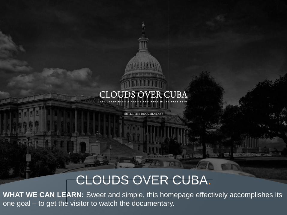
CLOUDS OVER CUBA. WHAT WE CAN LEARN: Sweet and simple, this homepage effectively accomplishes its
one goal – to get the visitor to watch the documentary.

POTTERMORE. WHAT WE CAN LEARN: Here Sony conveys both the look and feel of the Harry Potter
franchise. They then use familiar imagery and interactive elements on the site to further
engage the visitor.

HEATH LIFE. WHAT WE CAN LEARN: This site presents multiple interactive and visual elements
(e.g., icons and a Google Maps integration) without being overwhelming. Not only does
it look great; it’s helpful too!

MAGIC LEAP. WHAT WE CAN LEARN: Despite Magic Leap’s apparent simplicity, this page presents
vivid images and well-designed typography that draw visitors into this website.
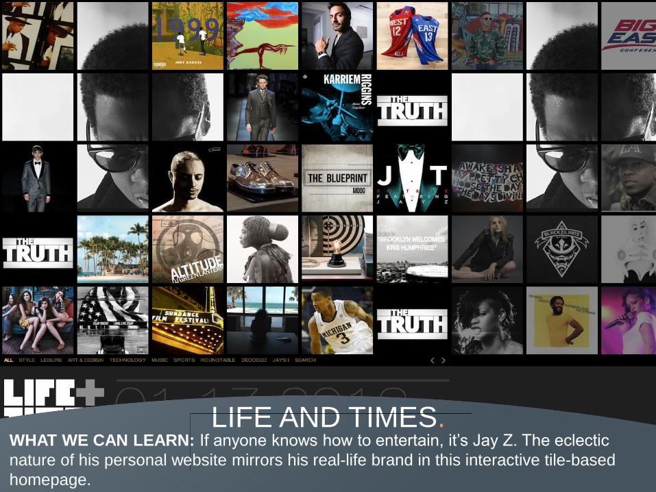
LIFE AND TIMES. WHAT WE CAN LEARN: If anyone knows how to entertain, it’s Jay Z. The eclectic
nature of his personal website mirrors his real-life brand in this interactive tile-based
homepage.

TV SAFETY. WHAT WE CAN LEARN: The animation-style visuals on this page work as a
counterbalance to the serious nature of this message, presenting important information
on TV safety in an approachable manner.

IMPRESS A PENGUIN. WHAT WE CAN LEARN: Graphically, this website feels like a storybook, attracting
attention by coupling interesting graphics and smart text. While this minimalism will work
for some audiences, carefully consider your market before eliminating a clear value
proposition that explains what your company does.

45
DESIGN TIP 4
Get Creative.
Good design is a terrific way to set your company apart from
the other 633 billion websites in the world. Experiment with
creative ways to present standard information without
sacrificing function or usability. Luhse Tea, Art & Code and
Sagmeister Walsh are all great examples of non-traditional
designs that elevate their company pages.
46
THE TECHIES. IT HOMEPAGE
EXAMPLES
SHARE COLLECTION

REZDY. WHAT WE CAN LEARN: Rezdy’s use of visual elements such as icons and arrows
allow the company to clearly explain the purpose of its product without having to rely on
heavy copy.

VIDDY. WHAT WE CAN LEARN: Viddy effectively presents a clear value proposition and a
strong call to action, which combine to direct visitors through its site registration process.

COLLABORATE. WHAT WE CAN LEARN: The layout of this website effectively handles several different
user stories by presenting three different CTAs without having them compete with one
another.

PREZI. WHAT WE CAN LEARN: This page sets up a clear information hierarchy and thought
sequence. Everything that you need to know is provided in a few pixels via a video,
company tagline and clear CTA. The video is also a smart addition if Prezi’s target
audience will want deeper information.

FUNCTION POINT. WHAT WE CAN LEARN: Function Point’s website maintains a consistent look and feel
across all of its design elements. The site’s illustration, style and choice of colors also
help enhance the design and build a visual hierarchy.
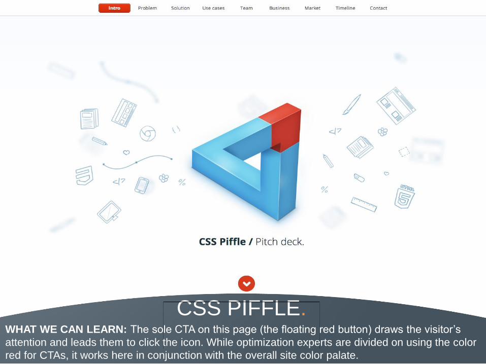
CSS PIFFLE. WHAT WE CAN LEARN: The sole CTA on this page (the floating red button) draws the visitor’s
attention and leads them to click the icon. While optimization experts are divided on using the color
red for CTAs, it works here in conjunction with the overall site color palate.

URBAN BOUND. WHAT WE CAN LEARN: Putting the CTA front and center, as Urban Bound does here,
is another great example of a web design focuses its most important information in the
center of the page.
54
DESIGN TIP 5
Optimize for the User.
Every part of your website should be designed for the person at
the other end of your screen – your visitor. There are a number
of design tools you can employ to accomplish this, including
grid layouts (check out Scotch and Soda), arrows and icons to
guide the viewer’s eye path (which Rezdy does well), and
interactive elements to engage the reader (just like REI).
55
THE
PROVIDERS. PROFESSIONAL
SERVICE FIRM
HOMEPAGE EXAMPLES
SHARE COLLECTION

WHO IS WILDLIFE. WHAT WE CAN LEARN: This site focuses almost entirely on its branding. Both the strong, visually
unique image and the non-traditional CTA copy match the site aesthetic. One slight improvement
we might suggest: Clarify for the visitor what “getting wild” will actually get them.

SILKTRICKY. WHAT WE CAN LEARN: Another example of content organized into visual tiles is
Silktricky. Notice the use of a carrot visual element (the white triangle in the text boxes) to
unobtrusively connect the site’s text and visuals for the reader.

SAGMEISTER WALSH. WHAT WE CAN LEARN: This page offers a truly unique way to address site navigation.
Called augmented reality, each element on the floor can be clicked to advance the reader
through the site, a visual that definitely sets it apart.
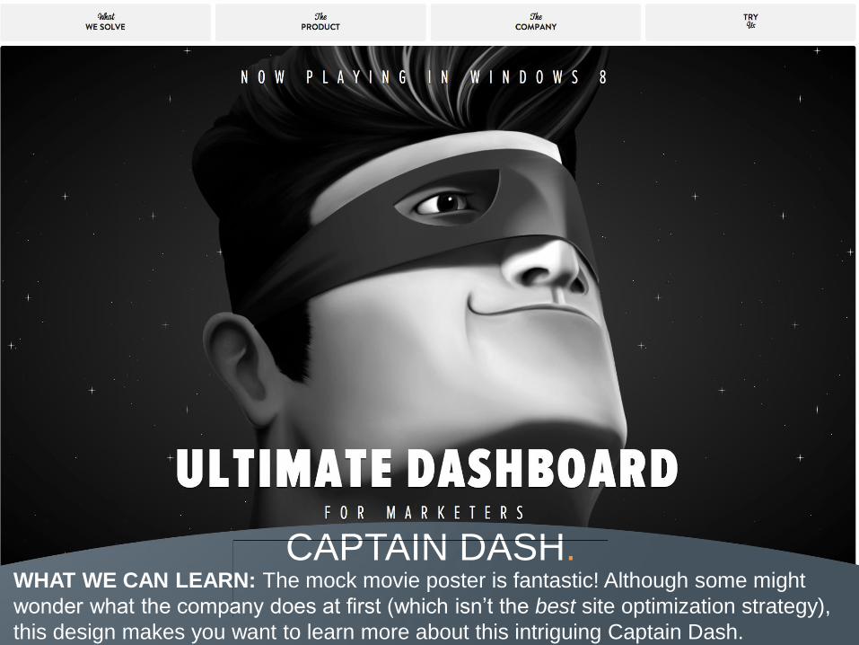
CAPTAIN DASH. WHAT WE CAN LEARN: The mock movie poster is fantastic! Although some might
wonder what the company does at first (which isn’t the best site optimization strategy),
this design makes you want to learn more about this intriguing Captain Dash.

MADWELL NYC. WHAT WE CAN LEARN: Using excellent graphic and design work, Madwell presents a
clean homepage experience that simply, yet effectively, showcases the quality of the
company’s portfolio.

WOODWORK. WHAT WE CAN LEARN: Despite the potentially overwhelming visuals on this page,
clear navigation and layout (shown here) ensures that the user isn’t overwhelmed.

RYAN EDY. WHAT WE CAN LEARN: As a professional photography website, the design plays well
into what its visitors expect: A stunning image. The site also offers simple navigation and
showcases a series of pictures to let the visitor see more work.
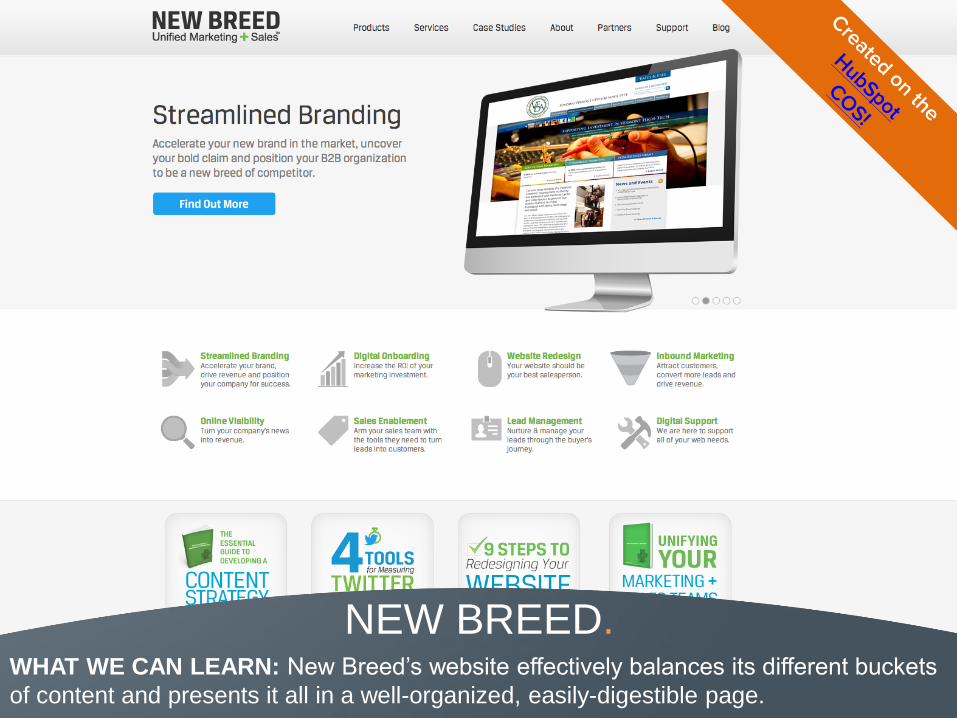
NEW BREED. WHAT WE CAN LEARN: New Breed’s website effectively balances its different buckets
of content and presents it all in a well-organized, easily-digestible page.
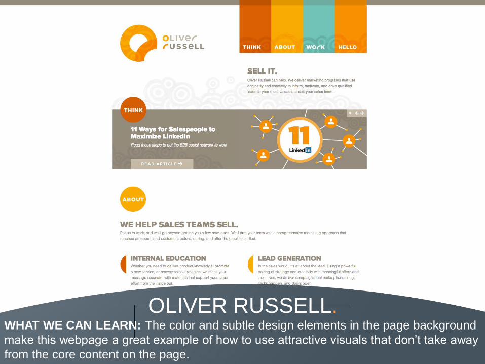
OLIVER RUSSELL. WHAT WE CAN LEARN: The color and subtle design elements in the page background
make this webpage a great example of how to use attractive visuals that don’t take away
from the core content on the page.

QUARTER REST STUDIOS. WHAT WE CAN LEARN: This homepage is essentially one large slideshow paired with
a simple top navigation. It gives the visitor a limited, but useful set of options –
presumably ideal for the magazine’s visual-based target market.

FANCY RHINO. WHAT WE CAN LEARN: Here’s another website that showcases their company with an
embedded video on the homepage. The navigation and sidebar are simple enough to
stand out, while not detracting from the video – clearly the primary goal of the page.
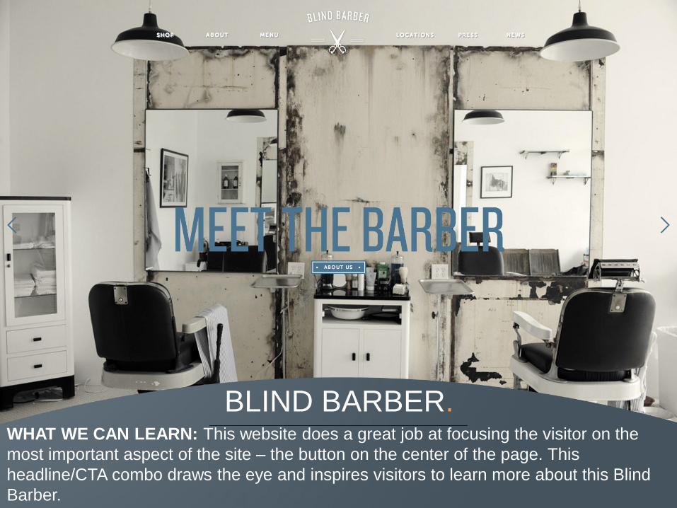
BLIND BARBER. WHAT WE CAN LEARN: This website does a great job at focusing the visitor on the
most important aspect of the site – the button on the center of the page. This
headline/CTA combo draws the eye and inspires visitors to learn more about this Blind
Barber.

68
DESIGN TIP 6
Step Back.
Once you finish your site design, take a final step back. Does
your website pass the blink test? In three to five seconds, can
someone look at your page and know: who your company is,
what you do, and what you want the visitor to do on the page?
If not, revisit both your copy and design to highlight those
important messages. Want to check out some blink test
winners? Click to Jib, TV Safety and Italian Kitchen.
69
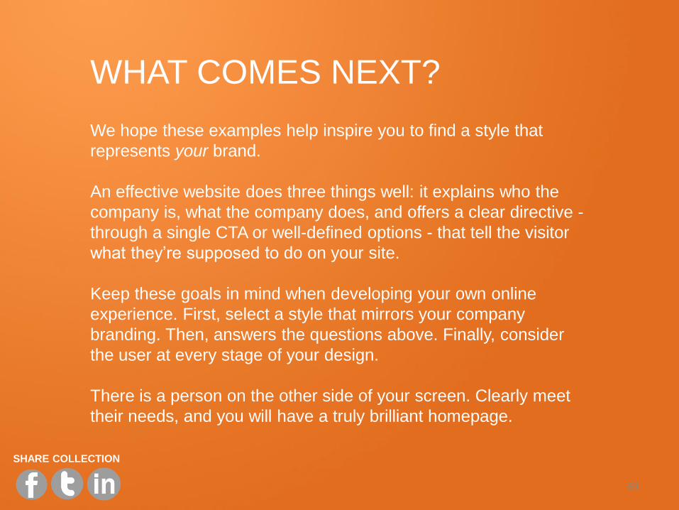
WHAT COMES NEXT? We hope these examples help inspire you to find a style that
represents your brand.
An effective website does three things well: it explains who the
company is, what the company does, and offers a clear directive -
through a single CTA or well-defined options - that tell the visitor
what they’re supposed to do on your site.
Keep these goals in mind when developing your own online
experience. First, select a style that mirrors your company
branding. Then, answers the questions above. Finally, consider
the user at every stage of your design.
There is a person on the other side of your screen. Clearly meet
their needs, and you will have a truly brilliant homepage.
SHARE COLLECTION
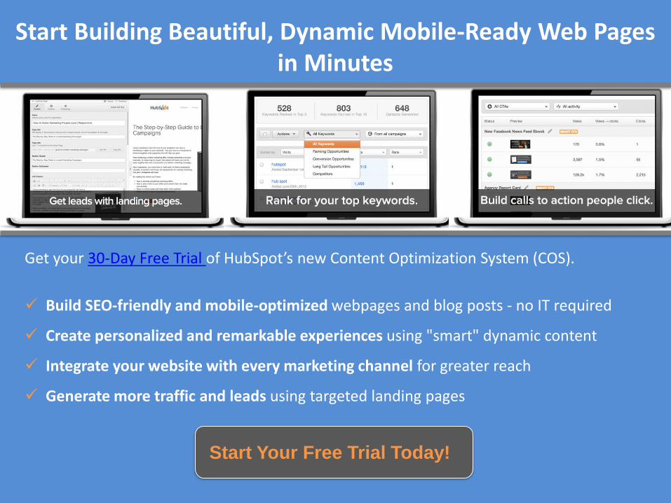
Get your 30-Day Free Trial of HubSpot’s new Content Optimization System (COS).
Build SEO-friendly and mobile-optimized webpages and blog posts - no IT required
Create personalized and remarkable experiences using "smart" dynamic content
Integrate your website with every marketing channel for greater reach
Generate more traffic and leads using targeted landing pages
Start Building Beautiful, Dynamic Mobile-Ready Web Pages in Minutes
Start Your Free Trial Today!


![[Hub spot] How to use online video for marketing](https://img.pdfslide.us/doc/110x75/554c18b3b4c905f1518b4fbb/hub-spot-how-to-use-online-video-for-marketing.jpg)


![[Hub spot] how to create 5 fabulous infographics in powerpoint](https://img.pdfslide.us/doc/110x75/54c711224a7959cb538b45de/hub-spot-how-to-create-5-fabulous-infographics-in-powerpoint.jpg)
