Embed Size (px)
Citation preview

Forecasting lessons
from FMCG aisles SAPICS 2015
Practical lessons across products and customer channels in
the FMCG and QSR industry.
Thinus Hermann
6/1/2015
ForecastinglessonsfromFMCGaisles
Table of Contents 1. INTRODUCTION ............................................................................................................................... 3
2. BENCHMARKING ............................................................................................................................. 3
3. MONTHLY FORECASTING ................................................................................................................ 5
3.1 How to forecast a typical FMCG product ...................................................................................... 5
Forecasting with averages .............................................................................................................. 5
Data cleansing, the impact of exceptional points ........................................................................... 7
Christmas ........................................................................................................................................ 9
Monthly indexes ........................................................................................................................... 10
Indexes for the Easter weekend ................................................................................................... 12
3.2 Key lessons from the aisles ......................................................................................................... 14
3.2.1 Wheat and maize ................................................................................................................. 14
3.2.2 More examples .................................................................................................................... 15
Events in the year .......................................................................................................................... 16
4. DAILY FORECASTING ..................................................................................................................... 17
4.1 Bread ........................................................................................................................................... 17
4.2 Milk ............................................................................................................................................. 18
4.3 Maize: daily trends? .................................................................................................................... 18
5. WEEKLY FORECATING ................................................................................................................... 19
5.1 When do we use weekly forecasting? ........................................................................................ 19
5.2 Calendars in weekly forecasting ................................................................................................. 20
5.3 Weekly trends in our trade visit .................................................................................................. 21
5.3.1 The quick service (QSR) industry .......................................................................................... 22
5.3.2 Bread .................................................................................................................................... 23
3.3.3 Fresh cream .......................................................................................................................... 23
3.3.4 Fruit juice ............................................................................................................................. 24
3.3.5 Pre packed cheese ............................................................................................................... 24
3.3.6 Water ................................................................................................................................... 25
5.4 Fruit juice: The promotions lesson.............................................................................................. 25
5.5 Beware of 4-4-5 weeks ............................................................................................................... 27
5.6 Mixing apples and pears lesson .................................................................................................. 27

6. SUMMARY AND CONCLUSIONS .................................................................................................... 29
Summary 1: The product view .......................................................................................................... 29
Summary : The channel view ............................................................................................................ 31
ABOUT THE AUTHOR ............................................................................................................................. 32
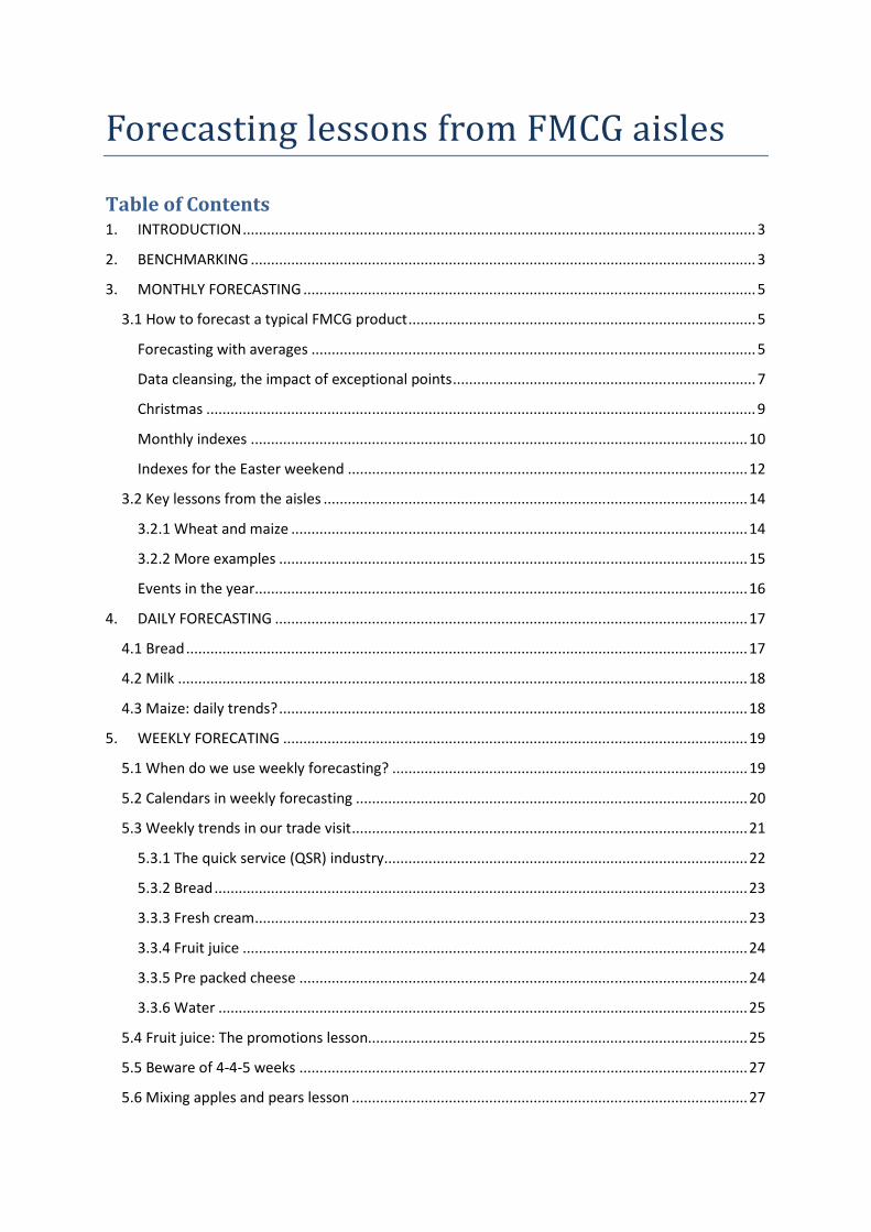
INTRODUCTION
This paper is titled Forecasting lessons from FMCG aisles. It draws out forecasting lessons from
various FMCG products through taking a virtual walk through a typical trade space. It also identifies
learnings from author of the white paper, Thinus Herman’s 25 years of forecasting for products in
every aisle of the typical retail store, translating this into forecasting techniques and the principals of
when and how to apply them.
Please note that the data cited herein is actual historical data and thereby presents real scenarios.
However the sources thereof have not been published (and in some instances the order of
magnitude was adjusted) in order to protect confidentiality of intellectual property.
1. BENCHMARKING
Is forecast accuracy dependent on the type of product? In other words, will dairy companies achieve
similar forecast accuracies and would they achieve better or worse forecast accuracies than a
company that is selling chicken?
A technique often used in Excel is to take the average sales and standard deviation (Stdev.) of the
sales to calculate the volatility of the sales of the product. This technique can be best explained by
this simple example (Figure 1: Volatility example):
I. Both of the products sell an average of
approximately 100 units.
II. Stdev/Average is utilised as an
indication of volatility.
III. The sales volatility of product 1 is 33%.
IV. The sales volatility of product 2 is 3%.
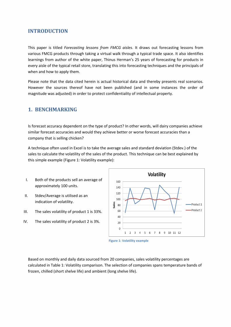
Based on monthly and daily data sourced from 20 companies, sales volatility percentages are
calculated in Table 1: Volatility comparison. The selection of companies spans temperature bands of
frozen, chilled (short shelve life) and ambient (long shelve life).
Figure 1: Volatility example
.
Conclusions:
The monthly volatilities are all almost the same across all products and in the order of magnitude of
30%. What does this mean? It looks like we can benchmark all companies against each other and
that all have a similar change for achieving good forecast accuracies.
However, this is NOT true. So what drives different behaviour in these products? Why can we
achieve 95% accuracies in some of these and battle to forecast others more accurately than 70%?
PS: We will discuss the daily volatility a little later in this document. Here it is sufficient to note that
the daily volatility are higher than the monthly.
Table 1: Volatility comparison
2. MONTHLY FORECASTING
3.1 How to forecast a typical FMCG product
In order for us to compare the forecasting accuracies across products, we must first spend a bit of
time in the basic theory to ensure we understand the principals behind statistical forecasting.
To make a statistical forecast of the future sales of a product, requires that we derive a model or
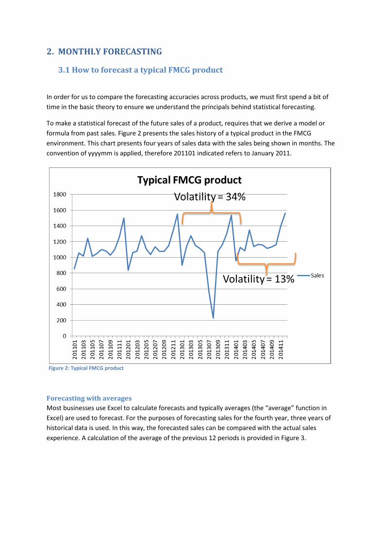
formula from past sales. Figure 2 presents the sales history of a typical product in the FMCG
environment. This chart presents four years of sales data with the sales being shown in months. The
convention of yyyymm is applied, therefore 201101 indicated refers to January 2011.
Forecasting with averages
Most businesses use Excel to calculate forecasts and typically averages (the “average” function in
Excel) are used to forecast. For the purposes of forecasting sales for the fourth year, three years of
historical data is used. In this way, the forecasted sales can be compared with the actual sales
experience. A calculation of the average of the previous 12 periods is provided in Figure 3.
Figure 2: Typical FMCG product
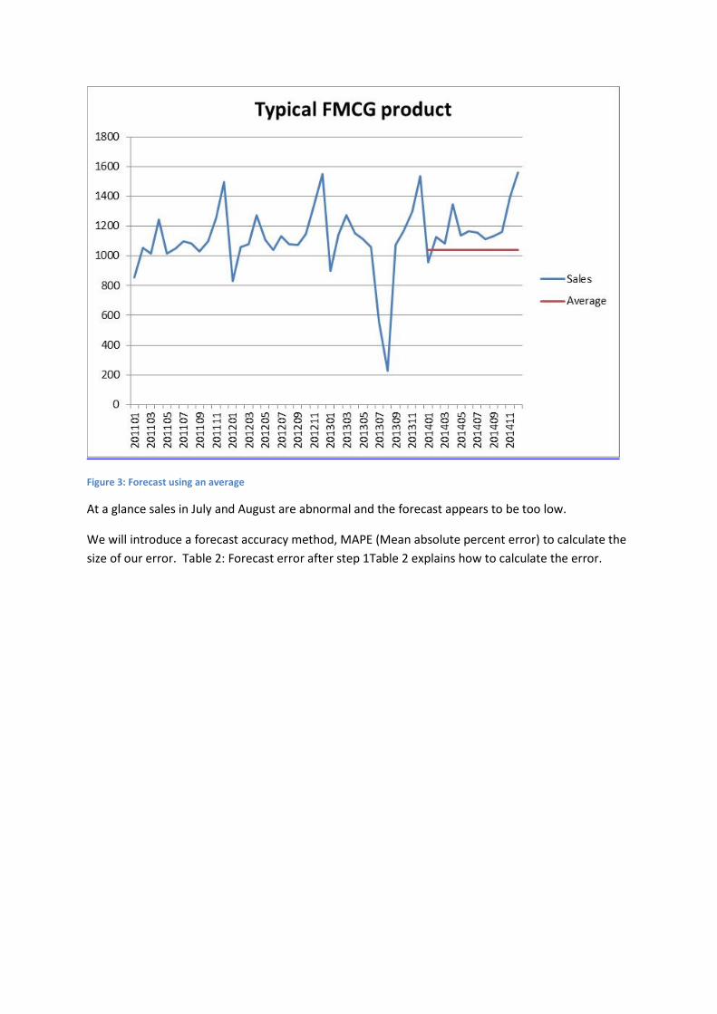
Figure 3: Forecast using an average
At a glance sales in July and August are abnormal and the forecast appears to be too low.
We will introduce a forecast accuracy method, MAPE (Mean absolute percent error) to calculate the
size of our error. Table 2: Forecast error after step 1Table 2 explains how to calculate the error.
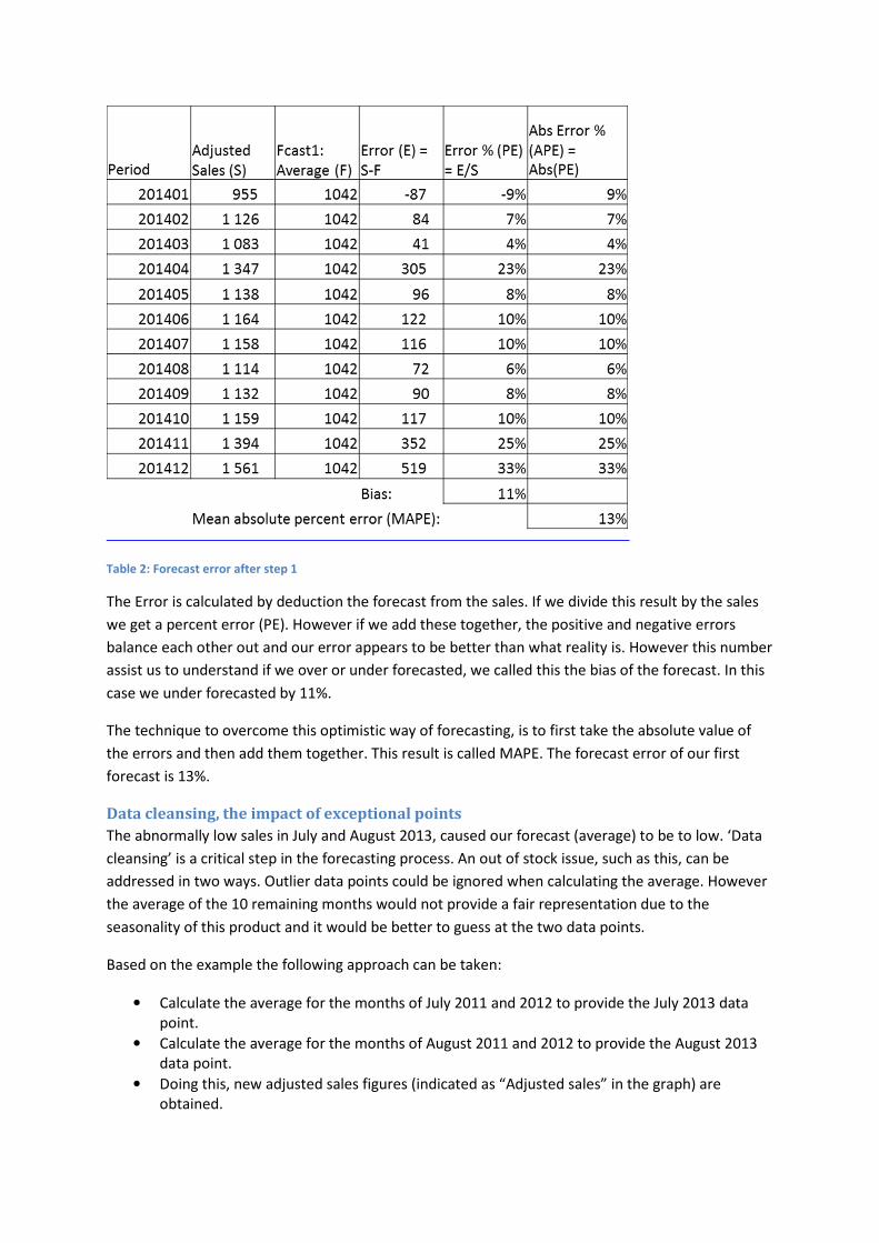
Table 2: Forecast error after step 1
The Error is calculated by deduction the forecast from the sales. If we divide this result by the sales
we get a percent error (PE). However if we add these together, the positive and negative errors
balance each other out and our error appears to be better than what reality is. However this number
assist us to understand if we over or under forecasted, we called this the bias of the forecast. In this
case we under forecasted by 11%.
The technique to overcome this optimistic way of forecasting, is to first take the absolute value of
the errors and then add them together. This result is called MAPE. The forecast error of our first
forecast is 13%.
Data cleansing, the impact of exceptional points
The abnormally low sales in July and August 2013, caused our forecast (average) to be to low. ‘Data
cleansing’ is a critical step in the forecasting process. An out of stock issue, such as this, can be
addressed in two ways. Outlier data points could be ignored when calculating the average. However
the average of the 10 remaining months would not provide a fair representation due to the
seasonality of this product and it would be better to guess at the two data points.
Based on the example the following approach can be taken:
• Calculate the average for the months of July 2011 and 2012 to provide the July 2013 data
point.
• Calculate the average for the months of August 2011 and 2012 to provide the August 2013
data point.
• Doing this, new adjusted sales figures (indicated as “Adjusted sales” in the graph) are
obtained.
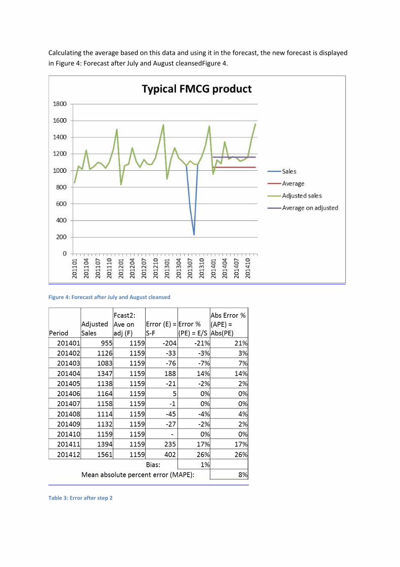
Calculating the average based on this data and using it in the forecast, the new forecast is displayed
in Figure 4: Forecast after July and August cleansedFigure 4.
Figure 4: Forecast after July and August cleansed
Table 3: Error after step 2
The result (see Table 2) is that we have 6 months of negative errors, 3 months of 0 errors and 3
months of positive errors. This is a much better spread of errors with a total bias 1%. It is also now
clear why the absolute value method is used because the positives and negatives almost completely
cancel each other out.
Importantly, our forecast error (MAPE) has improved from 13% to 8%. By looking at the percentage
errors by month it is clear that the error for December (26%) needs our attention next.
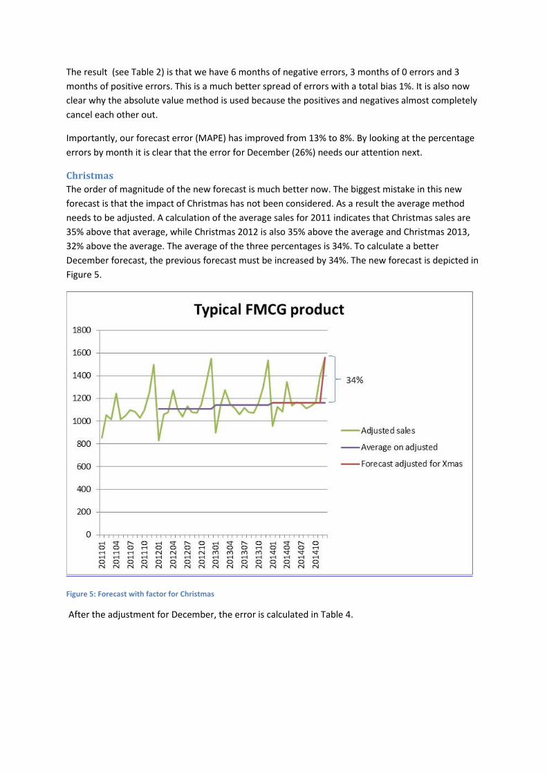
Christmas
The order of magnitude of the new forecast is much better now. The biggest mistake in this new
forecast is that the impact of Christmas has not been considered. As a result the average method
needs to be adjusted. A calculation of the average sales for 2011 indicates that Christmas sales are
35% above that average, while Christmas 2012 is also 35% above the average and Christmas 2013,
32% above the average. The average of the three percentages is 34%. To calculate a better
December forecast, the previous forecast must be increased by 34%. The new forecast is depicted in
Figure 5.
Figure 5: Forecast with factor for Christmas
After the adjustment for December, the error is calculated in Table 4.
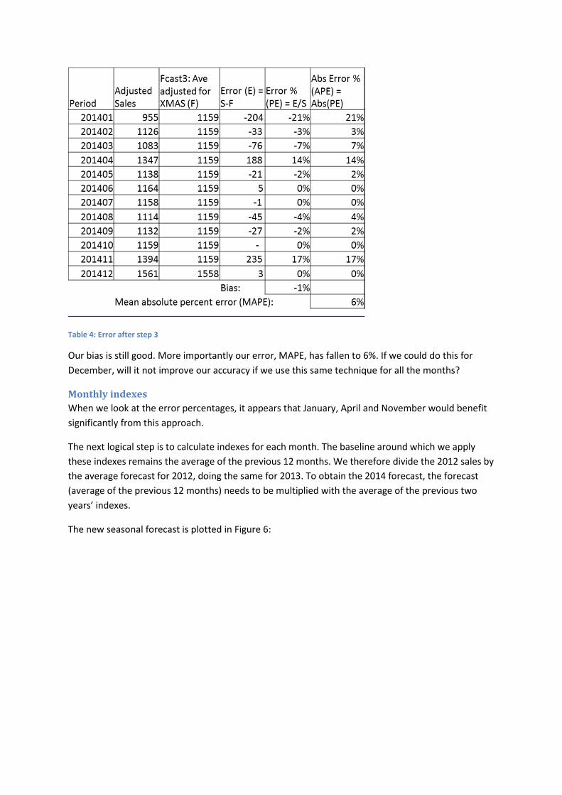
Table 4: Error after step 3
Our bias is still good. More importantly our error, MAPE, has fallen to 6%. If we could do this for
December, will it not improve our accuracy if we use this same technique for all the months?
Monthly indexes
When we look at the error percentages, it appears that January, April and November would benefit
significantly from this approach.
The next logical step is to calculate indexes for each month. The baseline around which we apply
these indexes remains the average of the previous 12 months. We therefore divide the 2012 sales by
the average forecast for 2012, doing the same for 2013. To obtain the 2014 forecast, the forecast
(average of the previous 12 months) needs to be multiplied with the average of the previous two
years’ indexes.
The new seasonal forecast is plotted in Figure 6:
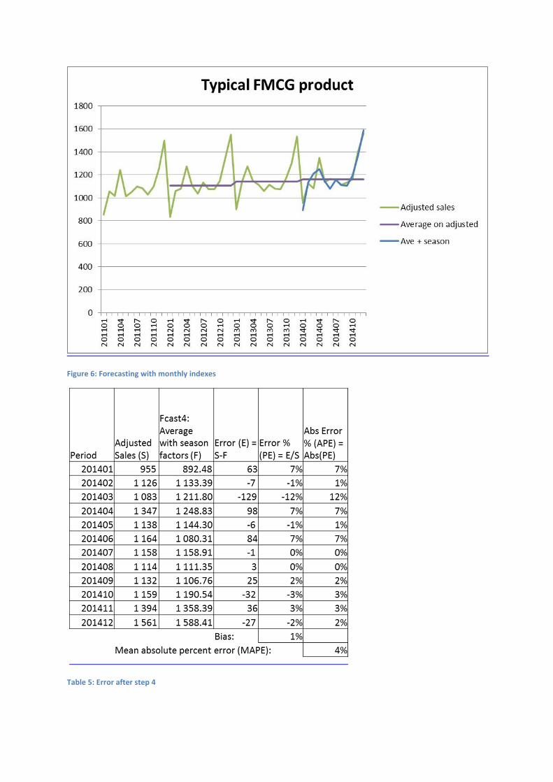
Figure 6: Forecasting with monthly indexes
Table 5: Error after step 4
Our error (MAPE) in Table 5: Error after step 4, has improved to 4%, an improvement of another 2%.
If we now look at the errors by month, the last opportunity for improvement is March and April.
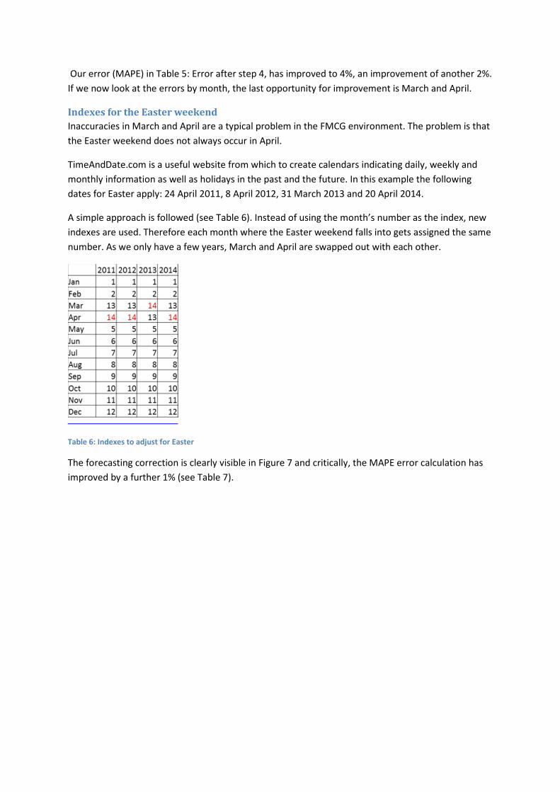
Indexes for the Easter weekend
Inaccuracies in March and April are a typical problem in the FMCG environment. The problem is that
the Easter weekend does not always occur in April.
TimeAndDate.com is a useful website from which to create calendars indicating daily, weekly and
monthly information as well as holidays in the past and the future. In this example the following
dates for Easter apply: 24 April 2011, 8 April 2012, 31 March 2013 and 20 April 2014.
A simple approach is followed (see Table 6). Instead of using the month’s number as the index, new
indexes are used. Therefore each month where the Easter weekend falls into gets assigned the same
number. As we only have a few years, March and April are swapped out with each other.
Table 6: Indexes to adjust for Easter
The forecasting correction is clearly visible in Figure 7 and critically, the MAPE error calculation has
improved by a further 1% (see Table 7).
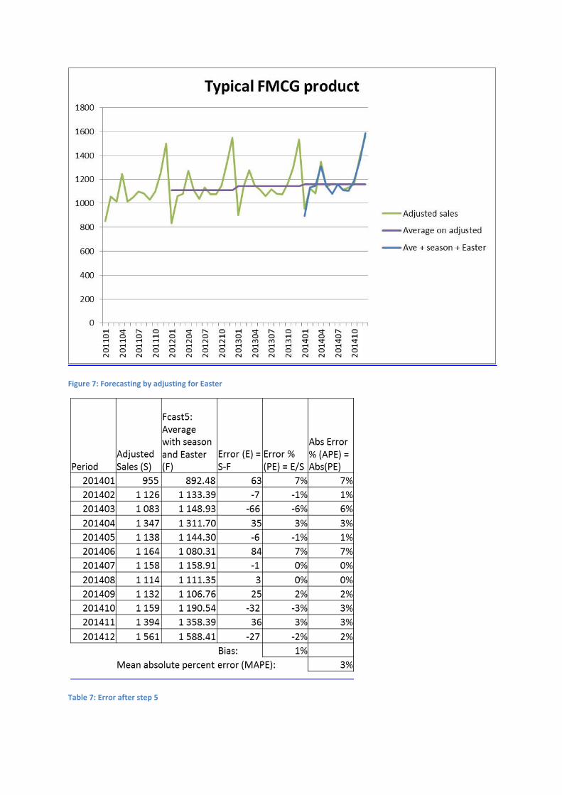
Figure 7: Forecasting by adjusting for Easter
Table 7: Error after step 5
3.2 Key lessons from the aisles
Three lessons can be learned from the above calculation progression:
– Replace the exceptional data points with more representative data points.
– Fit a straight line through the corrected history (in the above example we used
averages). For a more sophisticated method, fit a straight line with a slope through
the history to get a baseline.
– Use indexes for the corresponding months with an adjustment for Easter weekend
to assess seasonal trends.
We are ready to apply the above technique across different products in the aisles of a FMCG outlet
ain order to compare results and lessons between them.
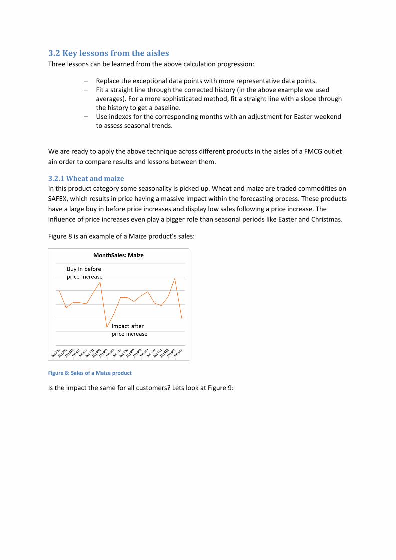
3.2.1 Wheat and maize
In this product category some seasonality is picked up. Wheat and maize are traded commodities on
SAFEX, which results in price having a massive impact within the forecasting process. These products
have a large buy in before price increases and display low sales following a price increase. The
influence of price increases even play a bigger role than seasonal periods like Easter and Christmas.
Figure 8 is an example of a Maize product’s sales:
Figure 8: Sales of a Maize product
Is the impact the same for all customers? Lets look at Figure 9:
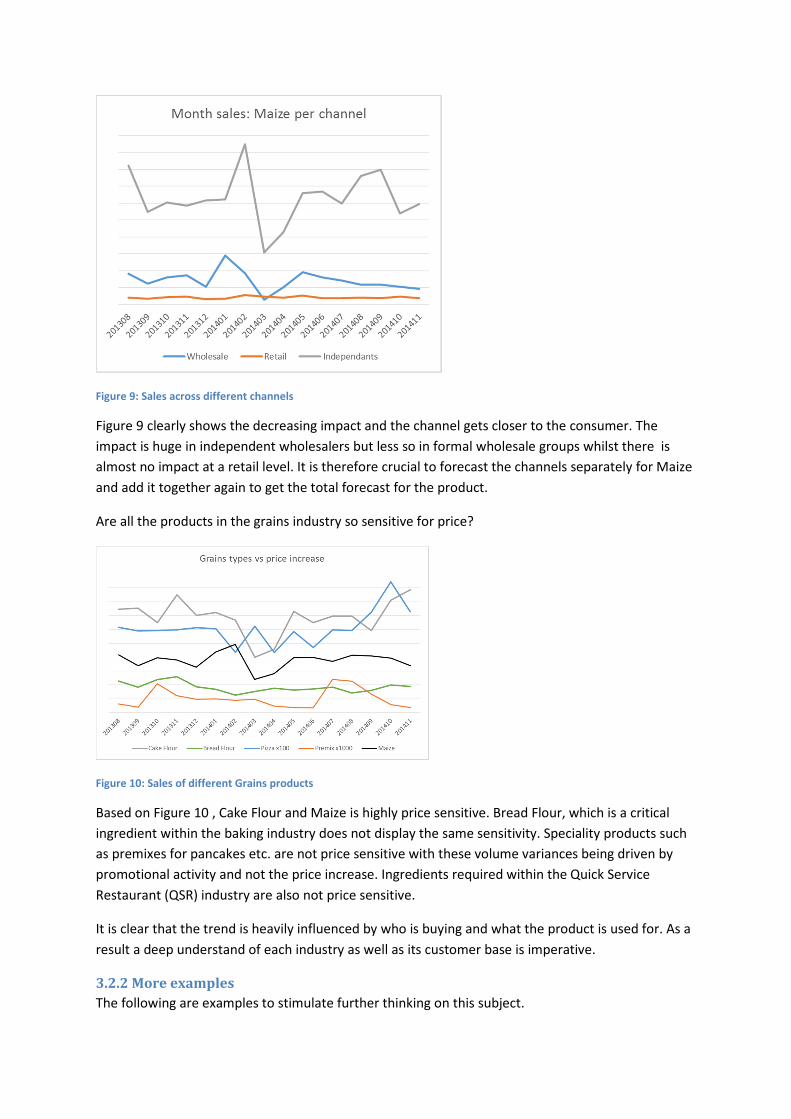
Figure 9: Sales across different channels
Figure 9 clearly shows the decreasing impact and the channel gets closer to the consumer. The
impact is huge in independent wholesalers but less so in formal wholesale groups whilst there is
almost no impact at a retail level. It is therefore crucial to forecast the channels separately for Maize
and add it together again to get the total forecast for the product.
Are all the products in the grains industry so sensitive for price?
Figure 10: Sales of different Grains products
Based on Figure 10 , Cake Flour and Maize is highly price sensitive. Bread Flour, which is a critical
ingredient within the baking industry does not display the same sensitivity. Speciality products such
as premixes for pancakes etc. are not price sensitive with these volume variances being driven by
promotional activity and not the price increase. Ingredients required within the Quick Service
Restaurant (QSR) industry are also not price sensitive.
It is clear that the trend is heavily influenced by who is buying and what the product is used for. As a
result a deep understand of each industry as well as its customer base is imperative.
3.2.2 More examples
The following are examples to stimulate further thinking on this subject.
Rice: impacted by importation
In South Africa all rice is imported. India supplies half of the rice consumed in the country however it
only exports 4% of its local crops, which can heavily influence trends. Further, highly branded rice
trends do not display the same trends in comparison with commodity price driven products
Cosmetics: the super session lesson
In the cosmetics product range changes regularly. The super session concept is a crucial skill in order
to forecast these products. This approach links the old product to the new product, adding in a
factor to adjust for pack size changes to ensure that trends of the past are used to launch new
products. Launches also play a big role in this industry. The ability to use similar item trends to
forecast these new items needs to be used here.
Canned fruit: Lessons about longer term and higher level forecasting
Most fruits have a very short season to harvest the relevant fruits. In order to produce tinned fruit,
the fruit must be tinned during the season. In this industry there is a term call “Bright cans or bright
stock.” This is the tinned fruit, but without the label. Forecasting the full year for the total number of
“bright cans” should be accurate.
Months later, closer to the time of consumption, the manufacturing plant labels these bright cans
with the correct branding. This is done with much shorter horizon forecasting by individual brand.
This technique requires forecasting at a higher level and can add value to most products, e.g.
forecasting the base product and adding flavours later.
Fruit juice, ice cream and coffee: The temperature lesson
Our intuition tells us that fruit juice and ice cream will sell higher in summer than in winter. The
opposite will be true for coffee. There is a clear relationship between temperature and these
products. In the cosmetics world a related example is sunscreen – a clear summer winter trend
should be expected. Seasonal forecasting techniques must be used for these products and for the
brave ones could even try regression forecasting.
Regression forecasting is based on the fact that you know the relationship between the temperature
and your product. You then forecast the temperature and based on the relationship you calculate
the forecast. In FMCG this technique is seldom used since the impact of promotions and competitive
activity play a bigger role. We will show this a bit later in this paper.
Events in the year
Over and above Easter and Christmas that we already covered in the basic example, the following
are examples of trends you can expect to see:
Sugar trends are low in January and February – is that how long new year resolutions for diets last?
Gifts spike over Mothers day, Fathers day and Christmas.
School holidays impacts fast foods and ready to eat solutions. This is clearly seen in the difference in
trends in KZN vs Gauteng.
In product that rely heavily on the season of a crop, prices tend to be high at the start of the season
and as available increases as all areas in the country come into production, the prices decline.
Shortages and short supply typically occur just before the season starts. If one look at these products
it is crucial to understand where these hotspots of the products are likely to be.
Fish
Fish is strongly influenced by highly variable and unpredictable catch sizes. During shortages of
certain sizes, substitution takes place and customers buy from suppliers they normally do not buy
from. Once supply stabilises the historical sales are not a reflection of true demand, but of what was
available over the abnormal period. The only way to find trends in this case is by summarising the
data to higher levels were trends are visible, and using past factors to reconstruct the correct trends.
3. DAILY FORECASTING
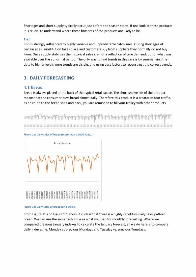
4.1 Bread
Bread is always placed at the back of the typical retail space. The short shelve life of the product
means that the consumer buys bread almost daily. Therefore this product is a creator of foot traffic,
as en route to the bread shelf and back, you are reminded to fill your trolley with other products.
Figure 11: Daily sales of bread (more than a 1000 days...)
Figure 12: Daily sales of bread for 8 weeks.
From Figure 11 and Figure 12, above it is clear that there is a highly repetitive daily sales pattern
bread. We can use the same technique as what we used for monthly forecasting. Where we
compared previous January indexes to calculate the January forecast, all we do here is to compare
daily indexes i.e. Monday vs previous Mondays and Tuesday vs. previous Tuesdays.
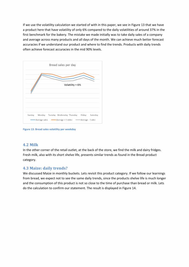
If we use the volatility calculation we started of with in this paper, we see in Figure 13 that we have
a product here that have volatility of only 6% compared to the daily volatilities of around 37% in the
first benchmark for the bakery. The mistake we made initially was to take daily sales of a company
and average across many products and all days of the month. We can achieve much better forecast
accuracies if we understand our product and where to find the trends. Products with daily trends
often achieve forecast accuracies in the mid 90% levels.
Figure 13: Bread sales volatility per weekday
4.2 Milk
In the other corner of the retail outlet, at the back of the store, we find the milk and dairy fridges.
Fresh milk, also with its short shelve life, presents similar trends as found in the Bread product
category.
4.3 Maize: daily trends?
We discussed Maize in monthly buckets. Lets revisit this product category. If we follow our learnings
from bread, we expect not to see the same daily trends, since the products shelve life is much longer
and the consumption of this product is not so close to the time of purchase than bread or milk. Lets
do the calculation to confirm our statement. The result is displayed in Figure 14.
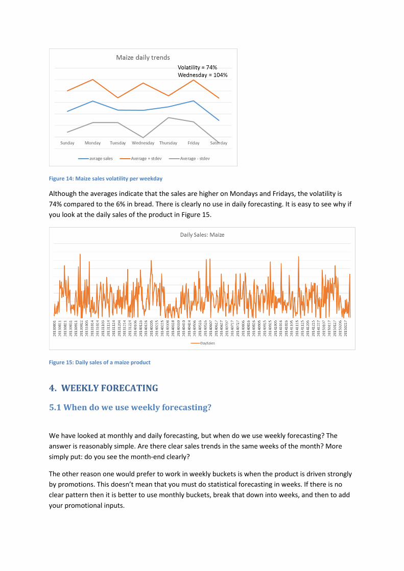
Figure 14: Maize sales volatility per weekday
Although the averages indicate that the sales are higher on Mondays and Fridays, the volatility is
74% compared to the 6% in bread. There is clearly no use in daily forecasting. It is easy to see why if
you look at the daily sales of the product in Figure 15.
Figure 15: Daily sales of a maize product
4. WEEKLY FORECATING
5.1 When do we use weekly forecasting?
We have looked at monthly and daily forecasting, but when do we use weekly forecasting? The
answer is reasonably simple. Are there clear sales trends in the same weeks of the month? More
simply put: do you see the month-end clearly?
The other reason one would prefer to work in weekly buckets is when the product is driven strongly
by promotions. This doesn’t mean that you must do statistical forecasting in weeks. If there is no
clear pattern then it is better to use monthly buckets, break that down into weeks, and then to add
your promotional inputs.

The main reason for a product showing month-end tendencies is that pay-day falls at month-end.
This drives two types of purchases. The first is that there are luxury goods which tend to be bought
around month–end. The second is that monthly shopping is largely done at this time.
For the forecasting specialist the dilemma is what data to use. The trends would be clearer should
PoS (Point of Sale) data be used. PoS being the sales figures produced by the sales out of the store.
Most demand planners use sales to the store however the store’s purchasing trends masks the
customers buying trend. The longer the shelf life of a product, the more the store can play around
with the number of products purchased, to take advantage of price opportunities with the suppliers.
Thus, we would expect shorter shelf life products trends to be closer to those of the consumer.
5.2 Calendars in weekly forecasting
The issue around which week is month-end does not have a simple answer. We have 12 months per
year, but 52 weeks. This means some months have 4 weeks and more or less every third month you
get a 5 week month. If you look more closely at the calendar you will see that the 5 week month is
not necessarily the same month each year. With a little effort you can mark past and future weeks
with a 1 to 5 number.
Most forecasting techniques need a fixed cycle to work correctly, e.g. 12 months or 7 days. In fact, a
year does not comprise of precisely 52 weeks. Therefore most forecasting methods do not work well
and some of those methods should not be used for weekly forecasting at all. Depending on where
the year starts, the 5 weeker month moves from year to year. As a result you start to compare the
last week of the month to a first week of the month and they tend to be very different. It takes more
or less four years and then we even have a year with 53 weeks.
To illustrate the impact of the problem I created very theoretical “sales” where the first week of the
month sells 1, the second week 2, the third 3 and the 4th, 4. The month that has 5 weeks, we sell 5 in
that week.
If we forecast with indexes as was explained in monthly and daily forecasting, where we use week 1
of previous years to determine week 1 of this year, it looks as follows (see Figure 16):
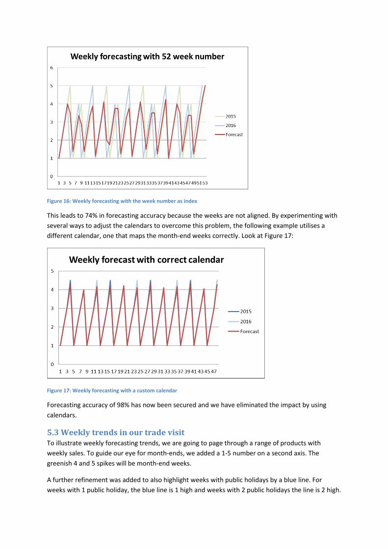
Figure 16: Weekly forecasting with the week number as index
This leads to 74% in forecasting accuracy because the weeks are not aligned. By experimenting with
several ways to adjust the calendars to overcome this problem, the following example utilises a
different calendar, one that maps the month-end weeks correctly. Look at Figure 17:
Figure 17: Weekly forecasting with a custom calendar
Forecasting accuracy of 98% has now been secured and we have eliminated the impact by using
calendars.
5.3 Weekly trends in our trade visit
To illustrate weekly forecasting trends, we are going to page through a range of products with
weekly sales. To guide our eye for month-ends, we added a 1-5 number on a second axis. The
greenish 4 and 5 spikes will be month-end weeks.
A further refinement was added to also highlight weeks with public holidays by a blue line. For
weeks with 1 public holiday, the blue line is 1 high and weeks with 2 public holidays the line is 2 high.
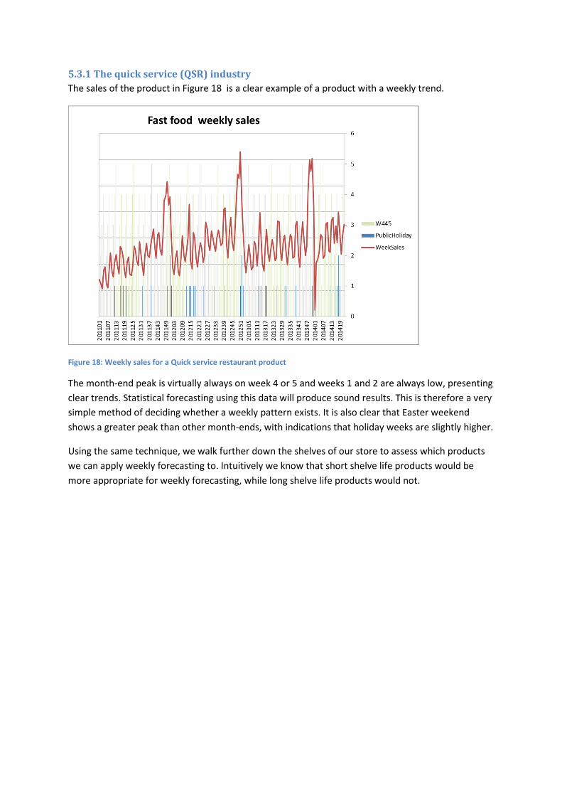
5.3.1 The quick service (QSR) industry
The sales of the product in Figure 18 is a clear example of a product with a weekly trend.
Figure 18: Weekly sales for a Quick service restaurant product
The month-end peak is virtually always on week 4 or 5 and weeks 1 and 2 are always low, presenting
clear trends. Statistical forecasting using this data will produce sound results. This is therefore a very
simple method of deciding whether a weekly pattern exists. It is also clear that Easter weekend
shows a greater peak than other month-ends, with indications that holiday weeks are slightly higher.
Using the same technique, we walk further down the shelves of our store to assess which products
we can apply weekly forecasting to. Intuitively we know that short shelve life products would be
more appropriate for weekly forecasting, while long shelve life products would not.
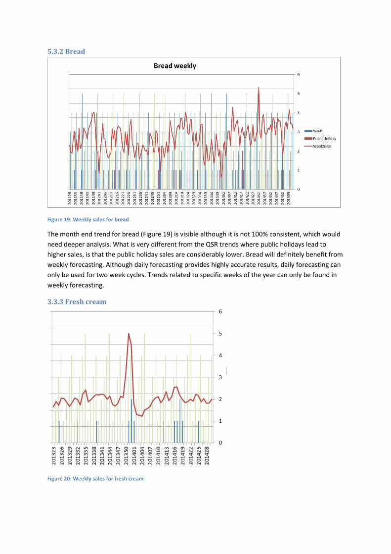
5.3.2 Bread
Figure 19: Weekly sales for bread
The month end trend for bread (Figure 19) is visible although it is not 100% consistent, which would
need deeper analysis. What is very different from the QSR trends where public holidays lead to
higher sales, is that the public holiday sales are considerably lower. Bread will definitely benefit from
weekly forecasting. Although daily forecasting provides highly accurate results, daily forecasting can
only be used for two week cycles. Trends related to specific weeks of the year can only be found in
weekly forecasting.
3.3.3 Fresh cream
Figure 20: Weekly sales for fresh cream
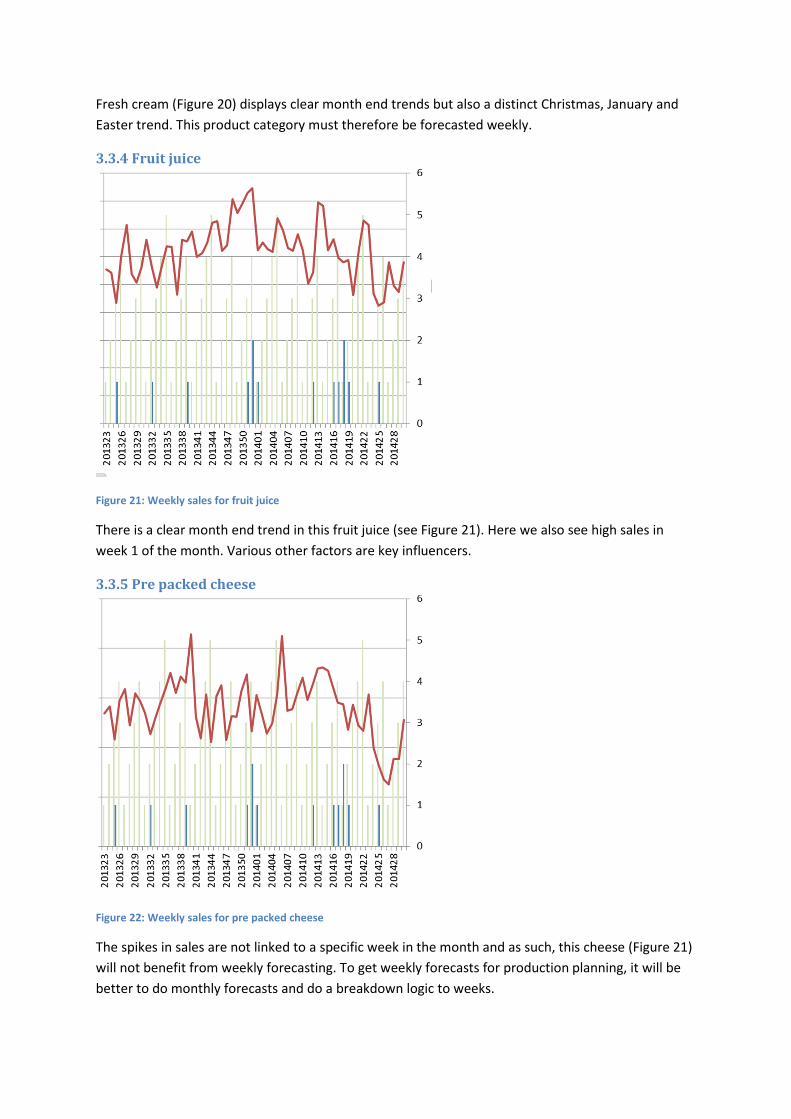
Fresh cream (Figure 20) displays clear month end trends but also a distinct Christmas, January and
Easter trend. This product category must therefore be forecasted weekly.
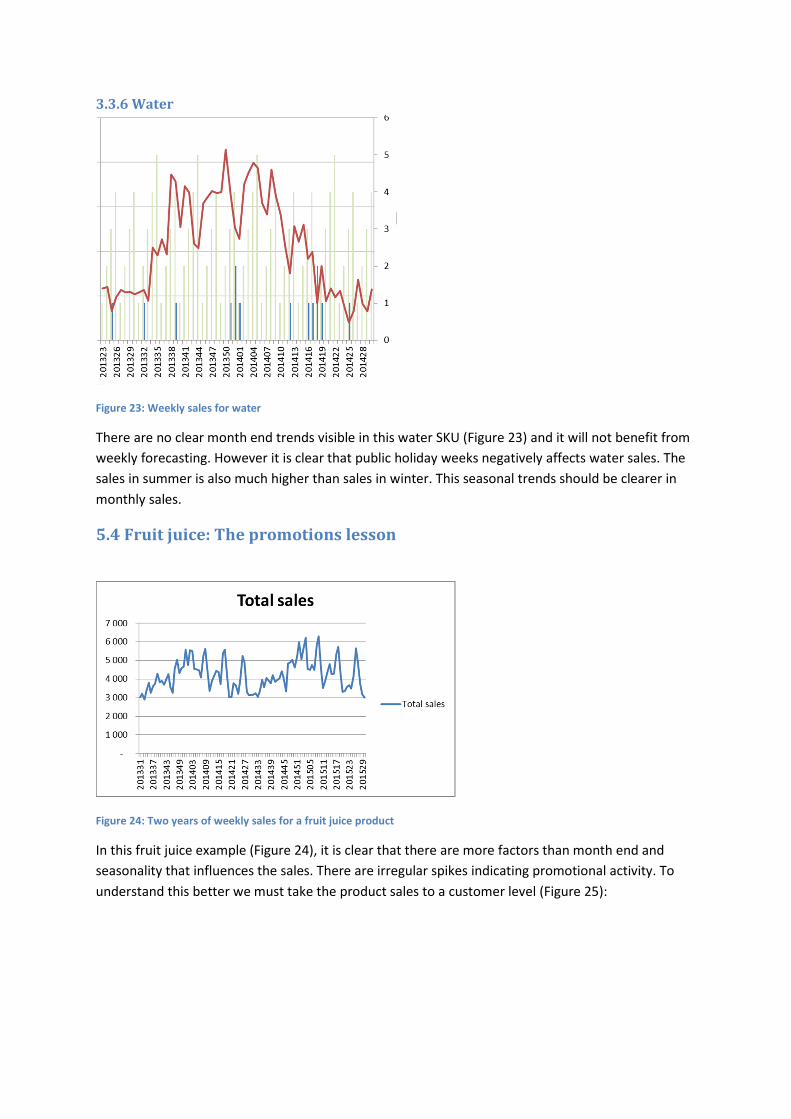
3.3.4 Fruit juice
Figure 21: Weekly sales for fruit juice
There is a clear month end trend in this fruit juice (see Figure 21). Here we also see high sales in
week 1 of the month. Various other factors are key influencers.
3.3.5 Pre packed cheese
Figure 22: Weekly sales for pre packed cheese
The spikes in sales are not linked to a specific week in the month and as such, this cheese (Figure 21)
will not benefit from weekly forecasting. To get weekly forecasts for production planning, it will be
better to do monthly forecasts and do a breakdown logic to weeks.
3.3.6 Water
Figure 23: Weekly sales for water
There are no clear month end trends visible in this water SKU (Figure 23) and it will not benefit from
weekly forecasting. However it is clear that public holiday weeks negatively affects water sales. The
sales in summer is also much higher than sales in winter. This seasonal trends should be clearer in
monthly sales.
5.4 Fruit juice: The promotions lesson
Figure 24: Two years of weekly sales for a fruit juice product
In this fruit juice example (Figure 24), it is clear that there are more factors than month end and
seasonality that influences the sales. There are irregular spikes indicating promotional activity. To
understand this better we must take the product sales to a customer level (Figure 25):
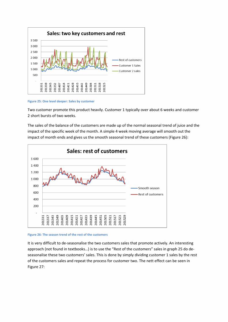
Figure 25: One level deeper: Sales by customer
Two customer promote this product heavily. Customer 1 typically over about 6 weeks and customer
2 short bursts of two weeks.
The sales of the balance of the customers are made up of the normal seasonal trend of juice and the
impact of the specific week of the month. A simple 4 week moving average will smooth out the
impact of month ends and gives us the smooth seasonal trend of these customers (Figure 26):
Figure 26: The season trend of the rest of the customers
It is very difficult to de-seasonalise the two customers sales that promote actively. An interesting
approach (not found in textbooks…) is to use the “Rest of the customers” sales in graph 25 do de-
seasonalise these two customers’ sales. This is done by simply dividing customer 1 sales by the rest
of the customers sales and repeat the process for customer two. The nett effect can be seen in
Figure 27:
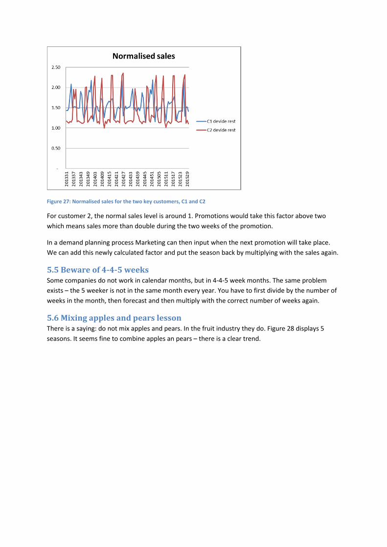
Figure 27: Normalised sales for the two key customers, C1 and C2
For customer 2, the normal sales level is around 1. Promotions would take this factor above two
which means sales more than double during the two weeks of the promotion.
In a demand planning process Marketing can then input when the next promotion will take place.
We can add this newly calculated factor and put the season back by multiplying with the sales again.
5.5 Beware of 4-4-5 weeks
Some companies do not work in calendar months, but in 4-4-5 week months. The same problem
exists – the 5 weeker is not in the same month every year. You have to first divide by the number of
weeks in the month, then forecast and then multiply with the correct number of weeks again.
5.6 Mixing apples and pears lesson
There is a saying: do not mix apples and pears. In the fruit industry they do. Figure 28 displays 5
seasons. It seems fine to combine apples an pears – there is a clear trend.
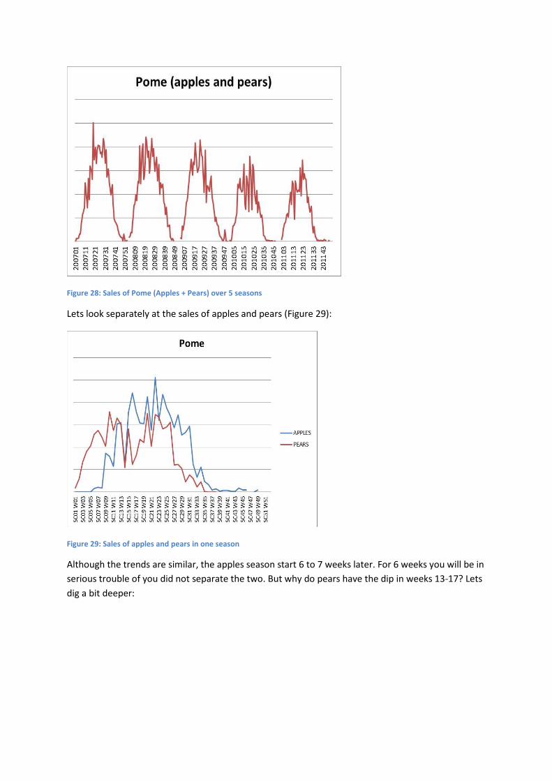
Figure 28: Sales of Pome (Apples + Pears) over 5 seasons
Lets look separately at the sales of apples and pears (Figure 29):
Figure 29: Sales of apples and pears in one season
Although the trends are similar, the apples season start 6 to 7 weeks later. For 6 weeks you will be in
serious trouble of you did not separate the two. But why do pears have the dip in weeks 13-17? Lets
dig a bit deeper:
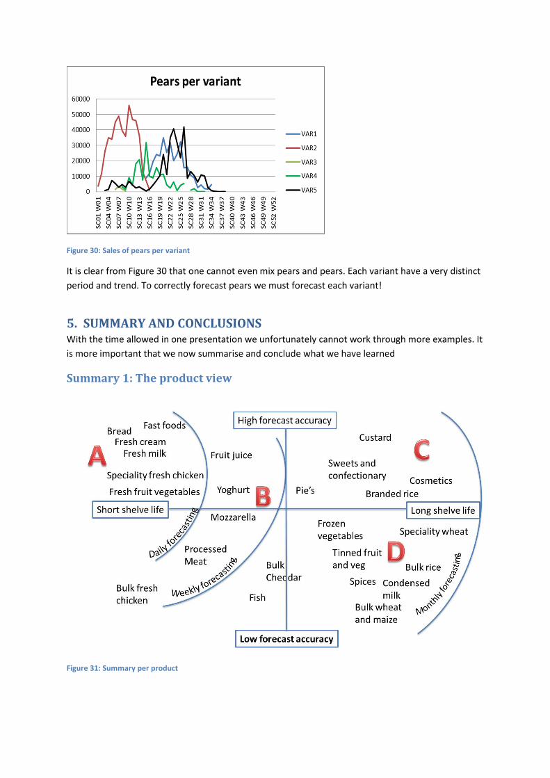
Figure 30: Sales of pears per variant
It is clear from Figure 30 that one cannot even mix pears and pears. Each variant have a very distinct
period and trend. To correctly forecast pears we must forecast each variant!
5. SUMMARY AND CONCLUSIONS With the time allowed in one presentation we unfortunately cannot work through more examples. It
is more important that we now summarise and conclude what we have learned
Summary 1: The product view
Figure 31: Summary per product
Area A
1. Short shelve life products like fast foods, milk and bread display daily trends and it is possible
to forecast with high accuracy.
2. Daily trends should be forecasted by using day of week factors.
3. Specific adjustments needs to be made for public holidays.
4. Daily forecasting should focus on short horizons of 14 to 21 days only.
5. Short shelve life products also typically display good weekly trends and should be used in
conjunction with daily forecasting to forecast seasonal trends and to focus on month end
variability.
6. Since high level of accuracies can be achieved by statistical forecasting very little input and
or collaboration should take place in these categories. Bottom up and top down forecasting
works well in these products.
Area B
1. Some chilled product, especially products with high seasonality and month end spikes are
successfully forecasted in weekly buckets
2. Since the number of full weeks in a year varies and month ends are not always in the same
week, the only way to successfully forecast in weekly buckets is to use calendars for indexing
the correct weeks.
3. Products tend to behave differently in different regions of the country since these products
tend to be influenced by temperature month ends, public and school holidays. These are
different in the different parts of the country. Bottom up forecasting therefor tends to
achieve better results here.
4. Since the shelve life is typically still fairly short, one should be able to rely heavily on the
statistical forecasting. Reviewing and manual input should not take place more frequently
than shelve life divide by 8 days.
5. Weekly forecasting facilitates inputs for promotional activity well since most promotional
deals are in weekly cycles (See discussion under Area E).
Area C
1. Longer shelve life products should be forecasted in monthly buckets.
2. Long shelve life products with highly branded products and products with clear seasonal
trends can achieve good forecast accuracies.
3. Seasonal forecasting methods are typically used for these products. The ability to adjust for
Easter from March to April in some years are important in this category.
4. Companies focus in this area for innovation and therefor launches, discontinuation and
rebranding takes place regularly. Techniques like supersession, using of similar items for
history during launch and run out strategies play a crucial role in achieving good forecast
accuracies in these areas.
Area D
1. Bulk and commodity products and products that are price sensitive typically does not have
high forecasting accuracies and should be forecasted in months.
2. The crops, surpluses, shortages, season and price fluctuations play a much bigger role in
order to accurately forecast these products.
3. Averages, moving averages and simple trend line forecasting methods are typically suitable
in these products. Data cleansing of abnormal events play a big role and most events are so
ad hoc of nature that it is adjusted manually.
4. The underlying commodity for the group of products typically determines abnormal events
across the whole range of products. Forecasting at group level and top down event editing
are therefore more appropriate.
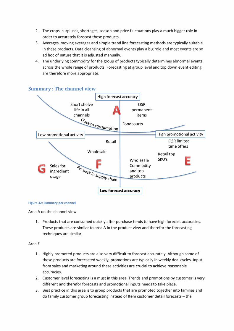
Summary : The channel view
Figure 32: Summary per channel
Area A on the channel view
1. Products that are consumed quickly after purchase tends to have high forecast accuracies.
These products are similar to area A in the product view and therefor the forecasting
techniques are similar.
Area E
1. Highly promoted products are also very difficult to forecast accurately. Although some of
these products are forecasted weekly, promotions are typically in weekly deal cycles. Input
from sales and marketing around these activities are crucial to achieve reasonable
accuracies.
2. Customer level forecasting is a must in this area. Trends and promotions by customer is very
different and therefor forecasts and promotional inputs needs to take place.
3. Best practice in this area is to group products that are promoted together into families and
do family customer group forecasting instead of Item customer detail forecasts – the
number of forecasts to manage makes that lower level just impossible to manage and
control.
4. Collaboration with sales and marketing is a must in this area. Statistical forecasting can
assist, must is seldom enough. Decomposition techniques to assist with the impact of
promotions are useful here.
Area F
1. Products in these areas are not heavily promoted. Statistical forecasting plays a significant
role here, but it is not necessary to forecast by customer. This B and C type products can run
on autopilot with forecasting, but weekly exception monitoring is normally required to
adjust for abnormal sales.
Area G
1. The further back in the supply chain the more difficult it becomes to achieve high accuracies.
In these cases collaboration from supply chain partners closer to the consumer is critical for
success.
2. Statistical forecasting plays a much smaller role here, except if the ingredients are delivered
into category A products.
ABOUT THE AUTHOR
Thinus Hermann has for the past 20 years implemented Advanced Planning Systems at major FMCG
brands including Clover, Danone, Tastic, AVI (National Brands, Indigo and CIRO), L’Oreal, SAB Miller
Africa, Famous Brands, KFC and GUD.
As a forecasting expert he has consulted to Capespan, Clover and its logistics principals and Vector
Logistics. There is, in fact almost no FMCG aisle that Thinus has not personally analysed or
forecasted sales for. His broad understanding of a wide range of categories has led him to create this
set of practical guidelines, to assist demand planners to make critical decisions.
From when to forecast in monthly, weekly and daily buckets to how to handle events and month
ends; when to bother looking at external events such as weather and price differentials, to when and
how to bring customer level forecasting into demand plans. And, how to leverage the better trends
at higher levels.
Thinus is a regular speaker at Sapics and Vicenda and developed a course on planning and
forecasting that he lectured at the University of Pretoria.