Embed Size (px)
Citation preview

Megan Brant 12CHT
In what ways does your media product use, develop or challenge forms and conventions of real media products?
My music video we are never getting back together by Taylor swift is the genre of Pop. I have stuck to the typical conventions of this genre by making sure that all of my music video, digipak and magazine poster is based around her. I done this with my magazine advert by having the main image of her, with her looking directly down the camera to make sure that she caught my audience’s attention. With my digipak I also made sure that my actress (Greta Bruce) was in most images. The only image that she wasn’t in was the image behind the CD, this was a picture of a sparkler, this related to my sections of my music video.
Music videoThe music video I created conforms to some of Andrew Goodwin's ideas on music videos, such as the fact that there is a link between the visuals and the lyrics. This is relevant to my product as I have created literal visual representations of the words in the song, for example with the lyrics ‘You go talk to your friends, talk to my friends, talk to me’ I have my actresses standing with her friends behind her doing actions to the song.
The song I chose “We are never getting back together” by Taylor Swift is of fast up beat tempo, therefore when editing my music video, I ensured to keep a fast pace , making sure the cuts of shots were on the beat, and didn’t contradict the melody of the song. However the song that I chose started off with a slow beat but as the song progressed as the tempo/beat got faster. As my beat got faster I made sure that my cuts got faster to make sure that they linked up with the song.
Cuts of my music video on a premiere timeline.

Megan Brant 12CHT
With representation I attempted to portray 2 contrasting situations.
The first situation that I portrayed is that my actresses over powered the male, I displayed this within my chorus’ of the song. With my chorus’ my actress was expressing that she doesn’t care about breaking up with him. She’s having fun being care free with her friends.
The second situation that I portrayed in my music videos is anger, this is highlighted in the verses. I displayed this in my verses by showing flash backs of the relationship that she had just ended. The flash backs consisted of her arguing with her ex and being stood up when they meant to go out.
My representation of power was displayed through performance, it means I could really get her feelings through her singing into the camera so it’s like my actresses is singing to her audience not to a camera. This way it allows my audience to connect with my actresses and be able to feel what she is feeling. My second representation was represented through narrative, this was displayed in my verses, and this means that you got to see what happened and how it affected her. One scene was a flashback to their favorite place but she ended up being on her own as he stood her up, this made my actress feel very alone. I close ups of her face when she was kissing the penny to throw it in the water so that my audience was able to really be able to see the emotion in her facial expressions.
I have followed the forms and conventions of a typical pop genre music video, I have made it fun and interesting to watch to keep my audience entertained and not bored. I focused the whole of my music video around my female actress.
I decided to stick with the forms and conventions of pop music videos as if I had done something different then it would have been hard to be able to relate to my audience and be able to understand why I have done it, also my song is aimed at young target audience so highlighting that it has to be suitable for them.
I have used a variety of shots within in my music video, for example close-ups, mid-shots and long shots, using all the different types of shots means that my audience is going to be able to connect well with my audience. Close up shots means that my audience will be able to connect and feel what my actresses is feeling, whereas long shots in my music video means that my audience will be able to see the surrounding and feel like they were there with her and engage in the song.
My focus on locations is what makes my music video so visually pleasing. I filmed in London as everyone knows the place so it will be easily recognised, therefore the locations within my video are easier for my audience to identify with. This is so I could ensure that my audience
Megan Brant 12CHT
would feel a personal identification with my actress, helping them to feel more engaged with the narrative – which also means my video applies to Bulmer and Katz' Uses and Gratifications theory. With having a younger target audience using the scenes of London means that it’s not a place they wouldn’t have visited because this is a family place where people tend to go out for day trips to all the tourist spots. Within in my music video I used Trafalgar square which will a tourists spot with the fountains and the bug lion statue, I also used Tower Bridge which is a major tourist spot as most people have walked across it or seen it on the TV. This means that they will be able to relate to it themself and feel a part of the video.
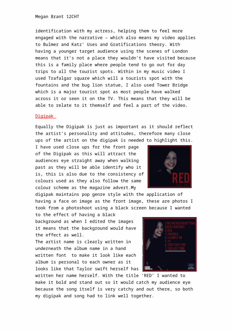
Digipak
Equally the Digipak is just as important as it should reflect the artist’s personality and attitudes, therefore many close ups of the artist on the digipak is needed to highlight this. I have used close ups for the front page of the Digipak as this will attract the audiences eye straight away when walking past as they will be able identify who it is, this is also due to the consistency of colours used as they also follow the same colour scheme as the magazine advert.My digipak maintains pop genre style with the application of having a face on image as the front image, these are photos I took from a photoshoot using a black screen because I wanted to the effect of having a black background as when I edited the images it means that the background would have the effect as well. The artist name is clearly written in underneath the album name in a hand written font to make it look like each album is personal to each owner as it looks like that Taylor swift herself has written her name herself. With the title ‘RED’ I wanted to make it bold and stand out so it would catch my audience eye because the song itself is very catchy and out there, so both my digipak and song had to link well together.
Whereas with my back image I decided to use a mid-shot so that audience was able to see her figure and how she works with the camera. However with all my images I made sure that I used the same effect to ensure that I kept the house style throughout. Also on the back of my digipak I made sure that stuck to the conventions as I added institution information, a barcode, listing of songs and the record labels logo.
As Richard Dyer quoted “a star is an image constructed from a range of materials”, both my digipak, magazine advert and music video highlight the star image; the digipak includes the singles being released on the album and the image of the star, the magazine advert also includes the name of the album and an images of the star, and finally the music video highlights scenes from a ‘live’ performance.
Megan Brant 12CHT
Magazine Advert
Similarly to my music video, my magazine advert conforms to the conventions of real-media products in relation to the pop genre. The artists name is written clearly at top, ensuring to grasp the attention from the fans of Taylor swift. Her name is written in the same way it is on the Digipak – this creates a House Style and a common theme – so the artist’s products are easily identified each time.On magazine advert I featured 5 star ratings from ‘Q magazine’ and ‘the Guardian’ in order to give the album a feeling of success, which audience members will appreciate as they will know spending their money on this album will not be of waste.My main image on my magazine poster is of her as I want to stick to the main conventions of pop genre poster. I also added when it is going to be released and how it is going to be released because many people may want it on CD, whereas some other people will want in on vinyl or iTunes.