Embed Size (px)
Citation preview
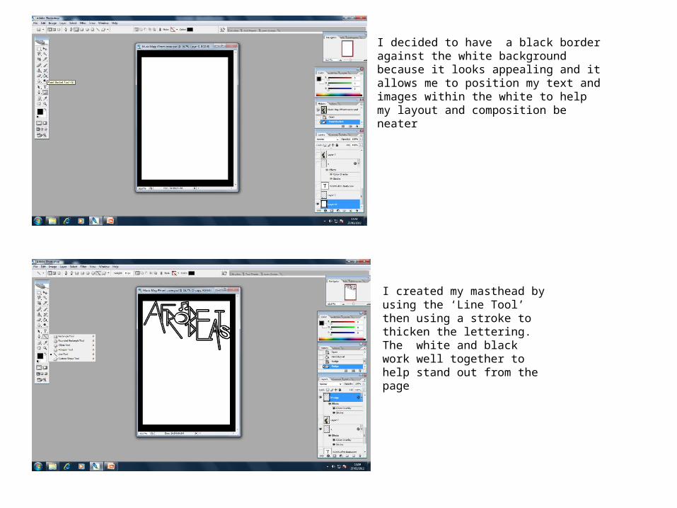
I decided to have a black border against the white background because it looks appealing and it allows me to position my text and images within the white to help my layout and composition be neater
I created my masthead by using the ‘Line Tool’ then using a stroke to thicken the lettering. The white and black work well together to help stand out from the page
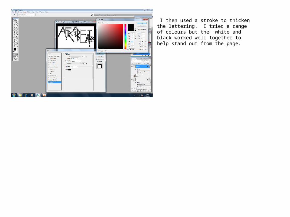
I then used a stroke to thicken the lettering, I tried a range of colours but the white and black worked well together to help stand out from the page.

I then dropped my picture into Photoshop and then used the ‘Magic Wand Tool’ to cut away the background and the ‘Eraser Tool’ to take away the extra edges of the picture which wasn’t needed. I then used the ‘Hue, Saturation and Brightness Tools’ to change the contrast of my main image so that you could see it against the white background. I also used the ‘Blur Tool’ to help even out his skin t give a better quality look to the image and to also give a smoother appearance
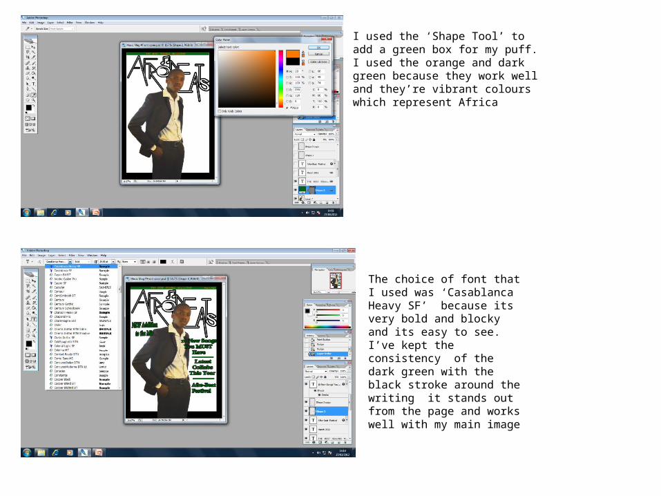
I used the ‘Shape Tool’ to add a green box for my puff. I used the orange and dark green because they work well and they’re vibrant colours which represent Africa
The choice of font that I used was ‘Casablanca Heavy SF’ because its very bold and blocky and its easy to see. I’ve kept the consistency of the dark green with the black stroke around the writing it stands out from the page and works well with my main image

With the artist name ‘Etienne’ I used the same font, I decided to use the vibrant orange and the dark green stroke around it to link with my puff. This makes it eye catching to my audience because its noticeable
By showing my range of technical skills by using various tools I was able to put together a final front over for my magazine, all the colours work together. And within layout and composition everything is in line and comes together neatly.