Embed Size (px)
Citation preview
By Ryan WardThe Grown Up Chocolate CompanyADV2 1
YCNThe Grown Up Chocolate Company
By Ryan Ward
By Ryan WardThe Grown Up Chocolate CompanyADV2 2
The Brief
To create a packaging sleeve and tray design aimed at creative profes-sionals and chocoholics.
- To create a landing page for the idea.
- (Optional) Create any promotional material for the idea.
By Ryan WardThe Grown Up Chocolate CompanyADV2 3
initialresearch
By Ryan WardThe Grown Up Chocolate CompanyADV2 4
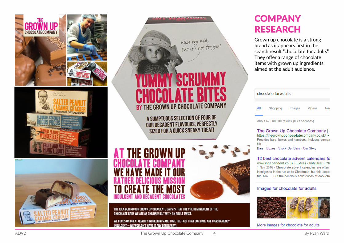
COMPANY RESEARCHGrown up chocolate is a strong brand as it appears first in the search result “chocolate for adults”. They offer a range of chocolate items with grown up ingredients, aimed at the adult audience.
By Ryan WardThe Grown Up Chocolate CompanyADV2 5
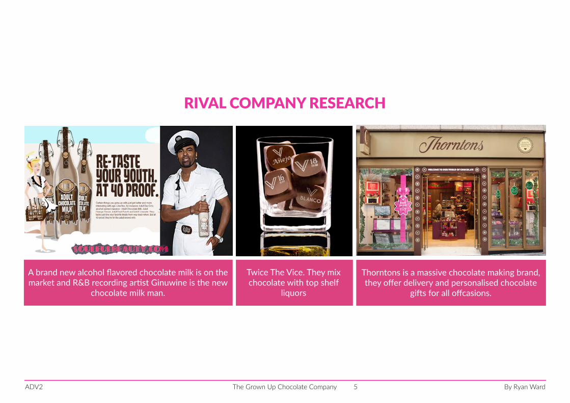
A brand new alcohol flavored chocolate milk is on the market and R&B recording artist Ginuwine is the new
chocolate milk man.
Twice The Vice. They mix chocolate with top shelf
liquors
RIVAL COMPANY RESEARCH
Thorntons is a massive chocolate making brand, they offer delivery and personalised chocolate
gifts for all offcasions.
By Ryan WardThe Grown Up Chocolate CompanyADV2 6
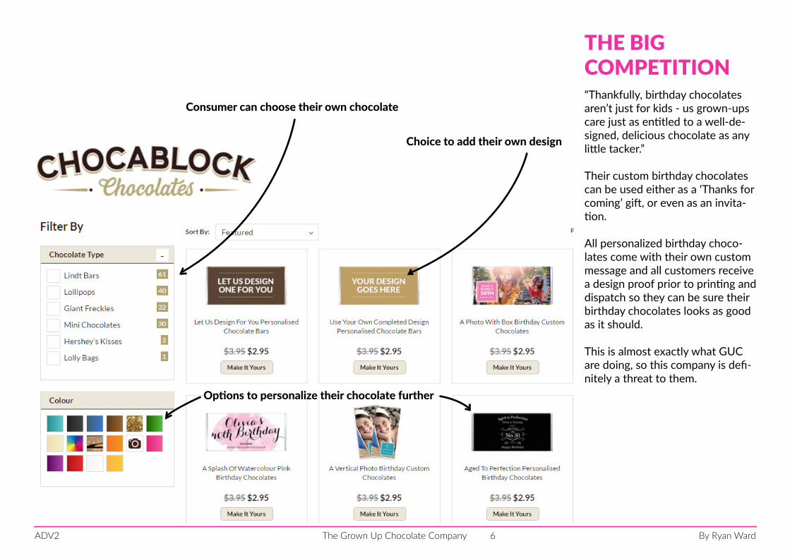
“Thankfully, birthday chocolates aren’t just for kids - us grown-ups care just as entitled to a well-de-signed, delicious chocolate as any little tacker.”
Their custom birthday chocolates can be used either as a ‘Thanks for coming’ gift, or even as an invita-tion.
All personalized birthday choco-lates come with their own custom message and all customers receive a design proof prior to printing and dispatch so they can be sure their birthday chocolates looks as good as it should.
This is almost exactly what GUC are doing, so this company is defi-nitely a threat to them.
Consumer can choose their own chocolate
Choice to add their own design
Options to personalize their chocolate further
THE BIG COMPETITION
By Ryan WardThe Grown Up Chocolate CompanyADV2 7
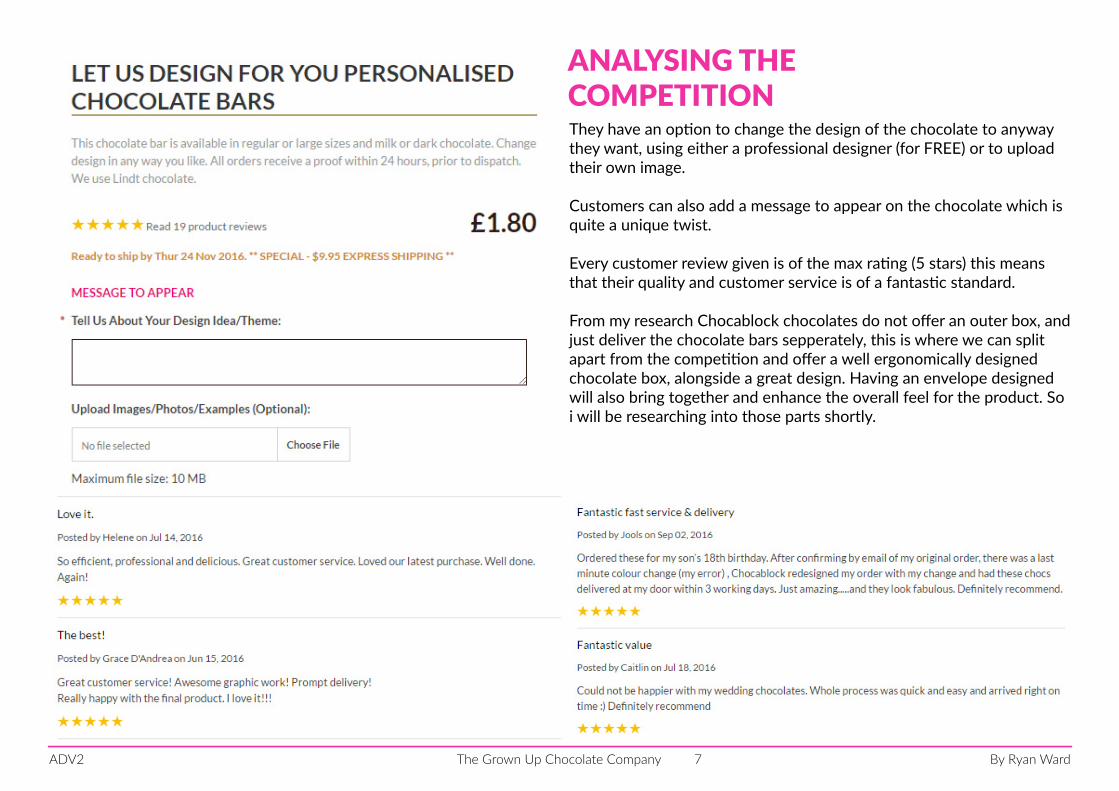
They have an option to change the design of the chocolate to anyway they want, using either a professional designer (for FREE) or to upload their own image.
Customers can also add a message to appear on the chocolate which is quite a unique twist.
Every customer review given is of the max rating (5 stars) this means that their quality and customer service is of a fantastic standard.
From my research Chocablock chocolates do not offer an outer box, and just deliver the chocolate bars sepperately, this is where we can split apart from the competition and offer a well ergonomically designed chocolate box, alongside a great design. Having an envelope designed will also bring together and enhance the overall feel for the product. So i will be researching into those parts shortly.
ANALYSING THE COMPETITION
By Ryan WardThe Grown Up Chocolate CompanyADV2 8
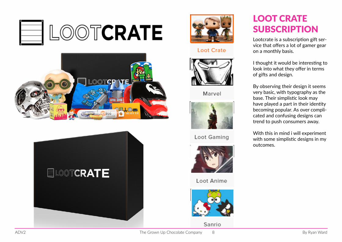
Lootcrate is a subscription gift ser-vice that offers a lot of gamer gear on a monthly basis.
I thought it would be interesting to look into what they offer in terms of gifts and design.
By observing their design it seems very basic, with typography as the base. Their simplistic look may have played a part in their identity becoming popular. As over compli-cated and confusing designs can trend to push consumers away.
With this in mind i will experiment with some simplistic designs in my outcomes.
LOOT CRATESUBSCRIPTION
By Ryan WardThe Grown Up Chocolate CompanyADV2 9
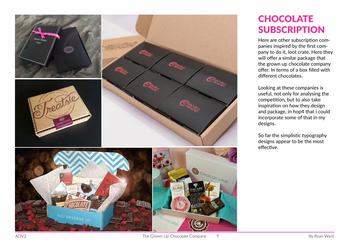
Here are other subscription com-panies inspired by the first com-pany to do it, loot crate. Here they will offer a similar package that the grown up chocolate company offer. In terms of a box filled with different chocolates.
Looking at these companies is useful, not only for analysing the competition, but to also take inspiration on how they design and package, in hop4 that i could incorporate some of that in my designs.
So far the simplistic typography designs appear to be the most effective.
CHOCOLATESUBSCRIPTION
By Ryan WardThe Grown Up Chocolate CompanyADV2 10
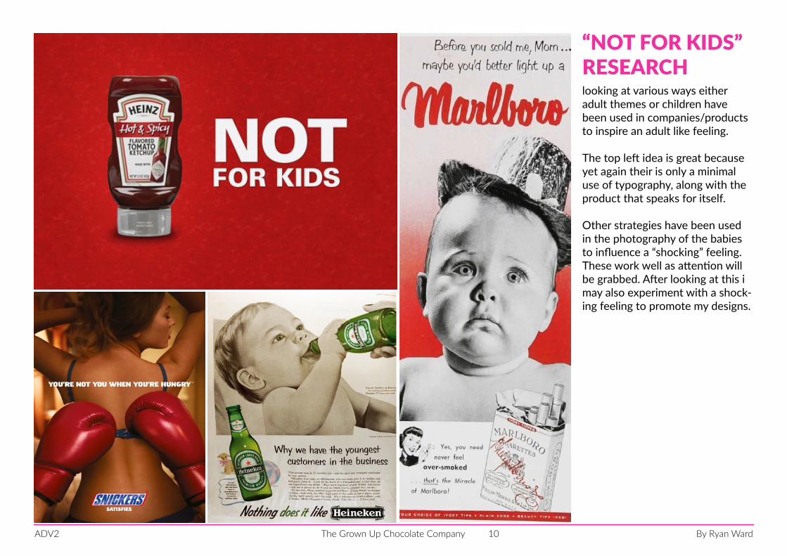
looking at various ways either adult themes or children have been used in companies/products to inspire an adult like feeling.
The top left idea is great because yet again their is only a minimal use of typography, along with the product that speaks for itself.
Other strategies have been used in the photography of the babies to influence a “shocking” feeling. These work well as attention will be grabbed. After looking at this i may also experiment with a shock-ing feeling to promote my designs.
“NOT FOR KIDS”RESEARCH
By Ryan WardThe Grown Up Chocolate CompanyADV2 11
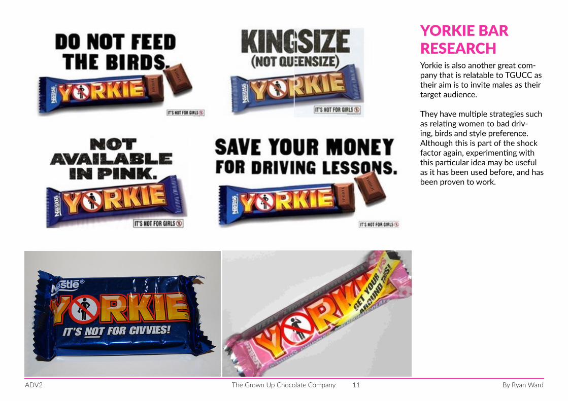
Yorkie is also another great com-pany that is relatable to TGUCC as their aim is to invite males as their target audience.
They have multiple strategies such as relating women to bad driv-ing, birds and style preference. Although this is part of the shock factor again, experimenting with this particular idea may be useful as it has been used before, and has been proven to work.
YORKIE BARRESEARCH
By Ryan WardThe Grown Up Chocolate CompanyADV2 12
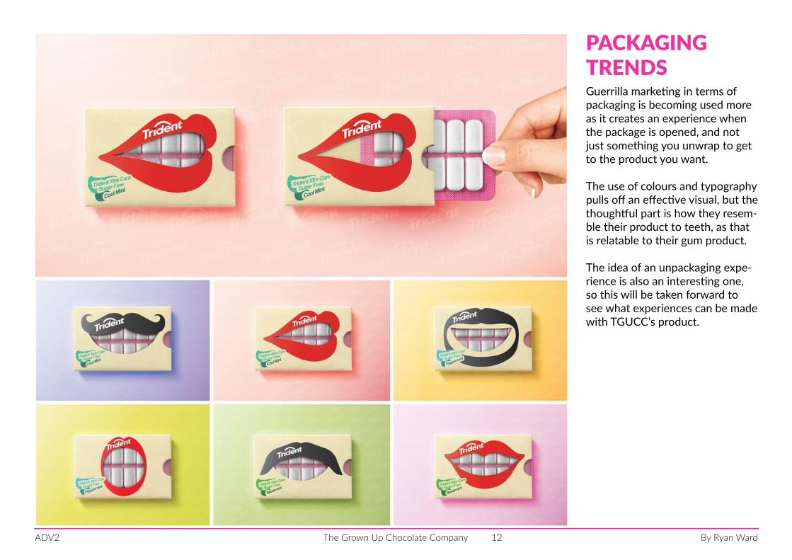
Guerrilla marketing in terms of packaging is becoming used more as it creates an experience when the package is opened, and not just something you unwrap to get to the product you want.
The use of colours and typography pulls off an effective visual, but the thoughtful part is how they resem-ble their product to teeth, as that is relatable to their gum product.
The idea of an unpackaging expe-rience is also an interesting one, so this will be taken forward to see what experiences can be made with TGUCC’s product.
PACKAGING TRENDS
By Ryan WardThe Grown Up Chocolate CompanyADV2 13
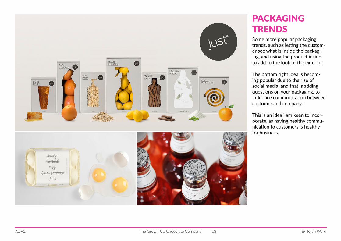
Some more popular packaging trends, such as letting the custom-er see what is inside the packag-ing, and using the product inside to add to the look of the exterior.
The bottom right idea is becom-ing popular due to the rise of social media, and that is adding questions on your packaging, to influence communication between customer and company.
This is an idea i am keen to incor-porate, as having healthy commu-nication to customers is healthy for business.
PACKAGING TRENDS
By Ryan WardThe Grown Up Chocolate CompanyADV2 14
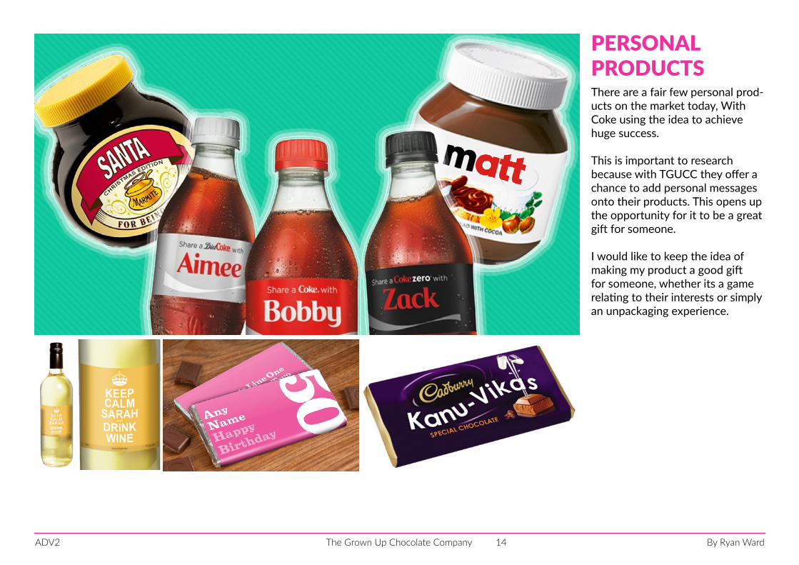
There are a fair few personal prod-ucts on the market today, With Coke using the idea to achieve huge success.
This is important to research because with TGUCC they offer a chance to add personal messages onto their products. This opens up the opportunity for it to be a great gift for someone.
I would like to keep the idea of making my product a good gift for someone, whether its a game relating to their interests or simply an unpackaging experience.
PERSONALPRODUCTS
By Ryan WardThe Grown Up Chocolate CompanyADV2 15
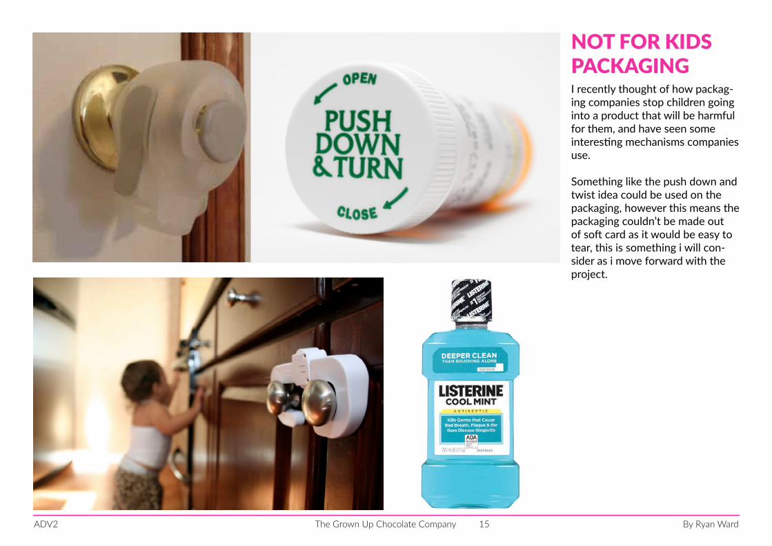
I recently thought of how packag-ing companies stop children going into a product that will be harmful for them, and have seen some interesting mechanisms companies use.
Something like the push down and twist idea could be used on the packaging, however this means the packaging couldn’t be made out of soft card as it would be easy to tear, this is something i will con-sider as i move forward with the project.
NOT FOR KIDSPACKAGING
By Ryan WardThe Grown Up Chocolate CompanyADV2 16
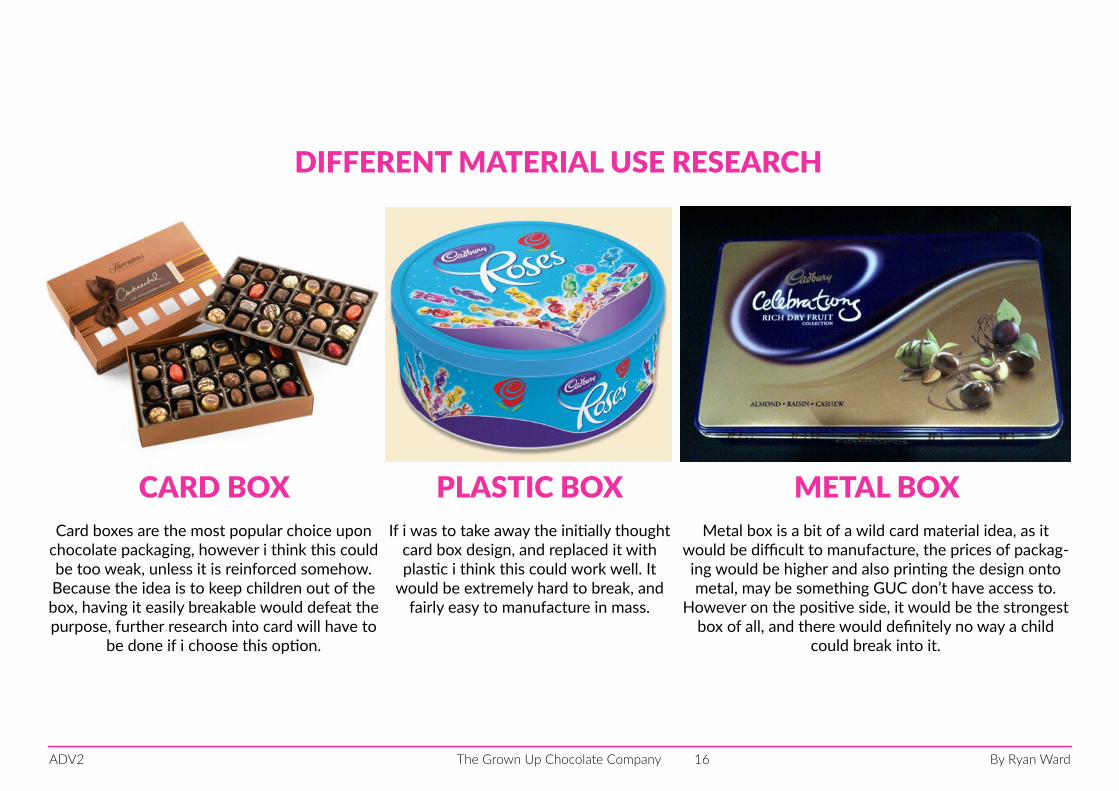
Metal box is a bit of a wild card material idea, as it would be difficult to manufacture, the prices of packag-ing would be higher and also printing the design onto metal, may be something GUC don’t have access to.
However on the positive side, it would be the strongest box of all, and there would definitely no way a child
could break into it.
DIFFERENT MATERIAL USE RESEARCH
Card boxes are the most popular choice upon chocolate packaging, however i think this could be too weak, unless it is reinforced somehow. Because the idea is to keep children out of the box, having it easily breakable would defeat the purpose, further research into card will have to
be done if i choose this option.
If i was to take away the initially thought card box design, and replaced it with plastic i think this could work well. It
would be extremely hard to break, and fairly easy to manufacture in mass.
CARD BOX PLASTIC BOX METAL BOX
By Ryan WardThe Grown Up Chocolate CompanyADV2 17
who is the target audience and what do they want?
By Ryan WardThe Grown Up Chocolate CompanyADV2 18
what do adults/kids like?
By Ryan WardThe Grown Up Chocolate CompanyADV2 19
Idea generation
By Ryan WardThe Grown Up Chocolate CompanyADV2 20
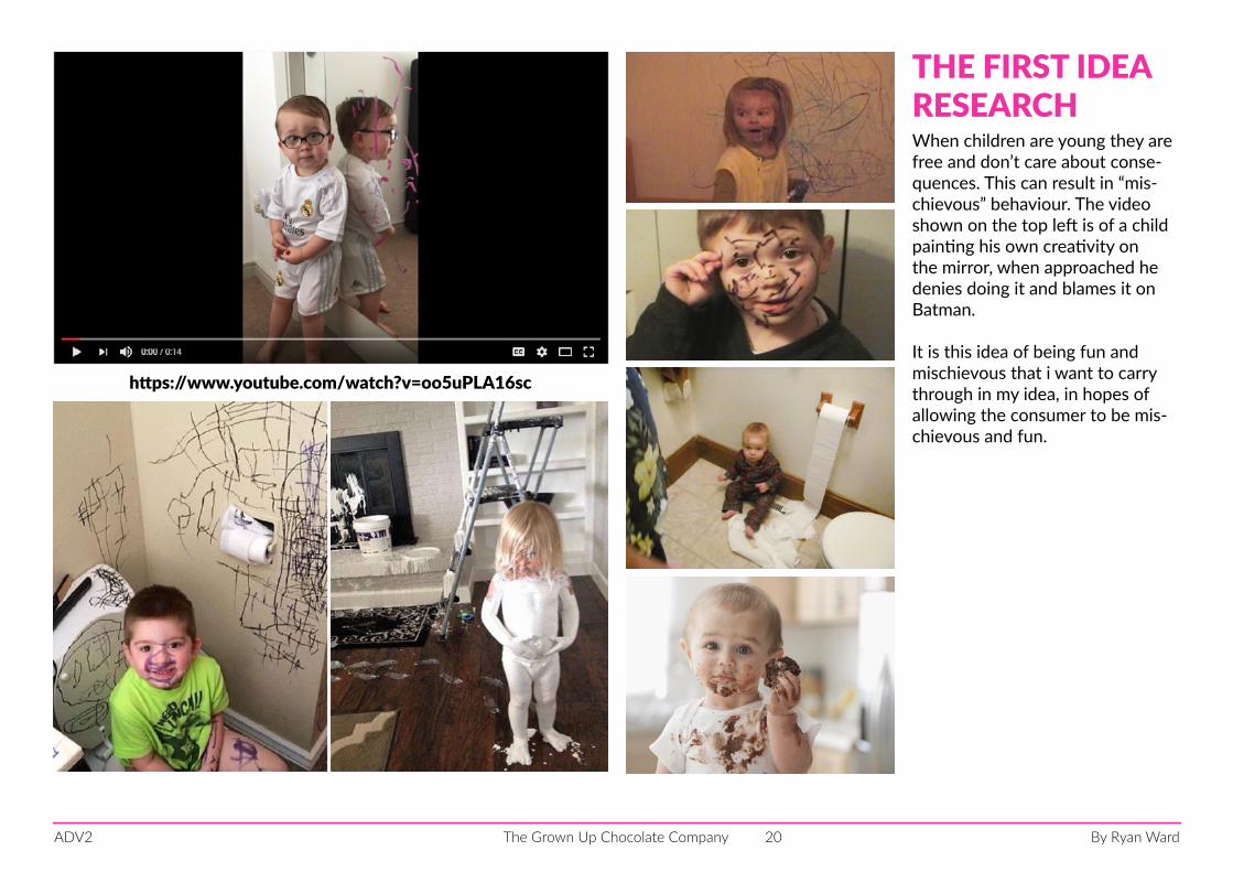
https://www.youtube.com/watch?v=oo5uPLA16sc
When children are young they are free and don’t care about conse-quences. This can result in “mis-chievous” behaviour. The video shown on the top left is of a child painting his own creativity on the mirror, when approached he denies doing it and blames it on Batman.
It is this idea of being fun and mischievous that i want to carry through in my idea, in hopes of allowing the consumer to be mis-chievous and fun.
THE FIRST IDEARESEARCH

By Ryan WardThe Grown Up Chocolate CompanyADV2 21
The first design idea is of a hand painting chocolate on the wall, like my past research suggested chil-dren do.
The actual look of the design hasnt turned out how i wanted it to look, as the chocolate may not look realistic.
More importantly there is just a motivational message for the idea, and not a full experience.
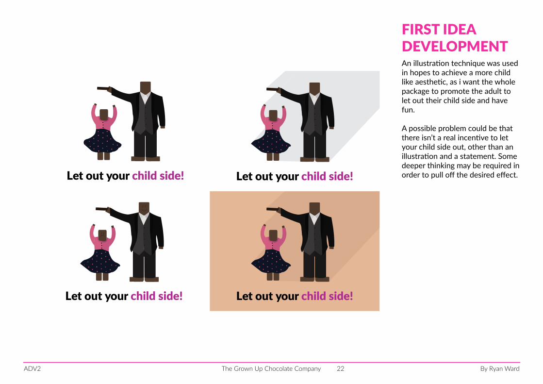
FIRST IDEADEVELOPMENT
By Ryan WardThe Grown Up Chocolate CompanyADV2 22
Let out your child side!
Let out your child side!
Let out your child side!
Let out your child side!
An illustration technique was used in hopes to achieve a more child like aesthetic, as i want the whole package to promote the adult to let out their child side and have fun.
A possible problem could be that there isn’t a real incentive to let your child side out, other than an illustration and a statement. Some deeper thinking may be required in order to pull off the desired effect.
FIRST IDEADEVELOPMENT
By Ryan WardThe Grown Up Chocolate CompanyADV2 23
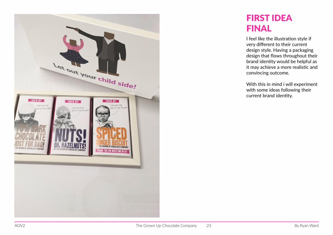
I feel like the illustration style if very different to their current design style. Having a packaging design that flows throughout their brand identity would be helpful as it may achieve a more realistic and convincing outcome.
With this in mind i will experiment with some ideas following their current brand identity.
FIRST IDEAFINAL
By Ryan WardThe Grown Up Chocolate CompanyADV2 24
“You’re not old enough to be watching this!”
“Cover your ears, you cant be listening to that.”
“You will learn about that when you are older.”
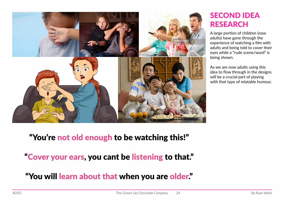
A large portion of children (now adults) have gone through the experience of watching a film with adults and being told to cover their eyes while a “rude scene/word” is being shown.
As we are now adults using this idea to flow through in the designs will be a crucial part of playing with that type of relatable humour.
SECOND IDEARESEARCH
By Ryan WardThe Grown Up Chocolate CompanyADV2 25
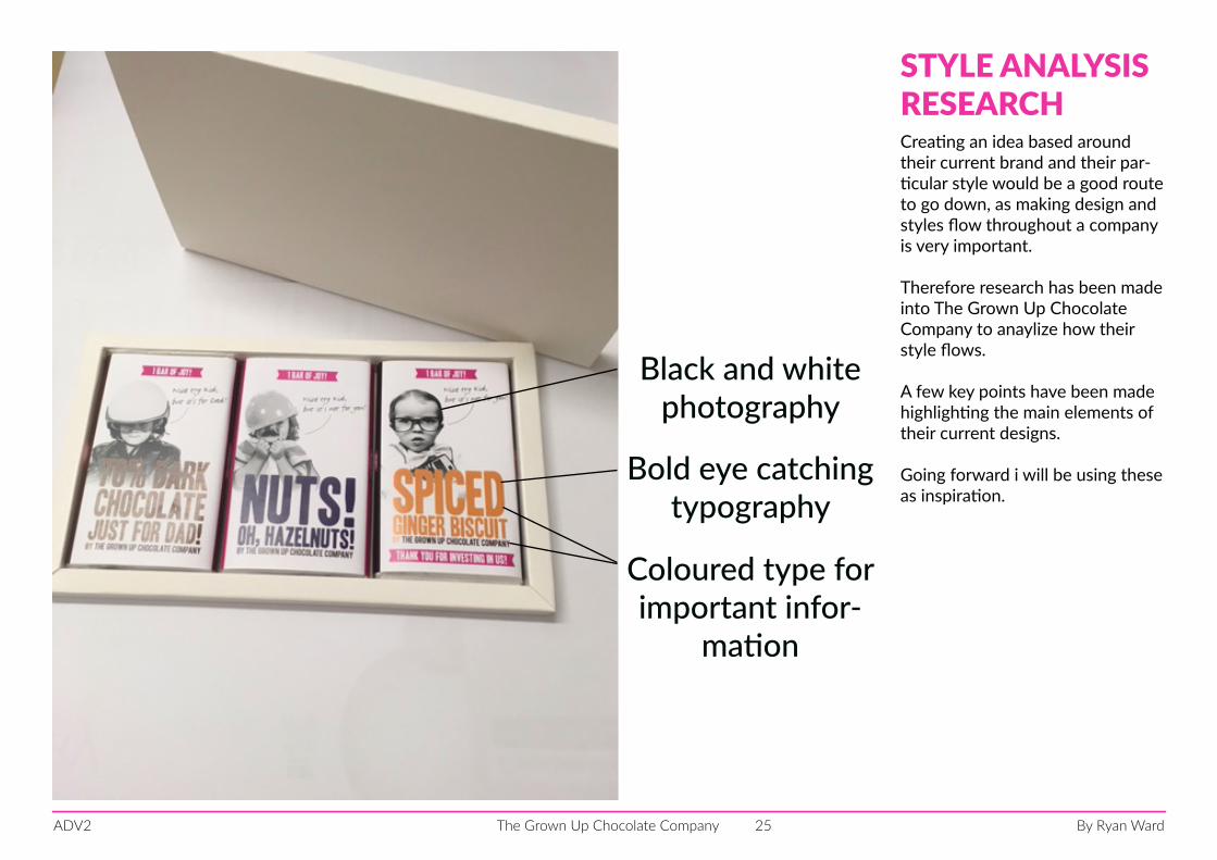
Creating an idea based around their current brand and their par-ticular style would be a good route to go down, as making design and styles flow throughout a company is very important.
Therefore research has been made into The Grown Up Chocolate Company to anaylize how their style flows.
A few key points have been made highlighting the main elements of their current designs.
Going forward i will be using these as inspiration.
STYLE ANALYSISRESEARCH
Black and white photography
Bold eye catching typography
Coloured type for important infor-
mation
By Ryan WardThe Grown Up Chocolate CompanyADV2 26
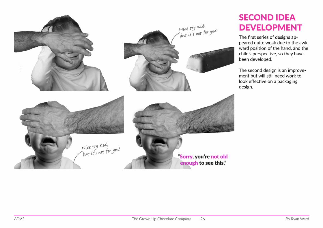
The first series of designs ap-peared quite weak due to the awk-ward position of the hand, and the child’s perspective, so they have been developed.
The second design is an improve-ment but will still need work to look effective on a packaging design.
SECOND IDEA DEVELOPMENT
By Ryan WardThe Grown Up Chocolate CompanyADV2 27
Sorry, you’re not old enough to see this.
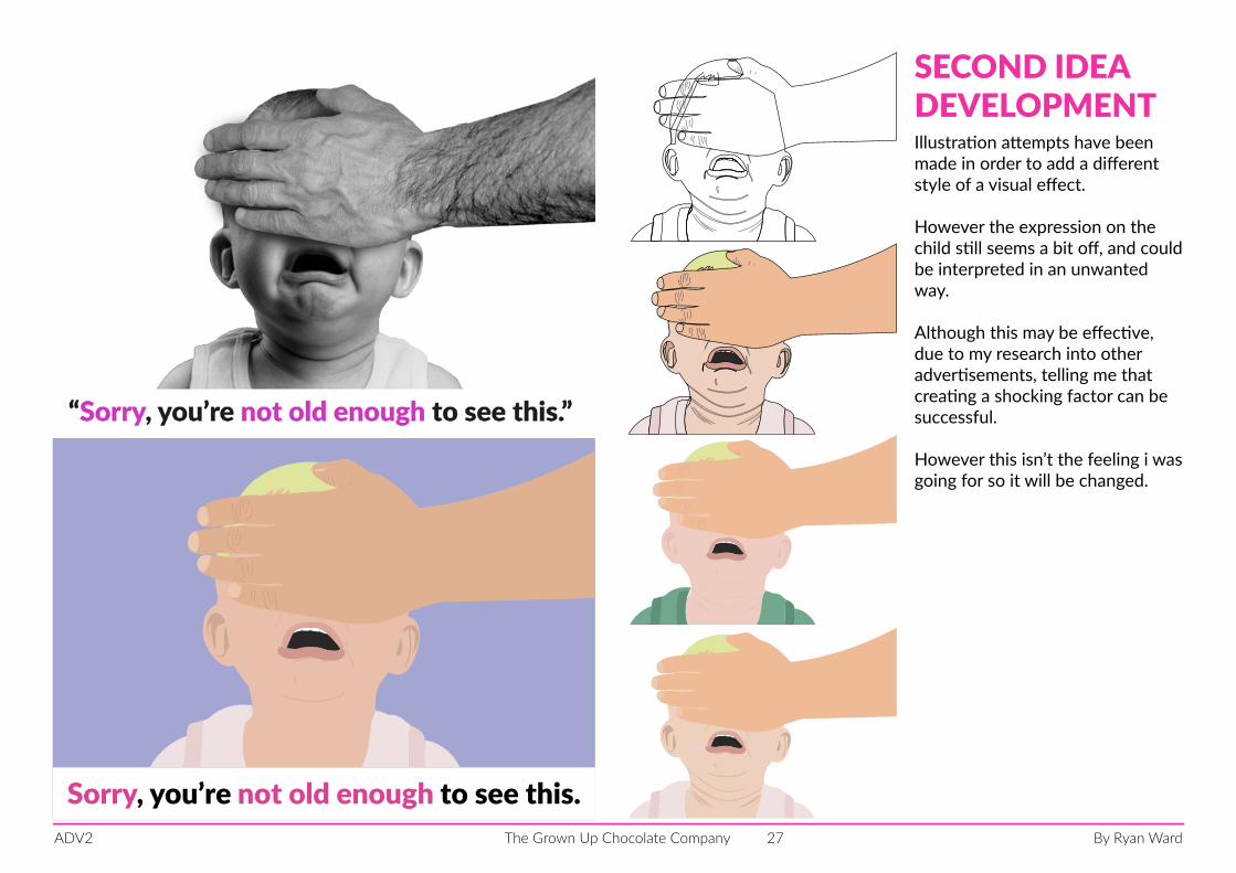
Illustration attempts have been made in order to add a different style of a visual effect.
However the expression on the child still seems a bit off, and could be interpreted in an unwanted way.
Although this may be effective, due to my research into other advertisements, telling me that creating a shocking factor can be successful.
However this isn’t the feeling i was going for so it will be changed.
SECOND IDEADEVELOPMENT
By Ryan WardThe Grown Up Chocolate CompanyADV2 28
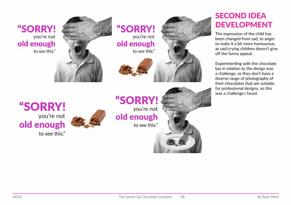
The expression of the child has been changed from sad, to anger to make it a bit more humourous, as sad/crying children doesn’t give off the funny appeal.
Experimenting with the chocolate bar in relation to the design was a challenge, as they don’t have a diverse range of photography of their chocolates that are suitable for professional designs, so this was a challenge i faced.
SECOND IDEADEVELOPMENT
By Ryan WardThe Grown Up Chocolate CompanyADV2 29
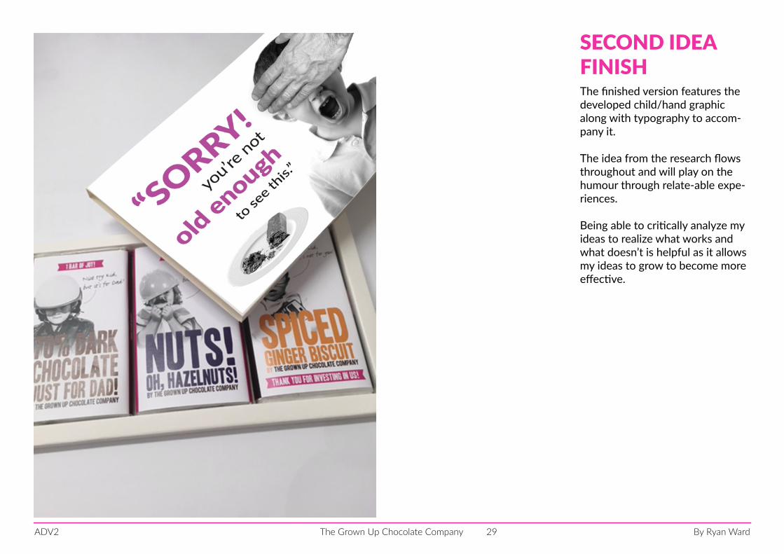
The finished version features the developed child/hand graphic along with typography to accom-pany it.
The idea from the research flows throughout and will play on the humour through relate-able expe-riences.
Being able to critically analyze my ideas to realize what works and what doesn’t is helpful as it allows my ideas to grow to become more effective.
SECOND IDEAFINISH
By Ryan WardThe Grown Up Chocolate CompanyADV2 30
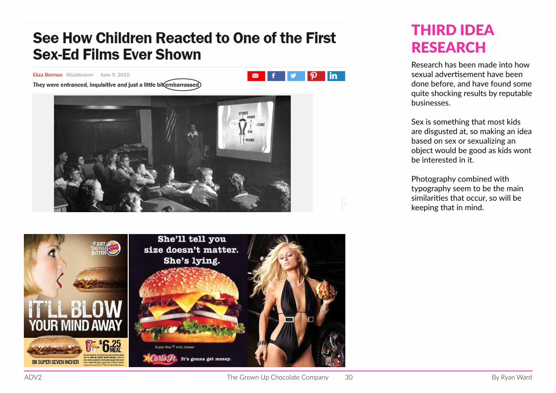
Research has been made into how sexual advertisement have been done before, and have found some quite shocking results by reputable businesses.
Sex is something that most kids are disgusted at, so making an idea based on sex or sexualizing an object would be good as kids wont be interested in it.
Photography combined with typography seem to be the main similarities that occur, so will be keeping that in mind.
THIRD IDEARESEARCH
By Ryan WardThe Grown Up Chocolate CompanyADV2 31
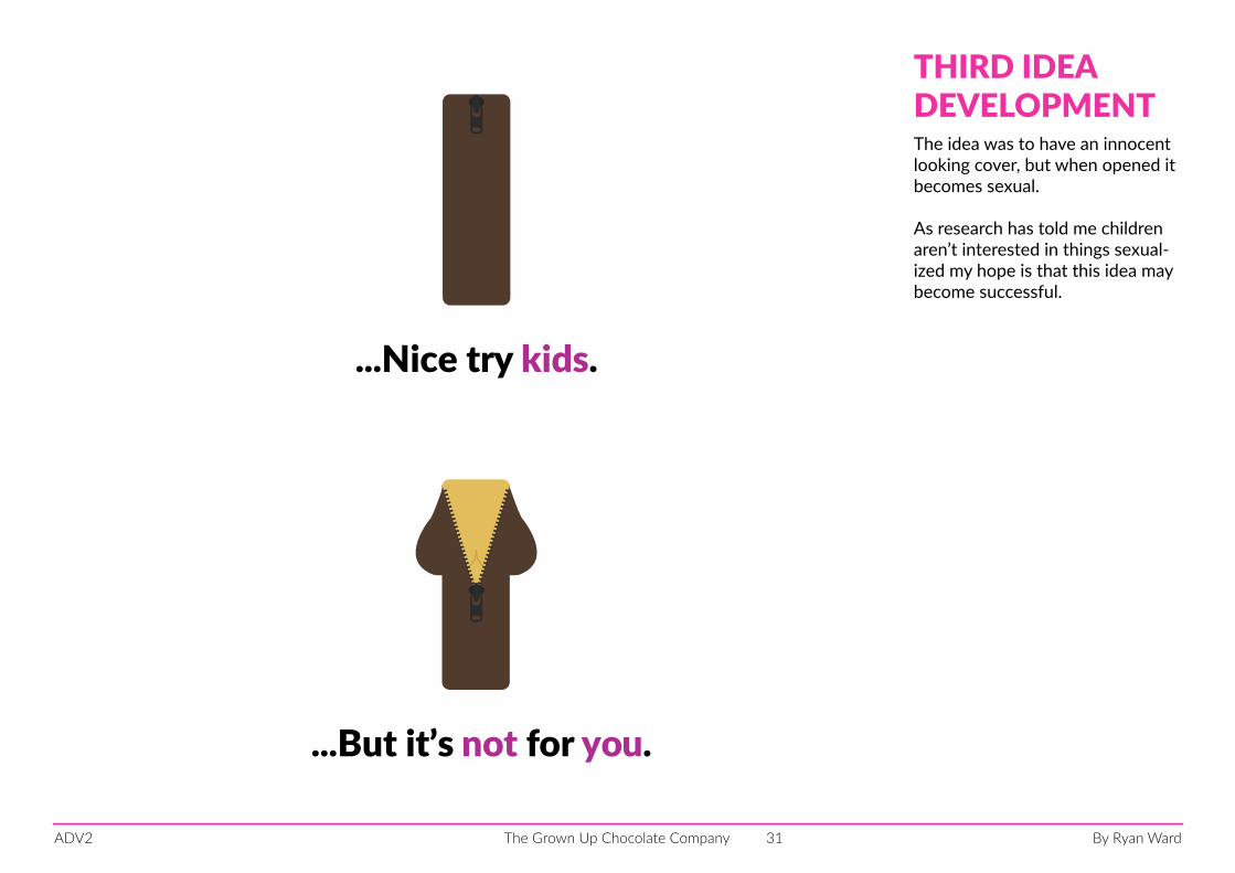
...Nice try kids.
...But it’s not for you.
The idea was to have an innocent looking cover, but when opened it becomes sexual.
As research has told me children aren’t interested in things sexual-ized my hope is that this idea may become successful.
THIRD IDEADEVELOPMENT
By Ryan WardThe Grown Up Chocolate CompanyADV2 32
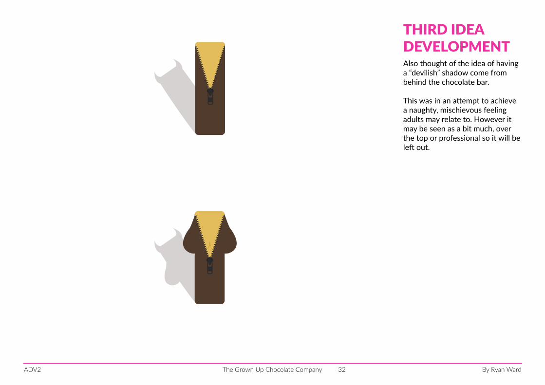
Also thought of the idea of having a “devilish” shadow come from behind the chocolate bar.
This was in an attempt to achieve a naughty, mischievous feeling adults may relate to. However it may be seen as a bit much, over the top or professional so it will be left out.
THIRD IDEADEVELOPMENT
By Ryan WardThe Grown Up Chocolate CompanyADV2 33
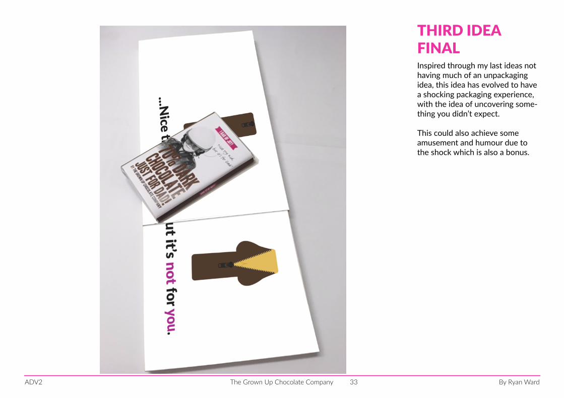
Inspired through my last ideas not having much of an unpackaging idea, this idea has evolved to have a shocking packaging experience, with the idea of uncovering some-thing you didn’t expect.
This could also achieve some amusement and humour due to the shock which is also a bonus.
THIRD IDEAFINAL
By Ryan WardThe Grown Up Chocolate CompanyADV2 34
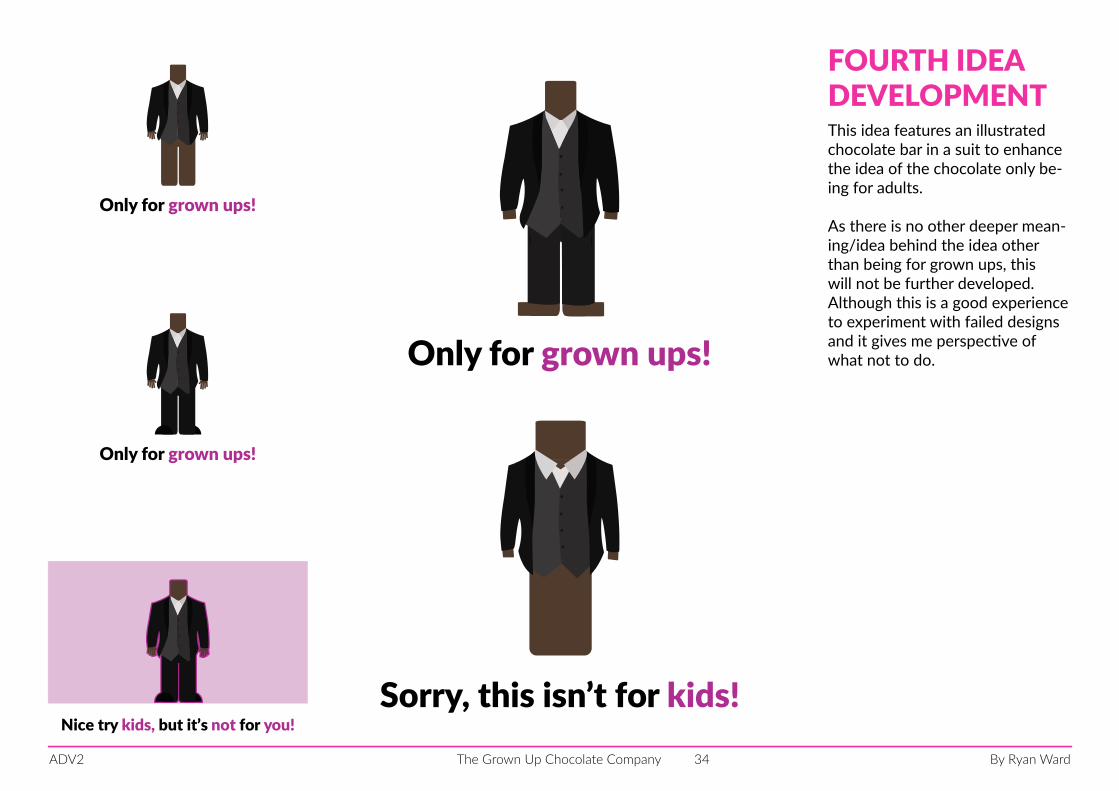
Only for grown ups!
Only for grown ups!
Only for grown ups!
Sorry, this isn’t for kids!Nice try kids, but it’s not for you!
This idea features an illustrated chocolate bar in a suit to enhance the idea of the chocolate only be-ing for adults.
As there is no other deeper mean-ing/idea behind the idea other than being for grown ups, this will not be further developed. Although this is a good experience to experiment with failed designs and it gives me perspective of what not to do.
FOURTH IDEADEVELOPMENT
By Ryan WardThe Grown Up Chocolate CompanyADV2 35
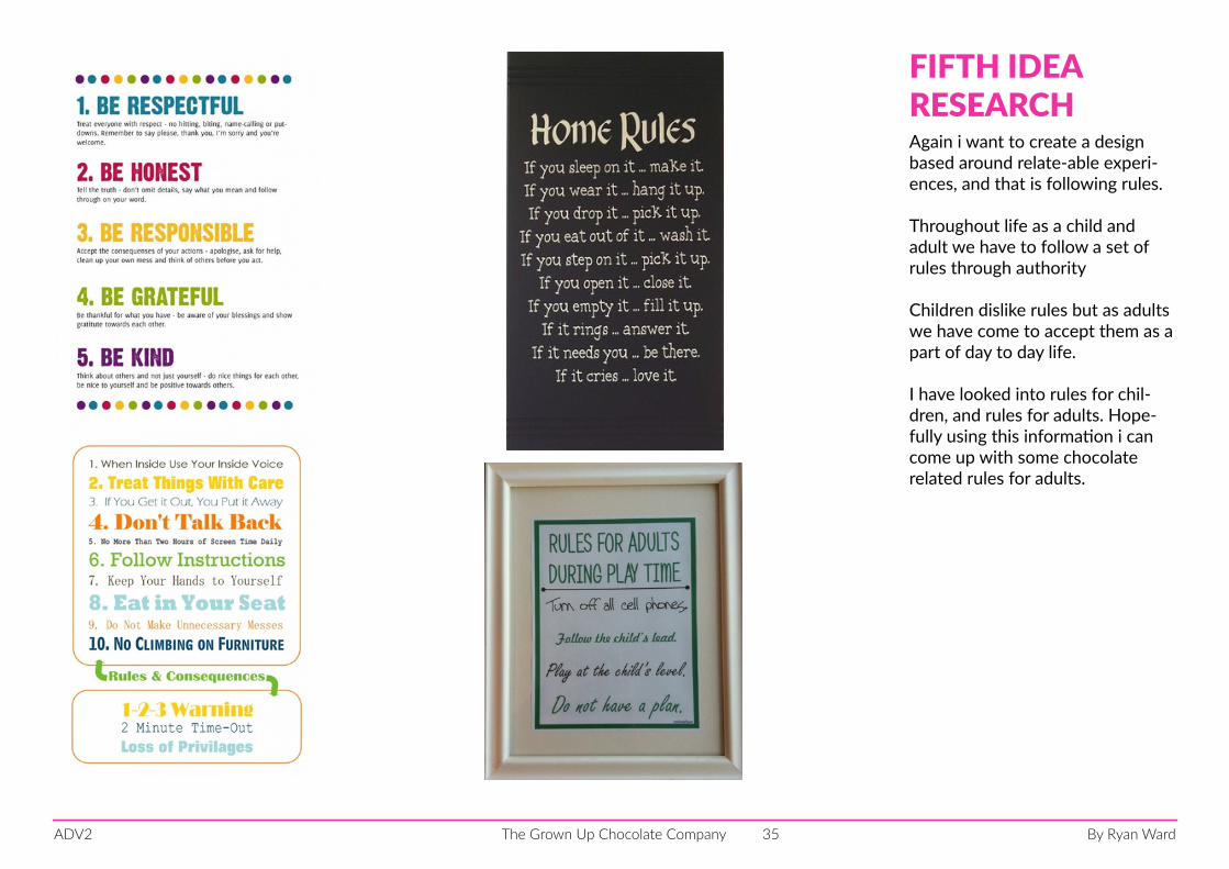
Again i want to create a design based around relate-able experi-ences, and that is following rules.
Throughout life as a child and adult we have to follow a set of rules through authority
Children dislike rules but as adults we have come to accept them as a part of day to day life.
I have looked into rules for chil-dren, and rules for adults. Hope-fully using this information i can come up with some chocolate related rules for adults.
FIFTH IDEARESEARCH
By Ryan WardThe Grown Up Chocolate CompanyADV2 36
Follow the rules!
1) DO NOT share this chocolate with anyone under 18.
2) DO eat sensibly and DO NOT make a mess.
3) DO NOT paint this chocolate on your wall/siblings.
Follow the rules!
DO NOT share THIS CHOCOLATE WITHANYONE under 18.
DO EAT sensibly AND DO NOT MAKE A mess.
DO NOT paint THIS CHOCOLATE ONYOUR wall/siblings.
IF YOU DO MAKE A MESS BLAME IT ON BATMAN.
Follow the rules!
DO NOT share THIS CHOCOLATE WITHANYONE under 18.
DO EAT sensibly AND DO NOT MAKE A mess.
DO NOT paint THIS CHOCOLATE ONYOUR wall/siblings.
IF YOU DO MAKE A MESS BLAME IT ON BATMAN.
Follow the rules!
DO NOT share THIS CHOCOLATE WITH ANYONE under 18.
DO EAT sensibly AND DO NOT MAKE A mess.
DO NOT paint THIS CHOCOLATE ON YOUR
wall/siblings.
IF YOU DO MAKE A MESS BLAME IT ON BATMAN.
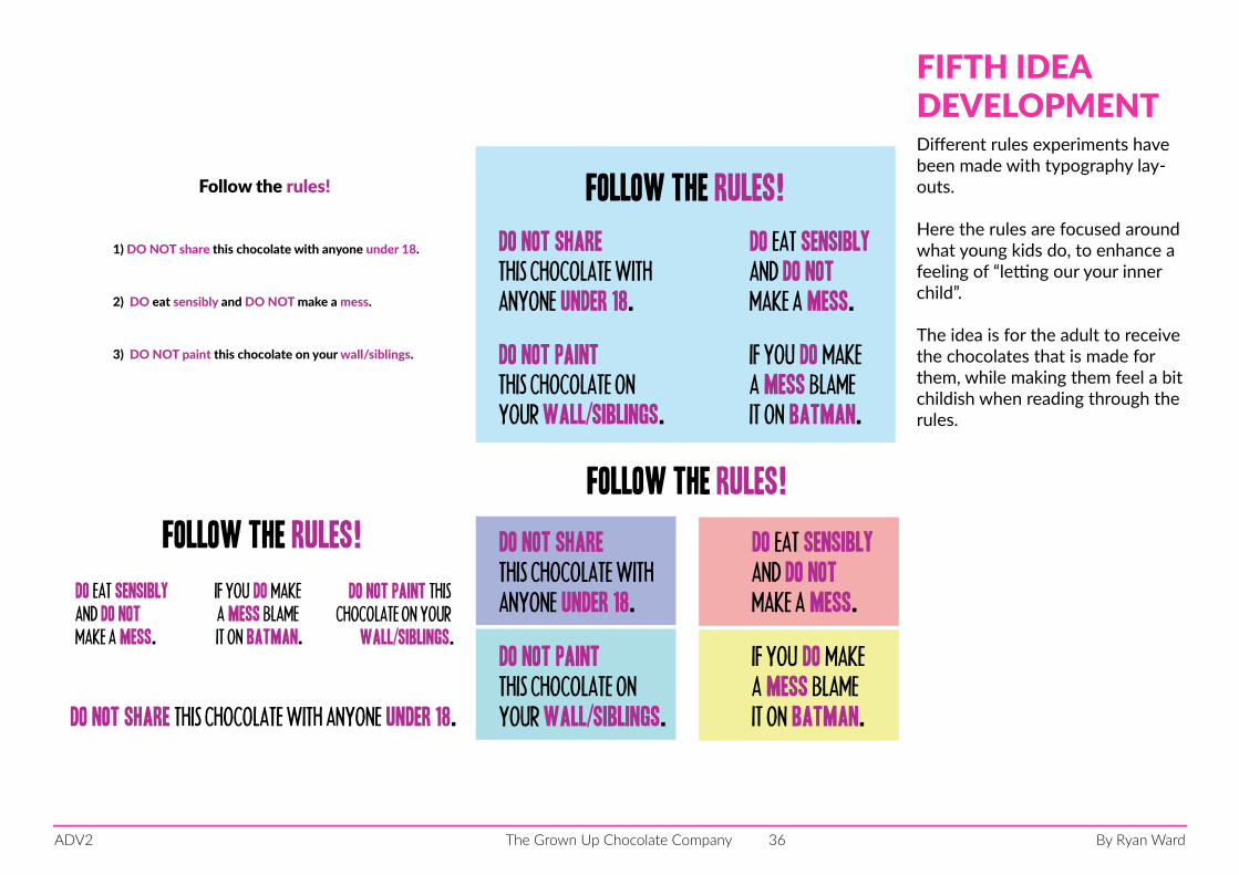
Different rules experiments have been made with typography lay-outs.
Here the rules are focused around what young kids do, to enhance a feeling of “letting our your inner child”.
The idea is for the adult to receive the chocolates that is made for them, while making them feel a bit childish when reading through the rules.
FIFTH IDEADEVELOPMENT
By Ryan WardThe Grown Up Chocolate CompanyADV2 37
DO NOT share with anyone under 18.
DO eat sensibly and DO NOT make a mess.
DO NOT paint chocolate on your wall/siblings.
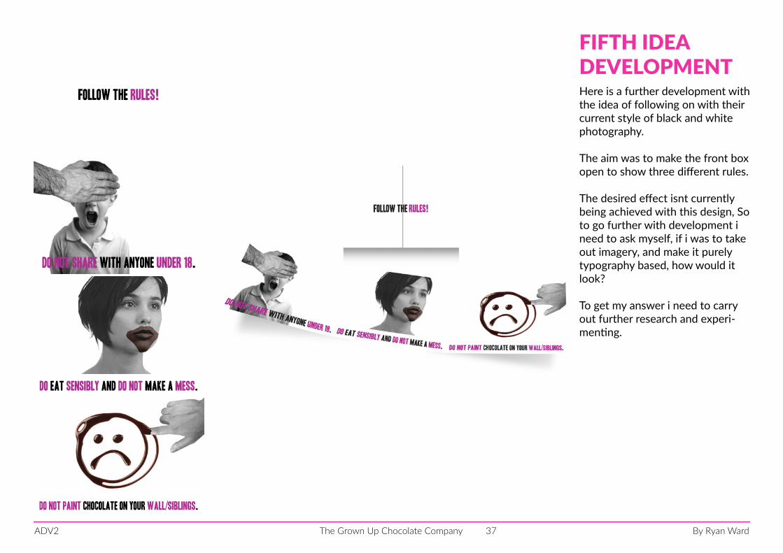
Follow the rules! Here is a further development with the idea of following on with their current style of black and white photography.
The aim was to make the front box open to show three different rules.
The desired effect isnt currently being achieved with this design, So to go further with development i need to ask myself, if i was to take out imagery, and make it purely typography based, how would it look?
To get my answer i need to carry out further research and experi-menting.
FIFTH IDEADEVELOPMENT
By Ryan WardThe Grown Up Chocolate CompanyADV2 38
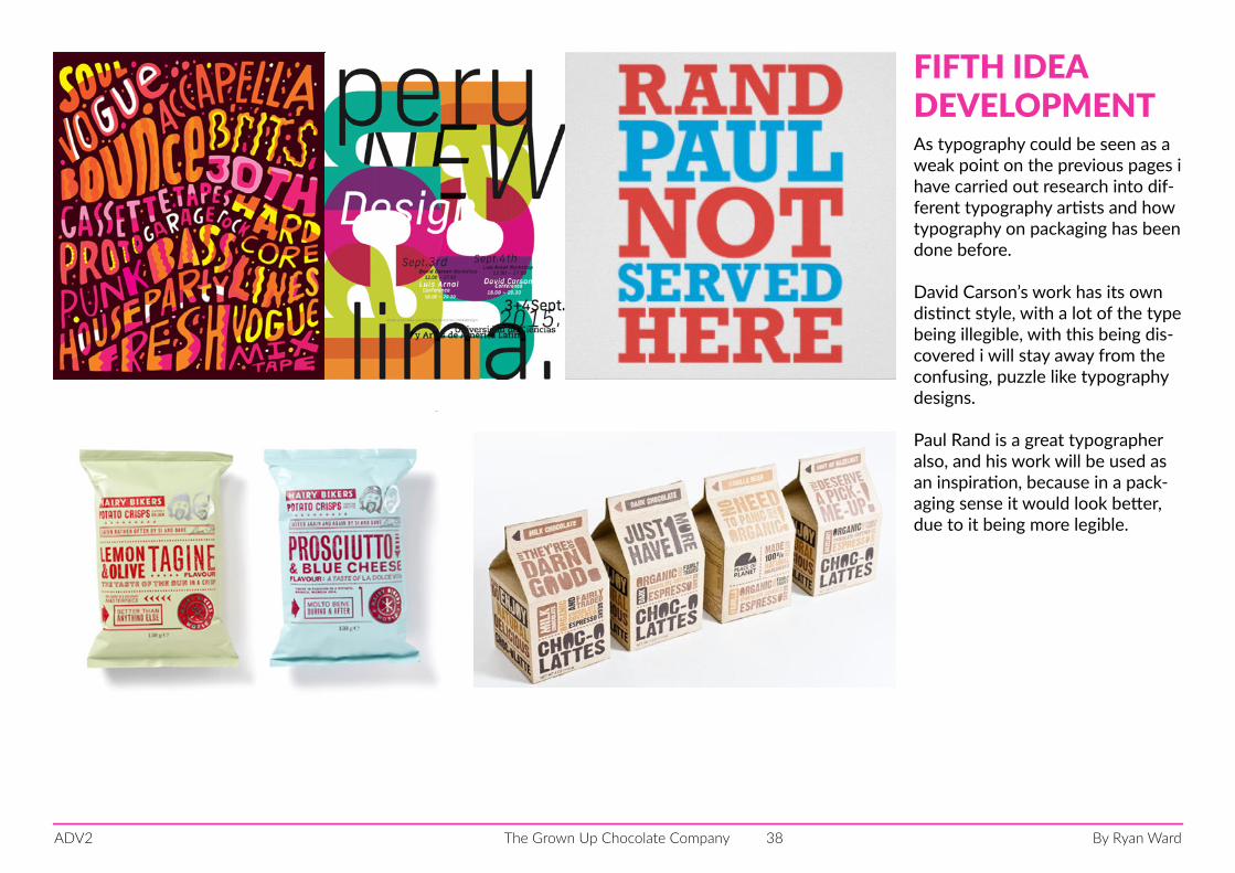
As typography could be seen as a weak point on the previous pages i have carried out research into dif-ferent typography artists and how typography on packaging has been done before.
David Carson’s work has its own distinct style, with a lot of the type being illegible, with this being dis-covered i will stay away from the confusing, puzzle like typography designs.
Paul Rand is a great typographer also, and his work will be used as an inspiration, because in a pack-aging sense it would look better, due to it being more legible.
FIFTH IDEADEVELOPMENT
By Ryan WardThe Grown Up Chocolate CompanyADV2 39
Follow the rules!
DO NOT share THIS CHOCOLATE WITH ANYONE under 18.
DO EAT
MAKE A MESS BLAME IT ON
MAKE ADO NOTDOIF YOU
BATMANON YOUR wall/siblings
DO NOT paint THIS
CHOCOLATE
sensibly
mess
Follow the rules
DO NOTMake a mess
DO NOT paint thisChocolateon your wall/siblings
if you
DOmake a mess blame it on
BATMANDO NOT share this chocolate with anyone under 18.
DOEat sensibly
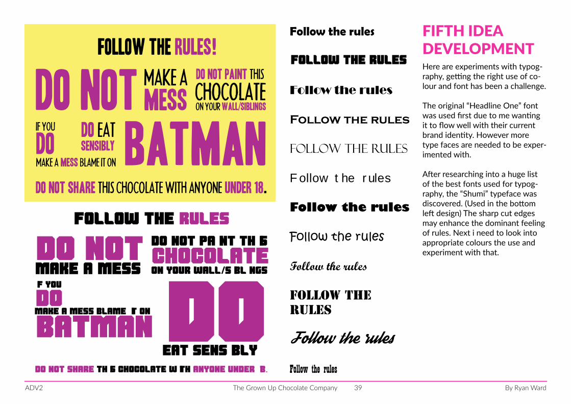
Here are experiments with typog-raphy, getting the right use of co-lour and font has been a challenge.
The original “Headline One” font was used first due to me wanting it to flow well with their current brand identity. However more type faces are needed to be exper-imented with.
After researching into a huge list of the best fonts used for typog-raphy, the “Shumi” typeface was discovered. (Used in the bottom left design) The sharp cut edges may enhance the dominant feeling of rules. Next i need to look into appropriate colours the use and experiment with that.
FIFTH IDEADEVELOPMENT
Follow the rules
Follow the rules
Follow the rules
Follow the rules
Follow the rules
Follow the rules
Follow the rules
Follow the rules
Follow the rules
Follow the rules
Follow the rulesFollow the rules
By Ryan WardThe Grown Up Chocolate CompanyADV2 40
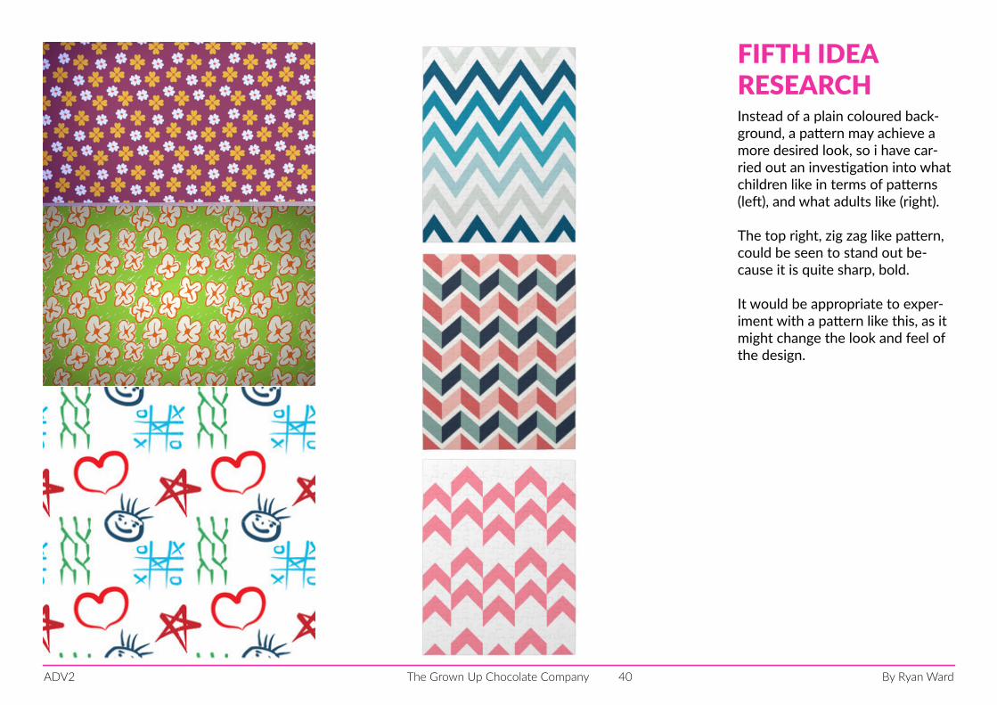
Instead of a plain coloured back-ground, a pattern may achieve a more desired look, so i have car-ried out an investigation into what children like in terms of patterns (left), and what adults like (right).
The top right, zig zag like pattern, could be seen to stand out be-cause it is quite sharp, bold.
It would be appropriate to exper-iment with a pattern like this, as it might change the look and feel of the design.
FIFTH IDEARESEARCH
By Ryan WardThe Grown Up Chocolate CompanyADV2 41
Follow the rules
1.DO NOTmAKE AMESS.
2.DO notshare with anykids.
3.DO notpaintchocolateon wall.
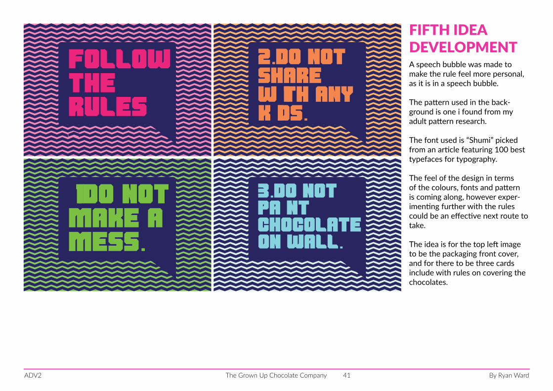
A speech bubble was made to make the rule feel more personal, as it is in a speech bubble.
The pattern used in the back-ground is one i found from my adult pattern research.
The font used is “Shumi” picked from an article featuring 100 best typefaces for typography.
The feel of the design in terms of the colours, fonts and pattern is coming along, however exper-imenting further with the rules could be an effective next route to take.
The idea is for the top left image to be the packaging front cover, and for there to be three cards include with rules on covering the chocolates.
FIFTH IDEADEVELOPMENT
By Ryan WardThe Grown Up Chocolate CompanyADV2 42
1.eat firstchocolatewith a cupof tea.
3.eat lastwhen youare
your emails.checking
2.eat next is playing.
favouritemovie
while your
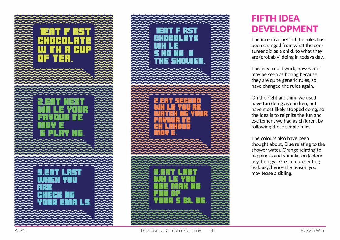
The incentive behind the rules has been changed from what the con-sumer did as a child, to what they are (probably) doing in todays day.
This idea could work, however it may be seen as boring because they are quite generic rules, so i have changed the rules again.
On the right are thing we used have fun doing as children, but have most likely stopped doing, so the idea is to reignite the fun and excitement we had as children, by following these simple rules.
The colours also have been thought about, Blue relating to the shower water. Orange relating to happiness and stimulation (colour psychology). Green representing jealousy, hence the reason you may tease a sibling.
FIFTH IDEADEVELOPMENT1.eat first
while singing inthe shower.
chocolate
2.eat secondwhile you’re watching yourfavouritechildhoodmovie.
3.eat lastwhile youare makingfun of your sibling.
By Ryan WardThe Grown Up Chocolate CompanyADV2 43
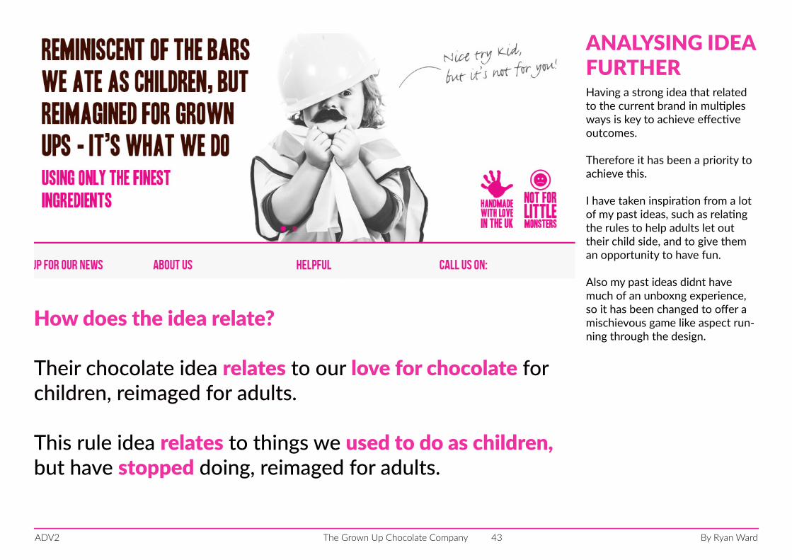
Having a strong idea that related to the current brand in multiples ways is key to achieve effective outcomes.
Therefore it has been a priority to achieve this.
I have taken inspiration from a lot of my past ideas, such as relating the rules to help adults let out their child side, and to give them an opportunity to have fun.
Also my past ideas didnt have much of an unboxng experience, so it has been changed to offer a mischievous game like aspect run-ning through the design.
ANALYSING IDEA FURTHER
How does the idea relate?
Their chocolate idea relates to our love for chocolate for children, reimaged for adults.
This rule idea relates to things we used to do as children, but have stopped doing, reimaged for adults.
By Ryan WardThe Grown Up Chocolate CompanyADV2 44
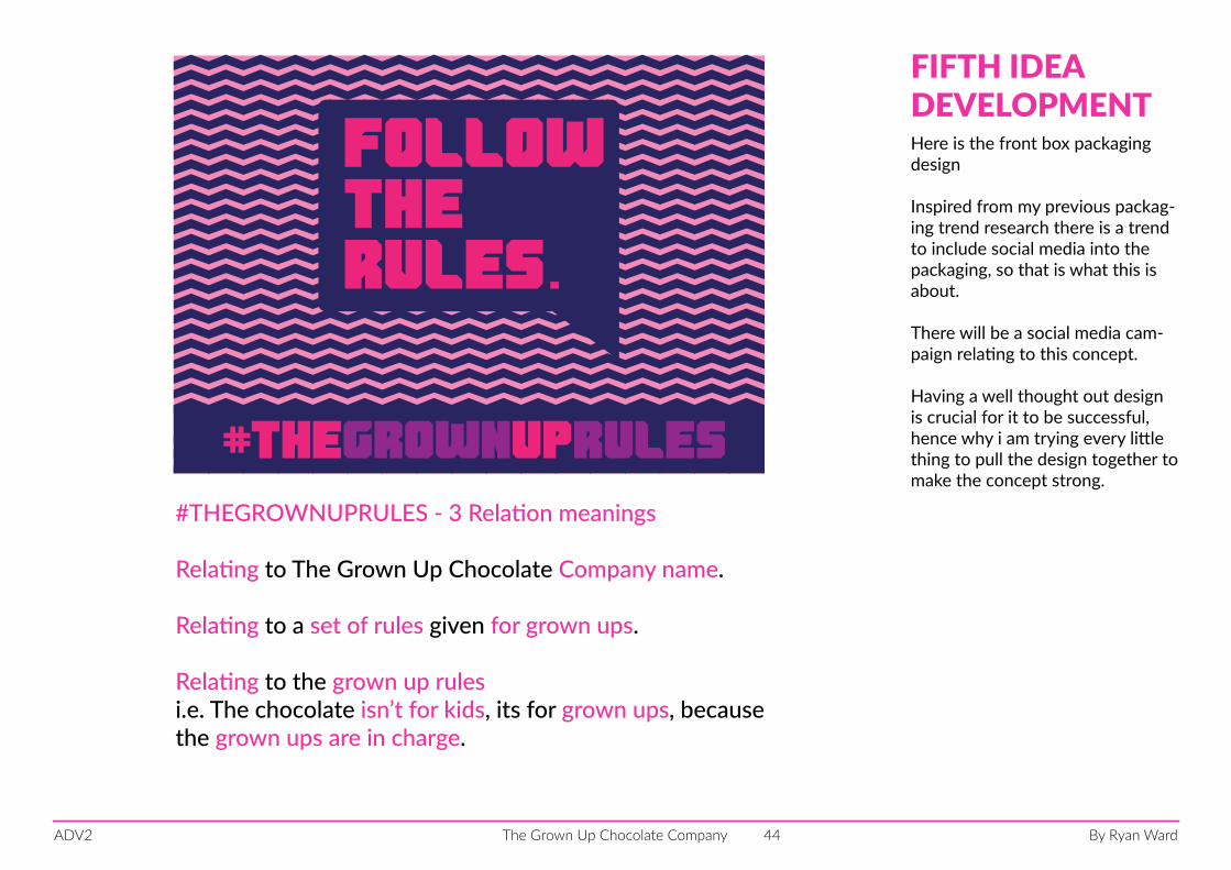
Followthe rules.
#thegrownuprules
Here is the front box packaging design
Inspired from my previous packag-ing trend research there is a trend to include social media into the packaging, so that is what this is about.
There will be a social media cam-paign relating to this concept.
Having a well thought out design is crucial for it to be successful, hence why i am trying every little thing to pull the design together to make the concept strong.
FIFTH IDEADEVELOPMENT
#THEGROWNUPRULES - 3 Relation meanings
Relating to The Grown Up Chocolate Company name.
Relating to a set of rules given for grown ups.
Relating to the grown up rules i.e. The chocolate isn’t for kids, its for grown ups, because the grown ups are in charge.
By Ryan WardThe Grown Up Chocolate CompanyADV2 45
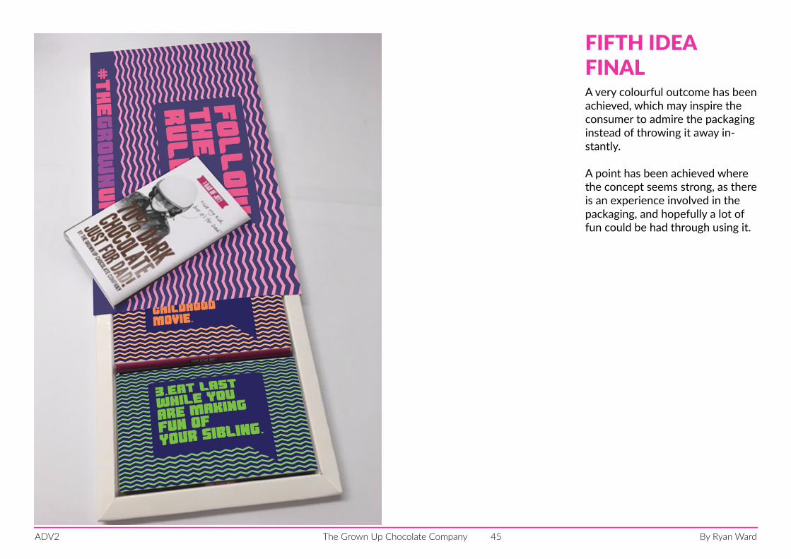
A very colourful outcome has been achieved, which may inspire the consumer to admire the packaging instead of throwing it away in-stantly.
A point has been achieved where the concept seems strong, as there is an experience involved in the packaging, and hopefully a lot of fun could be had through using it.
FIFTH IDEAFINAL
By Ryan WardThe Grown Up Chocolate CompanyADV2 46
Follow the rules.
#thegrownuprules
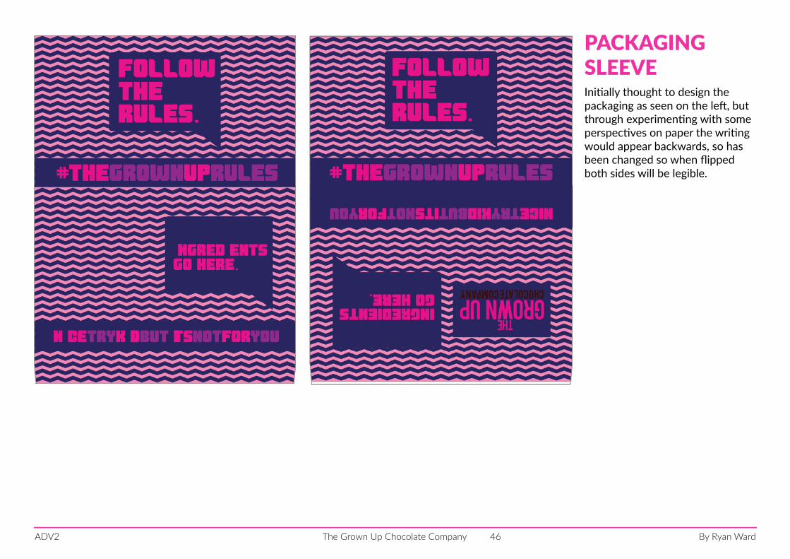
ingredientsgo here.
nicetrykidbutitsnotforyou
Initially thought to design the packaging as seen on the left, but through experimenting with some perspectives on paper the writing would appear backwards, so has been changed so when flipped both sides will be legible.
PACKAGING SLEEVE
By Ryan WardThe Grown Up Chocolate CompanyADV2 47
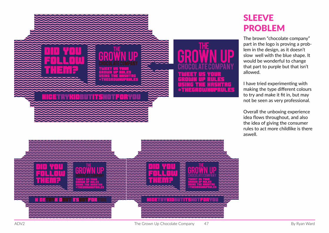
nicetrykidbutitsnotforyou
The brown “chocolate company” part in the logo is proving a prob-lem in the design, as it doesn’t slow well with the blue shape. It would be wonderful to change that part to purple but that isn’t allowed.
I have tried experimenting with making the type different colours to try and make it fit in, but may not be seen as very professional.
Overall the unboxing experience idea flows throughout, and also the idea of giving the consumer rules to act more childlike is there aswell.
SLEEVEPROBLEM
By Ryan WardThe Grown Up Chocolate CompanyADV2 48
photo of printed packaging, or on other page
By Ryan WardThe Grown Up Chocolate CompanyADV2 49
landing page
By Ryan WardThe Grown Up Chocolate CompanyADV2 50
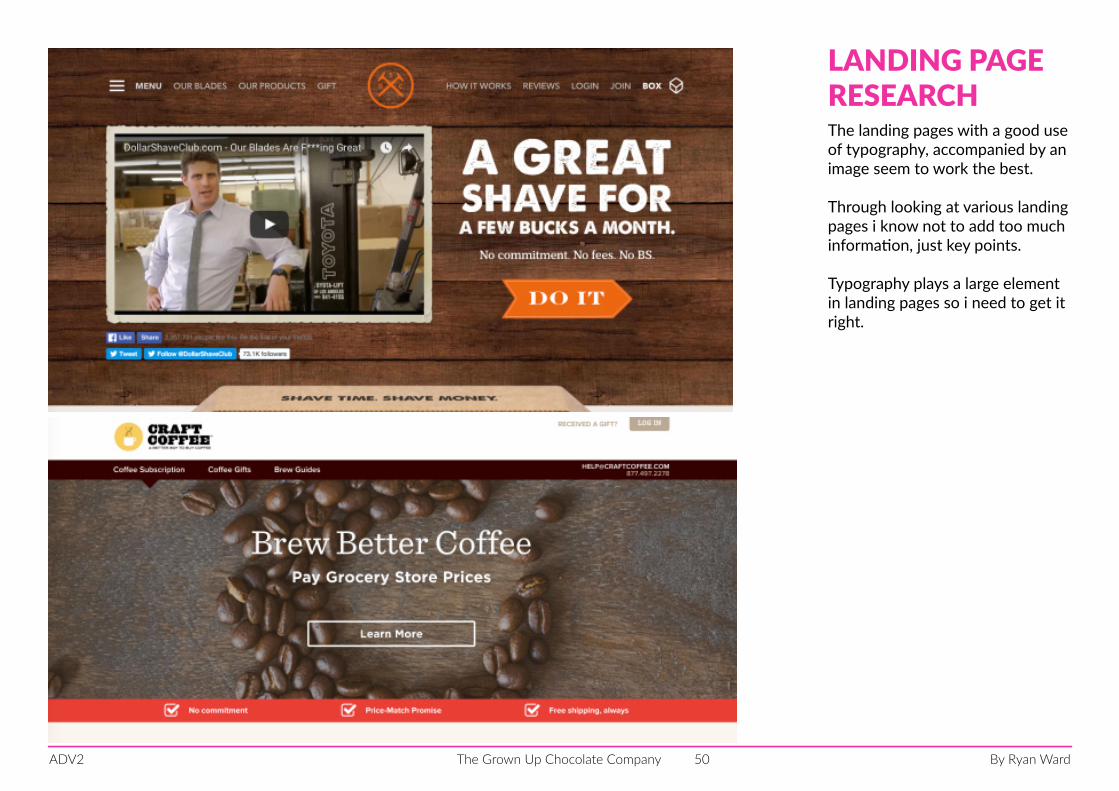
The landing pages with a good use of typography, accompanied by an image seem to work the best.
Through looking at various landing pages i know not to add too much information, just key points.
Typography plays a large element in landing pages so i need to get it right.
LANDING PAGERESEARCH
By Ryan WardThe Grown Up Chocolate CompanyADV2 51
H
PAPERPROTOTYPING
By Ryan WardThe Grown Up Chocolate CompanyADV2 52
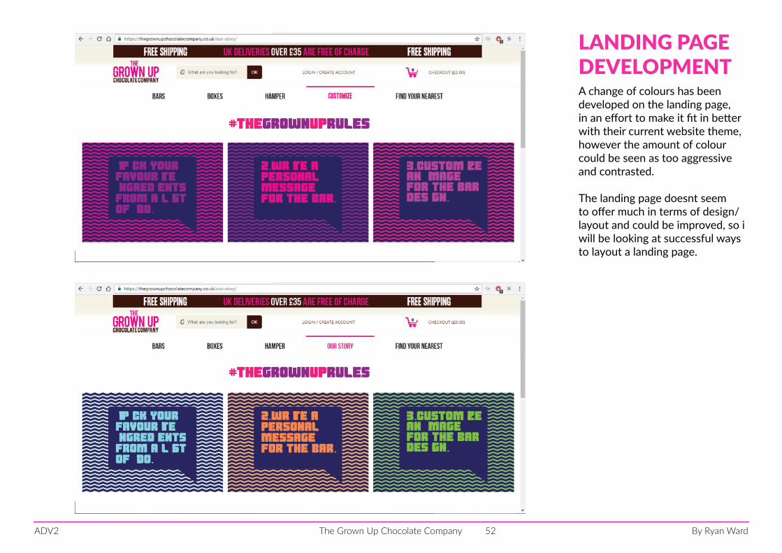
A change of colours has been developed on the landing page, in an effort to make it fit in better with their current website theme, however the amount of colour could be seen as too aggressive and contrasted.
The landing page doesnt seem to offer much in terms of design/layout and could be improved, so i will be looking at successful ways to layout a landing page.
LANDING PAGEDEVELOPMENT
#thegrownuprules
2.write a personalmessage for the bar.
1.Pick your
ingredientsfrom a listof 100.
favourite3.customizean imagefor the bar design.
Customize
#thegrownuprules
2.write a personalmessage for the bar.
1.Pick your
ingredientsfrom a listof 100.
favourite3.customizean imagefor the bar design.
By Ryan WardThe Grown Up Chocolate CompanyADV2 53
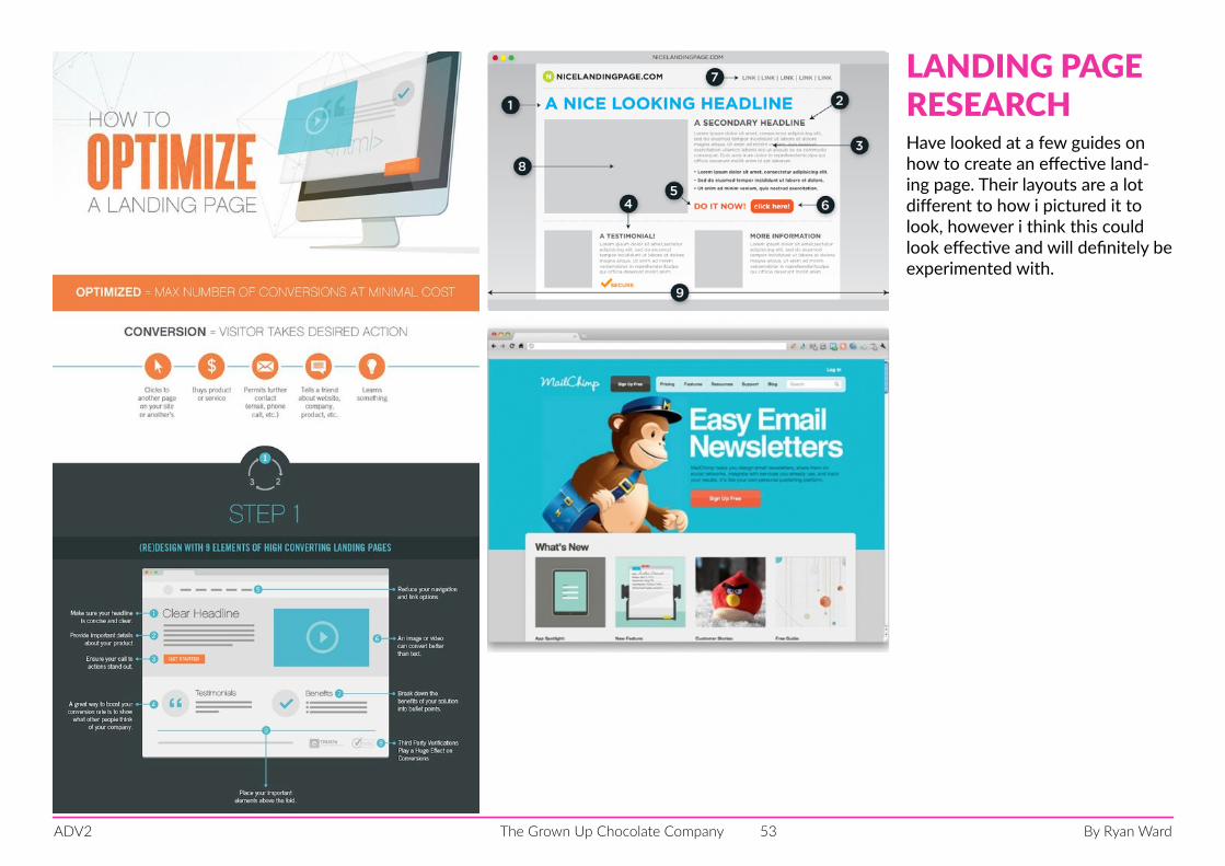
Have looked at a few guides on how to create an effective land-ing page. Their layouts are a lot different to how i pictured it to look, however i think this could look effective and will definitely be experimented with.
LANDING PAGERESEARCH
By Ryan WardThe Grown Up Chocolate CompanyADV2 54
#thegrownuprulesDO YOU RULE your chocolate?
2.write a personalmessage for the bar.
1.Pick your
ingredientsfrom a listof 100.
favourite3.customizean imagefor the bar design.
find out more on our twitter page @thegrownupchocs
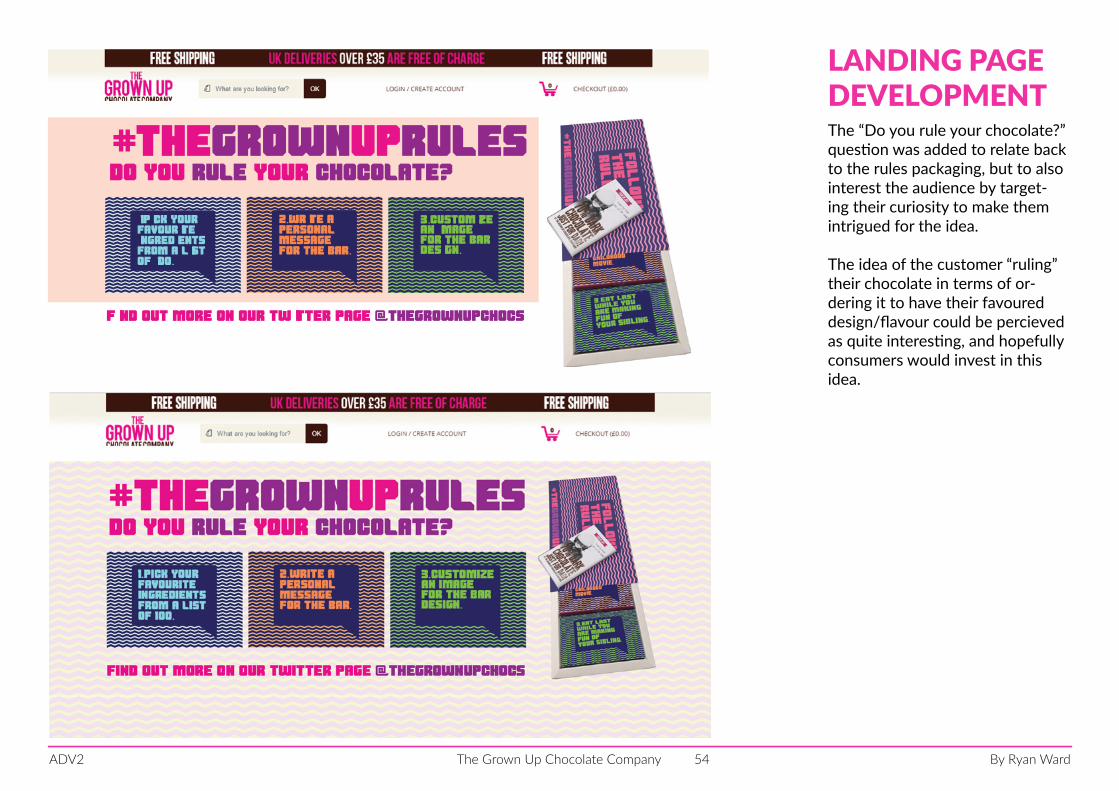
The “Do you rule your chocolate?” question was added to relate back to the rules packaging, but to also interest the audience by target-ing their curiosity to make them intrigued for the idea.
The idea of the customer “ruling” their chocolate in terms of or-dering it to have their favoured design/flavour could be percieved as quite interesting, and hopefully consumers would invest in this idea.
LANDING PAGEDEVELOPMENT
By Ryan WardThe Grown Up Chocolate CompanyADV2 55
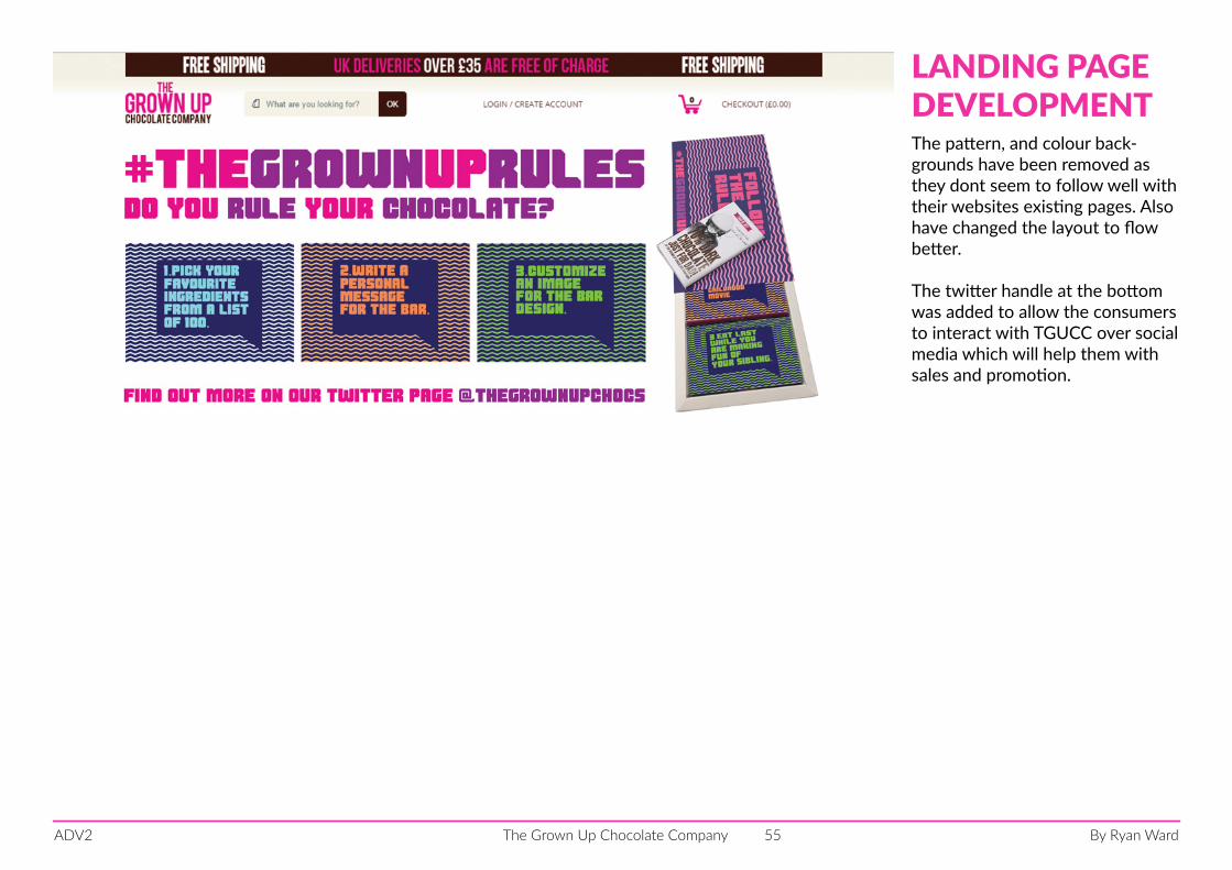
The pattern, and colour back-grounds have been removed as they dont seem to follow well with their websites existing pages. Also have changed the layout to flow better.
The twitter handle at the bottom was added to allow the consumers to interact with TGUCC over social media which will help them with sales and promotion.
LANDING PAGE DEVELOPMENT
By Ryan WardThe Grown Up Chocolate CompanyADV2 56
promotional material
By Ryan WardThe Grown Up Chocolate CompanyADV2 57
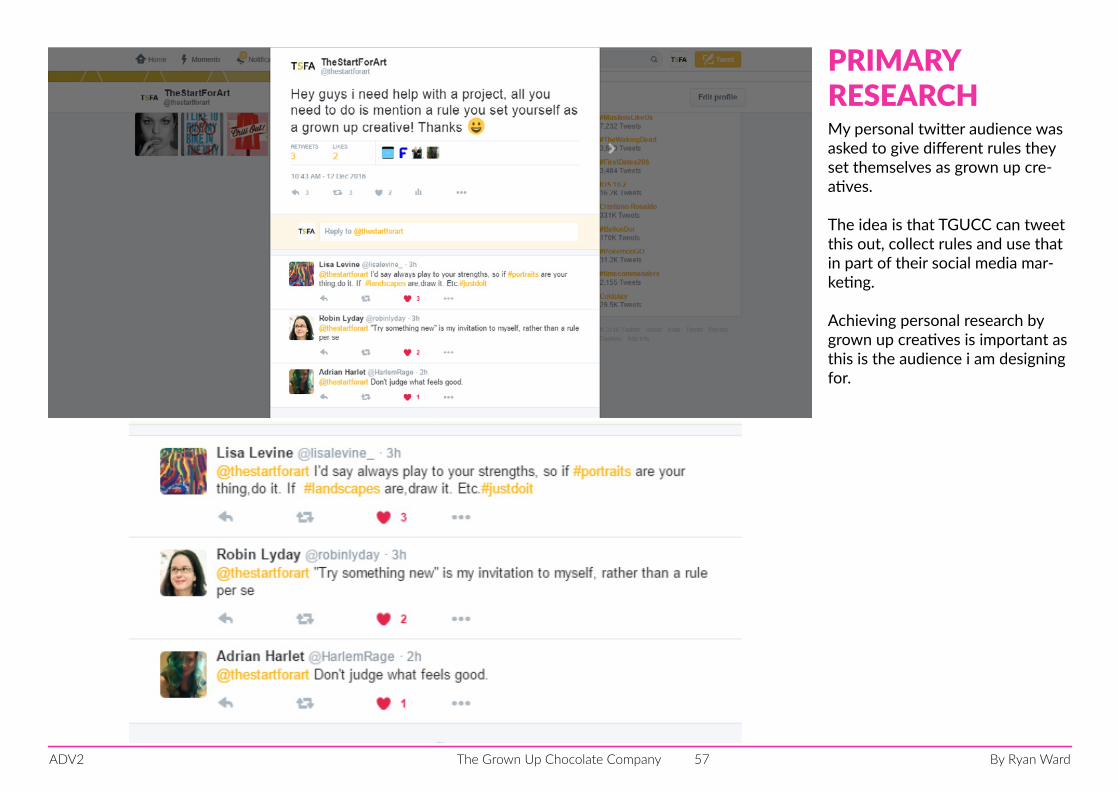
PRIMARYRESEARCHMy personal twitter audience was asked to give different rules they set themselves as grown up cre-atives.
The idea is that TGUCC can tweet this out, collect rules and use that in part of their social media mar-keting.
Achieving personal research by grown up creatives is important as this is the audience i am designing for.
By Ryan WardThe Grown Up Chocolate CompanyADV2 58
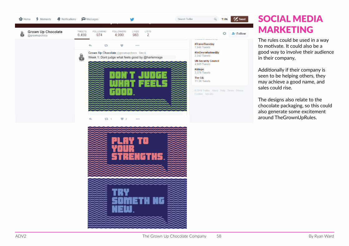
don’t judgewhat feelsgood.
Week 1: Dont judge what feels good by @harlemrage
don’t judgewhat feelsgood.
Week 1: Dont judge what feels good by @harlemrage
trysomethingnew.
play toyourstrengths.
SOCIAL MEDIAMARKETINGThe rules could be used in a way to motivate. It could also be a good way to involve their audience in their company,
Additionally if their company is seen to be helping others, they may achieve a good name, and sales could rise.
The designs also relate to the chocolate packaging, so this could also generate some excitement around TheGrownUpRules.
By Ryan WardThe Grown Up Chocolate CompanyADV2 59
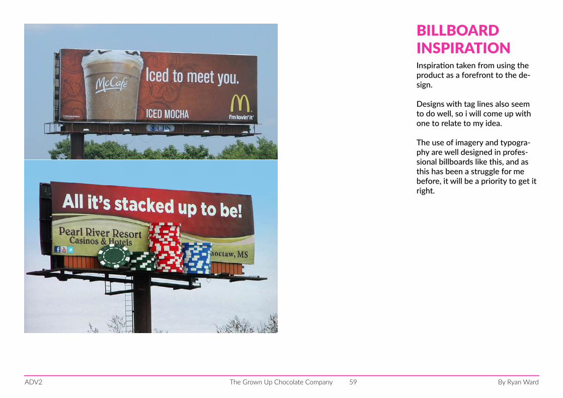
BILLBOARDINSPIRATIONInspiration taken from using the product as a forefront to the de-sign.
Designs with tag lines also seem to do well, so i will come up with one to relate to my idea.
The use of imagery and typogra-phy are well designed in profes-sional billboards like this, and as this has been a struggle for me before, it will be a priority to get it right.
By Ryan WardThe Grown Up Chocolate CompanyADV2 60
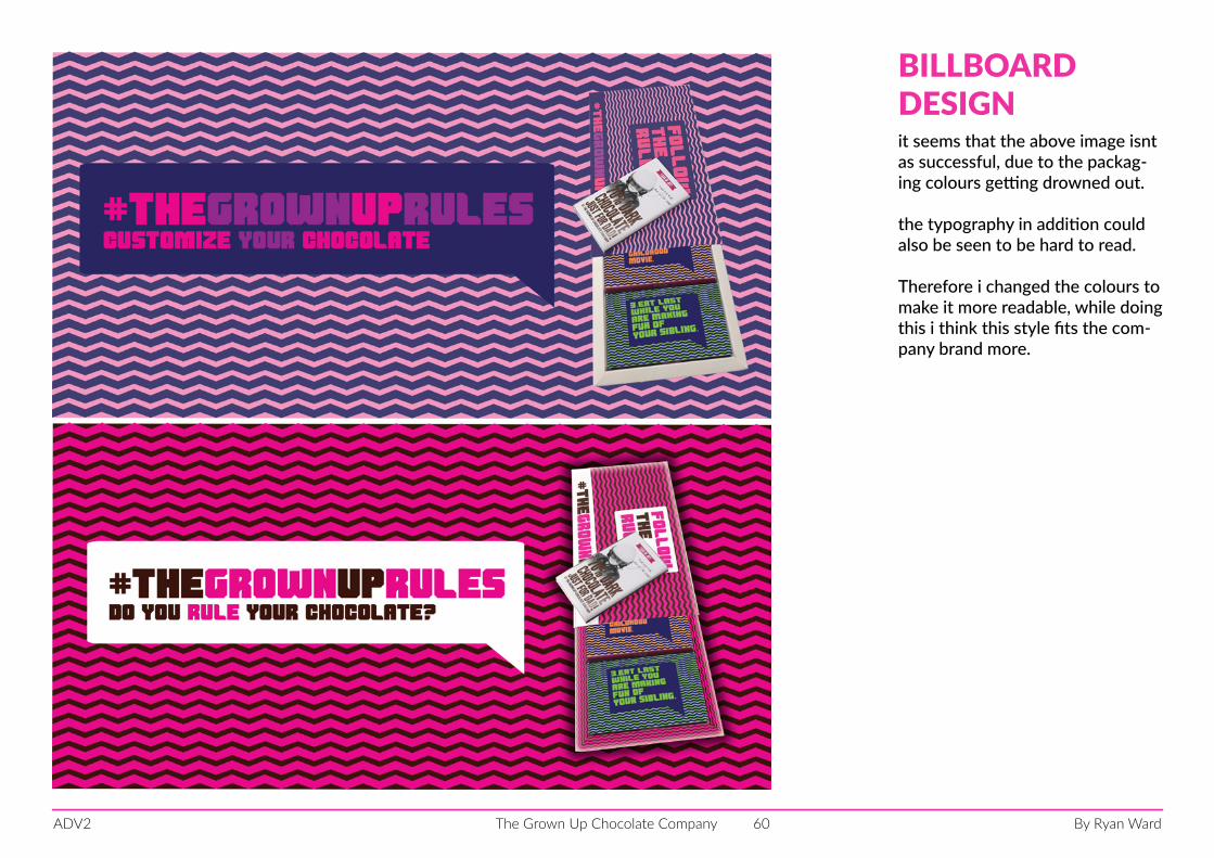
BILLBOARDDESIGNit seems that the above image isnt as successful, due to the packag-ing colours getting drowned out.
the typography in addition could also be seen to be hard to read.
Therefore i changed the colours to make it more readable, while doing this i think this style fits the com-pany brand more.
By Ryan WardThe Grown Up Chocolate CompanyADV2 61
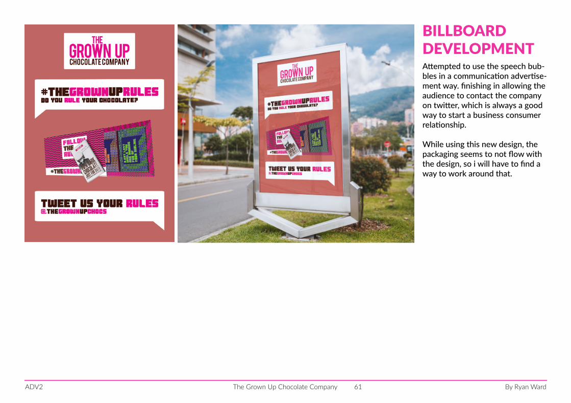
BILLBOARD DEVELOPMENTAttempted to use the speech bub-bles in a communication advertise-ment way. finishing in allowing the audience to contact the company on twitter, which is always a good way to start a business consumer relationship.
While using this new design, the packaging seems to not flow with the design, so i will have to find a way to work around that.
By Ryan WardThe Grown Up Chocolate CompanyADV2 62
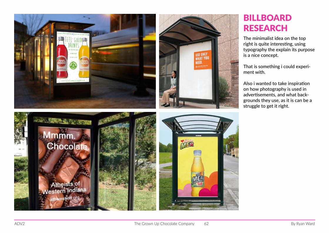
BILLBOARD RESEARCHThe minimalist idea on the top right is quite interesting, using typography the explain its purpose is a nice concept.
That is something i could experi-ment with.
Also i wanted to take inspiration on how photography is used in advertisements, and what back-grounds they use, as it is can be a struggle to get it right.
By Ryan WardThe Grown Up Chocolate CompanyADV2 63
What are your rules?
tweet them using #thegrownuprules
trysomethingnew.Don’tjudgewhatfeelsgood.
trysomethingnew.Don’tjudgewhatfeelsgood.
What are your rules?
tweet them using #thegrownuprules
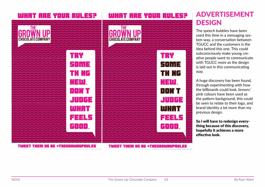
ADVERTISEMENTDESIGNThe speech bubbles have been used this time in a messaging sys-tem way, a conversation between TGUCC and the customers is the idea behind this one. This could subconsciously make young cre-ative people want to communicate with TGUCC more as the design is laid out in this communicating way.
A huge discovery has been found, through experimenting with how the billboards could look, brown/pink colours have been used as the pattern background, this could be seen to relate to their logo, and brand identity a lot more than my previous design.
So i will have to redesign every-thing because of this discovery, hopefully it achieves a more effective look.
By Ryan WardThe Grown Up Chocolate CompanyADV2 64
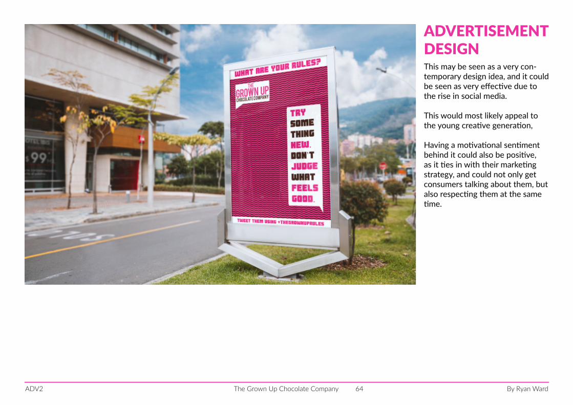
ADVERTISEMENTDESIGNThis may be seen as a very con-temporary design idea, and it could be seen as very effective due to the rise in social media.
This would most likely appeal to the young creative generation,
Having a motivational sentiment behind it could also be positive, as it ties in with their marketing strategy, and could not only get consumers talking about them, but also respecting them at the same time.
By Ryan WardThe Grown Up Chocolate CompanyADV2 65
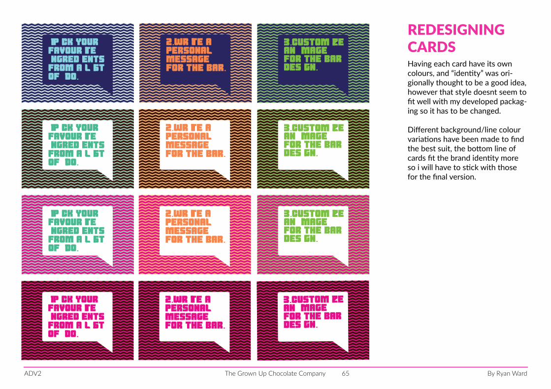
REDESIGNINGCARDSHaving each card have its own colours, and “identity” was ori-gionally thought to be a good idea, however that style doesnt seem to fit well with my developed packag-ing so it has to be changed.
Different background/line colour variations have been made to find the best suit, the bottom line of cards fit the brand identity more so i will have to stick with those for the final version.
2.write a personalmessage for the bar.
1.Pick your
ingredientsfrom a listof 100.
favourite3.customizean imagefor the bar design.
2.write a personalmessage for the bar.
1.Pick your
ingredientsfrom a listof 100.
favourite3.customizean imagefor the bar design.
2.write a personalmessage for the bar.
1.Pick your
ingredientsfrom a listof 100.
favourite3.customizean imagefor the bar design.
2.write a personalmessage for the bar.
1.Pick your
ingredientsfrom a listof 100.
favourite3.customizean imagefor the bar design.
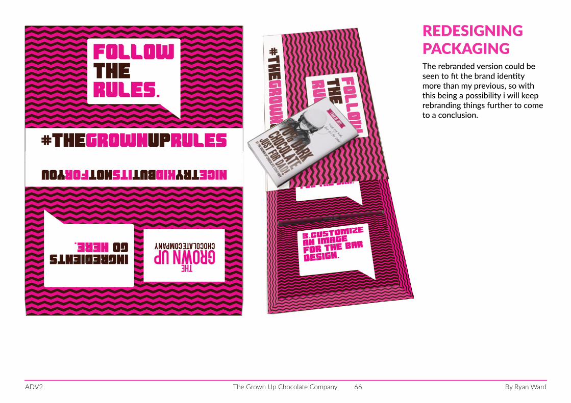
By Ryan WardThe Grown Up Chocolate CompanyADV2 66
REDESIGNINGPACKAGINGThe rebranded version could be seen to fit the brand identity more than my previous, so with this being a possibility i will keep rebranding things further to come to a conclusion.
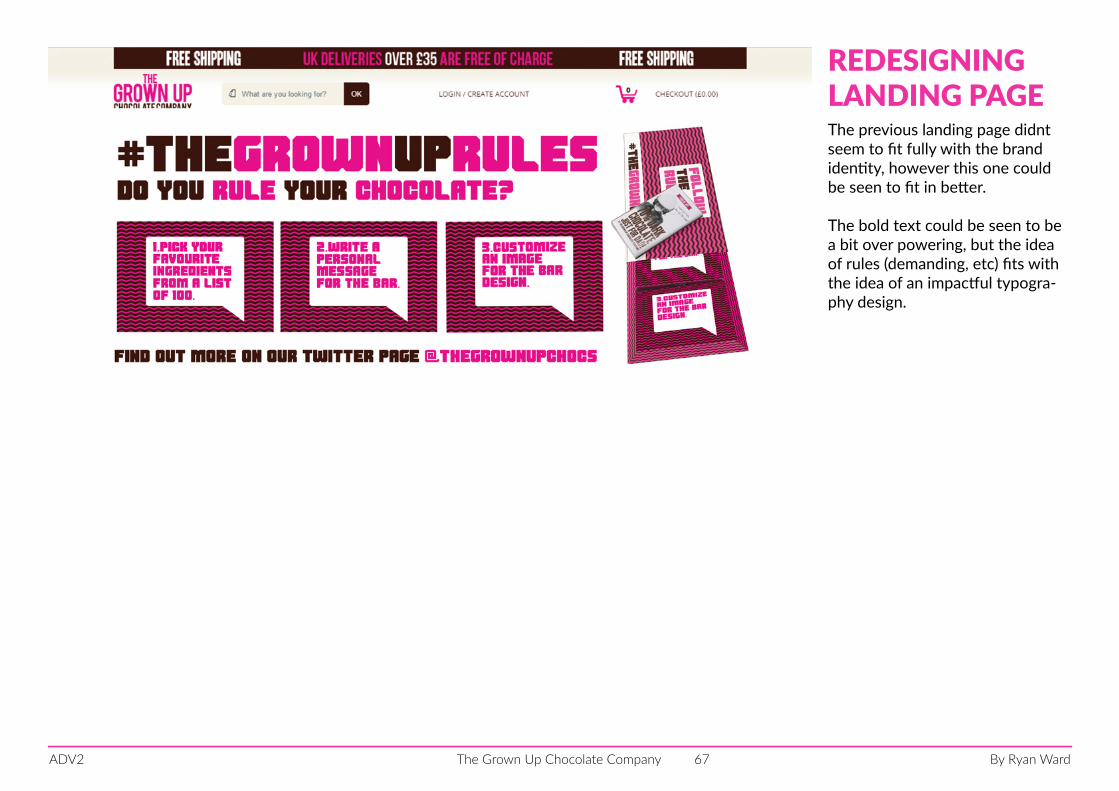
By Ryan WardThe Grown Up Chocolate CompanyADV2 67
REDESIGNINGLANDING PAGEThe previous landing page didnt seem to fit fully with the brand identity, however this one could be seen to fit in better.
The bold text could be seen to be a bit over powering, but the idea of rules (demanding, etc) fits with the idea of an impactful typogra-phy design.
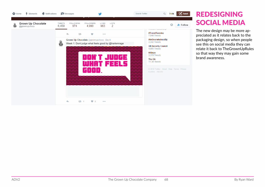
By Ryan WardThe Grown Up Chocolate CompanyADV2 68
don’t judgewhat feelsgood.
Week 1: Dont judge what feels good by @harlemrage
REDESIGNINGSOCIAL MEDIAThe new design may be more ap-preciated as it relates back to the packaging design, so when people see this on social media they can relate it back to TheGrownUpRules so that way they may gain some brand awareness.
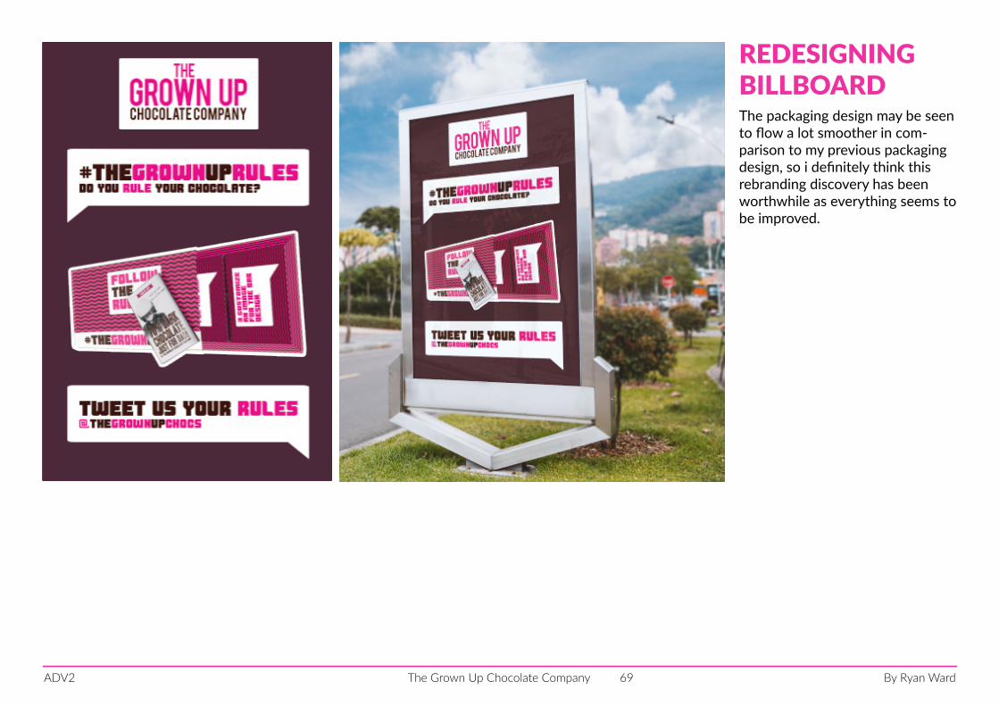
By Ryan WardThe Grown Up Chocolate CompanyADV2 69
REDESIGNINGBILLBOARDThe packaging design may be seen to flow a lot smoother in com-parison to my previous packaging design, so i definitely think this rebranding discovery has been worthwhile as everything seems to be improved.