Embed Size (px)
Citation preview
fonts
By Alex Bridgewood
Friday, 12 December 2014
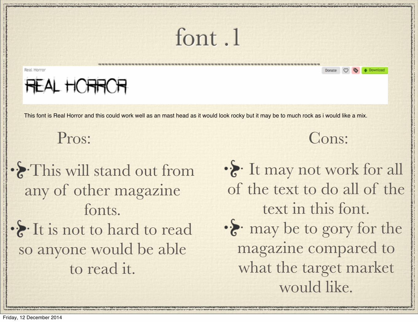
font .1
This font is Real Horror and this could work well as an mast head as it would look rocky but it may be to much rock as i would like a mix.
Pros: Cons:
This will stand out from any of other magazine
fonts.It is not to hard to read
so anyone would be able to read it.
It may not work for all of the text to do all of the
text in this font.may be to gory for the
magazine compared to what the target market
would like.
Friday, 12 December 2014
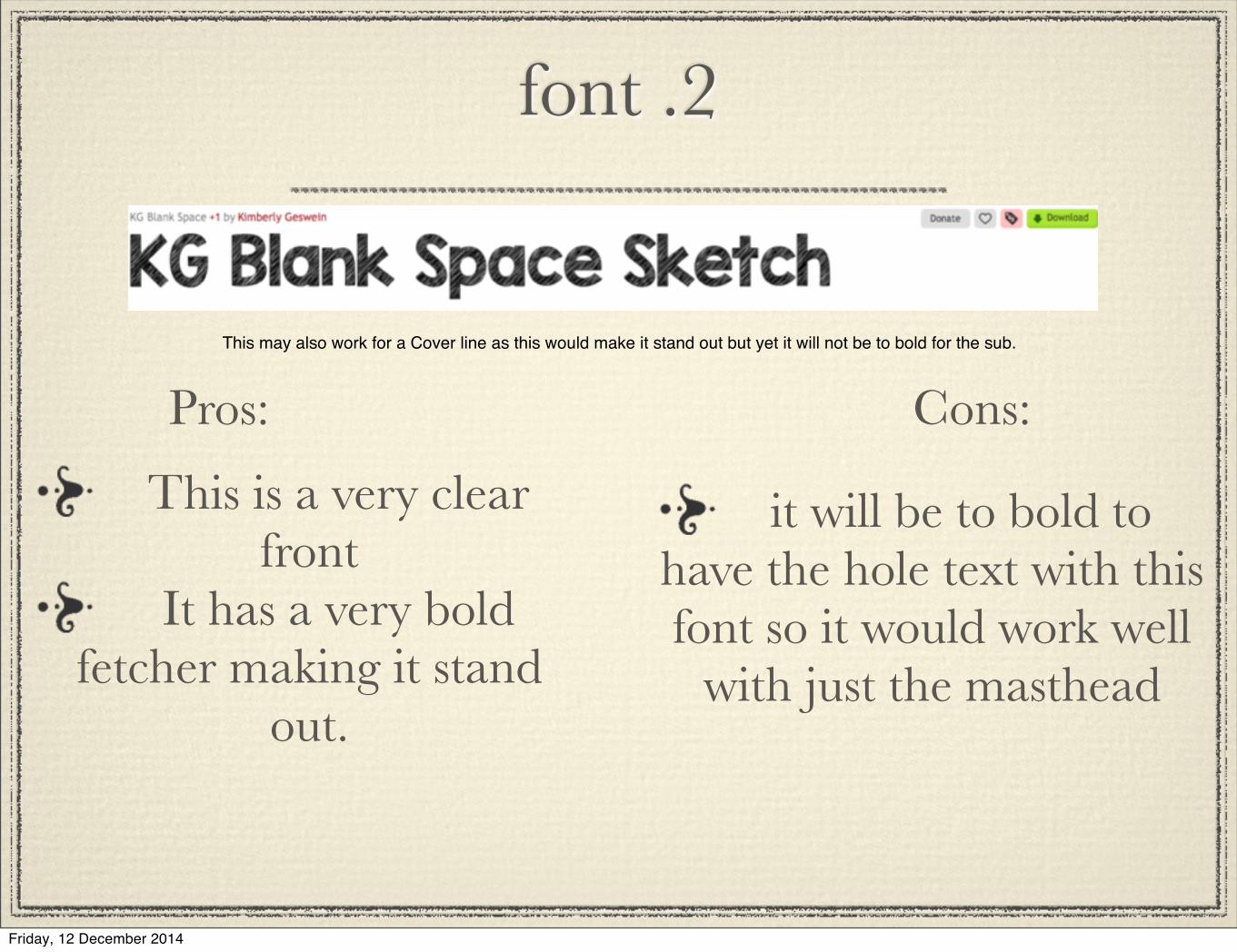
font .2
This may also work for a Cover line as this would make it stand out but yet it will not be to bold for the sub.
Pros: Cons:
This is a very clear front
It has a very bold fetcher making it stand
out.
it will be to bold to have the hole text with this font so it would work well
with just the masthead
Friday, 12 December 2014
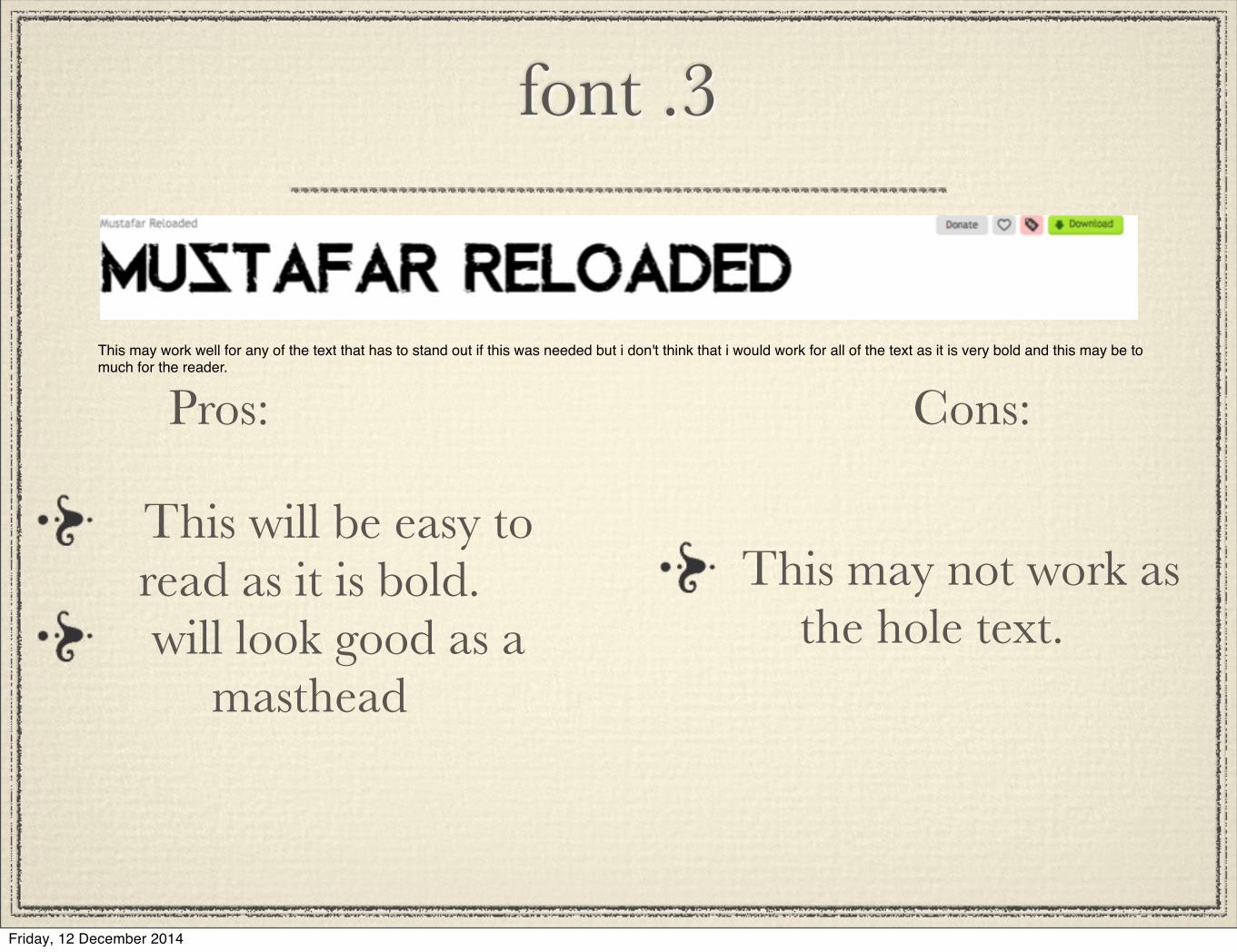
font .3
This may work well for any of the text that has to stand out if this was needed but i don't think that i would work for all of the text as it is very bold and this may be to much for the reader.
Pros: Cons:
This will be easy to read as it is bold.will look good as a
masthead
This may not work as the hole text.
Friday, 12 December 2014
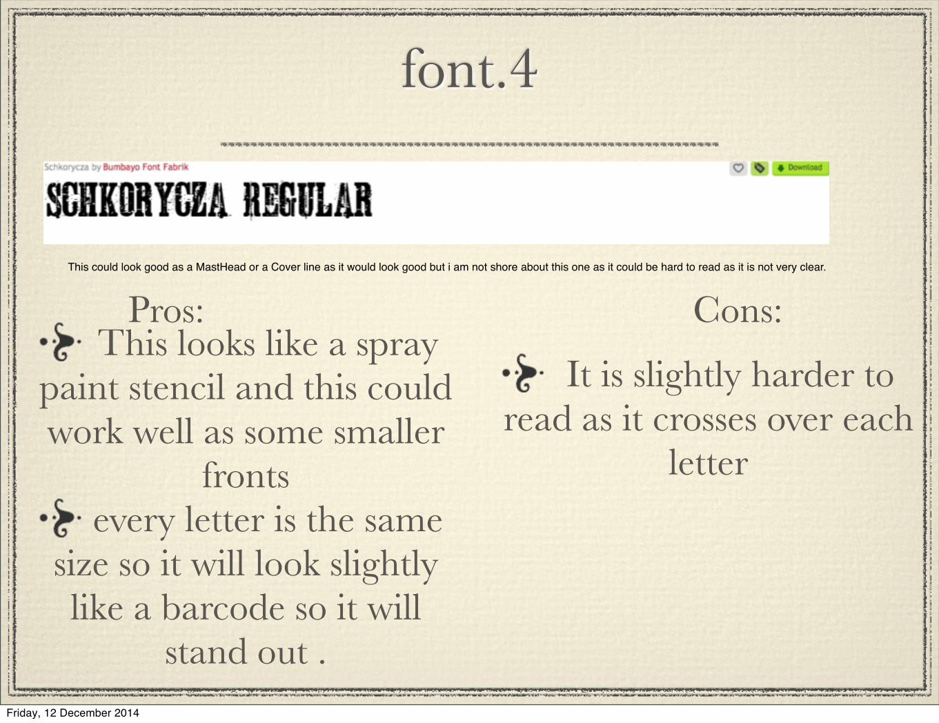
font.4
This could look good as a MastHead or a Cover line as it would look good but i am not shore about this one as it could be hard to read as it is not very clear.
Pros: Cons:This looks like a spray
paint stencil and this could work well as some smaller
frontsevery letter is the same
size so it will look slightly like a barcode so it will
stand out .
It is slightly harder to read as it crosses over each
letter
Friday, 12 December 2014
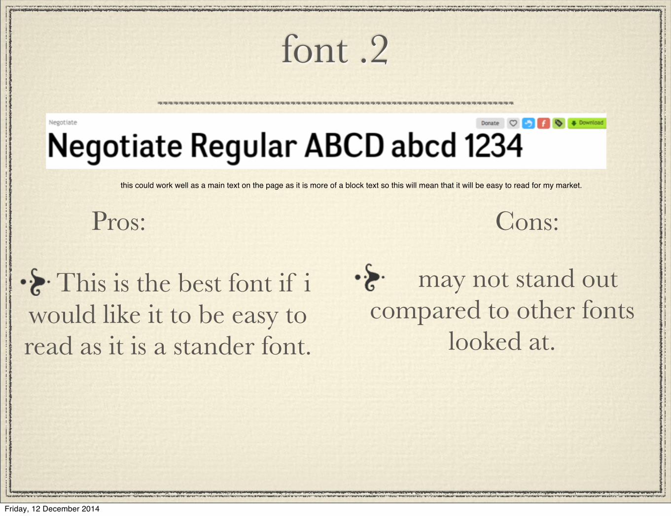
font .2
this could work well as a main text on the page as it is more of a block text so this will mean that it will be easy to read for my market.
Pros: Cons:
This is the best font if i would like it to be easy to read as it is a stander font.
may not stand out compared to other fonts
looked at.
Friday, 12 December 2014
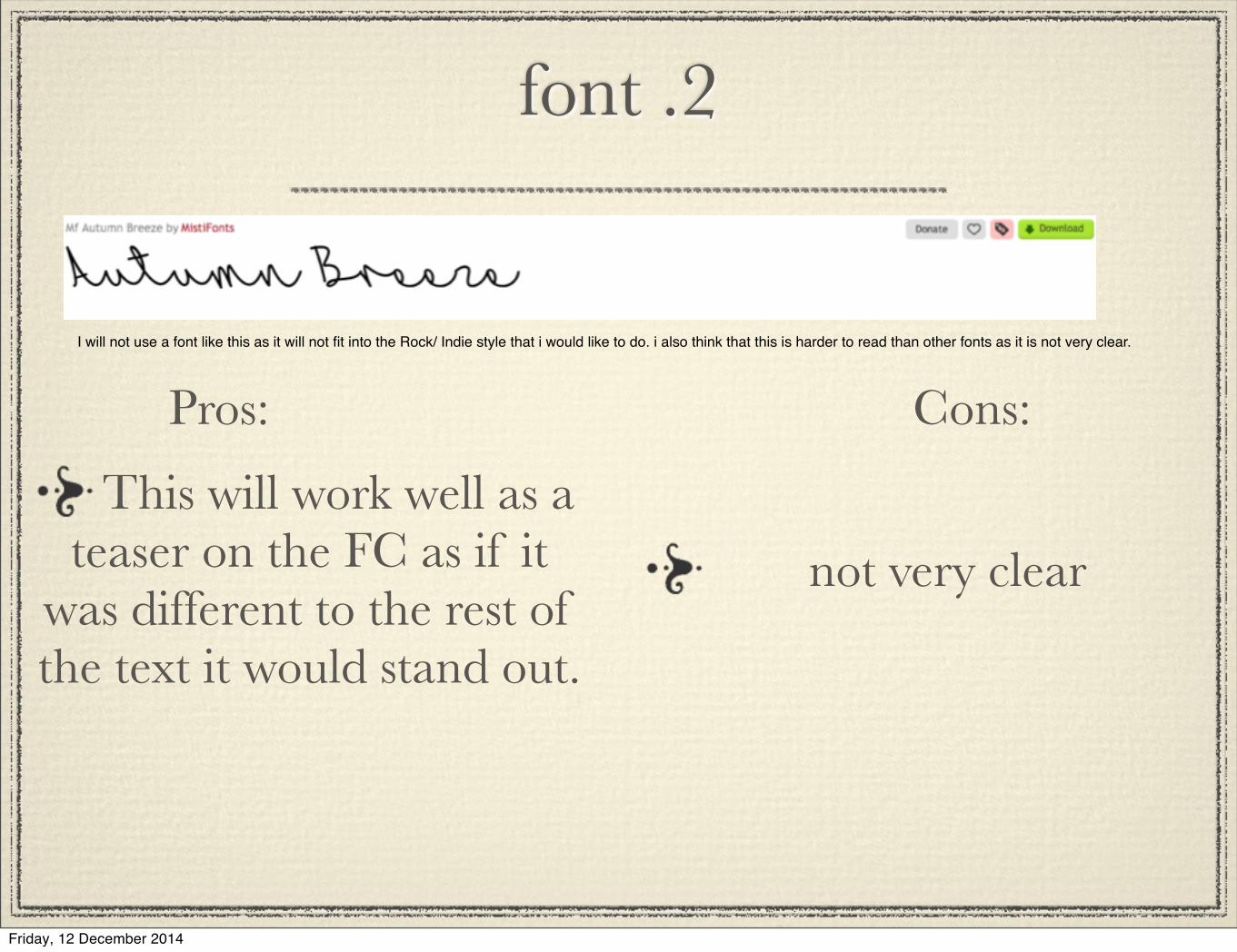
font .2
I will not use a font like this as it will not fit into the Rock/ Indie style that i would like to do. i also think that this is harder to read than other fonts as it is not very clear.
Pros: Cons:
This will work well as a teaser on the FC as if it
was different to the rest of the text it would stand out.
not very clear
Friday, 12 December 2014
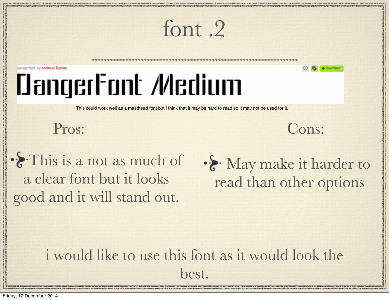
font .2
This could work well as a masthead font but i think that it may be hard to read so it may not be used for it.
Pros: Cons:
This is a not as much of a clear font but it looks
good and it will stand out.
May make it harder to read than other options
i would like to use this font as it would look the best.
Friday, 12 December 2014