Embed Size (px)
Citation preview
METROPOLITAN DPS

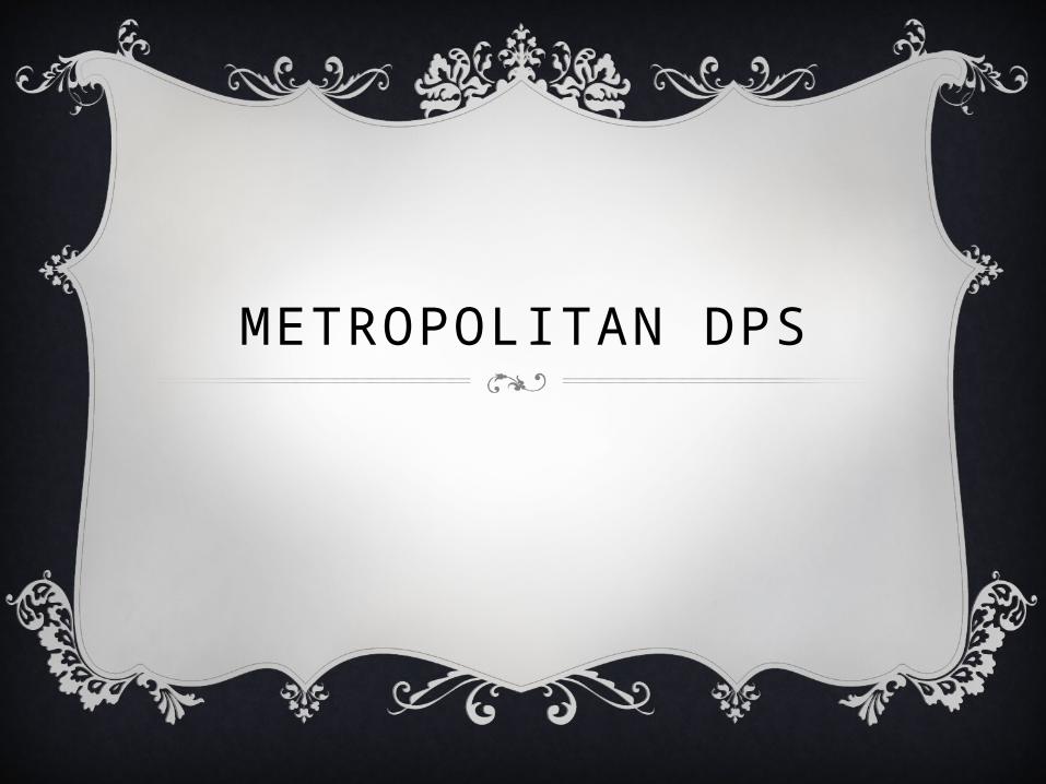
TextThe text used is kept the same throughout the dps to make sure that it is consistent and to make it look like it belongs together. The masthead text is different to that of the article as it is meant to stand out more and attract the most attention, hence why it is different.
LanguageThe language used is kept formal as it is aimed at more mature audiences therefore it has to match their convergence, and also by using more formal language, it allows the magazine to be presented in a more professional and sophisticated manner.

ColourThe colour used is kept simple and to yellow and green. These two colours match and flow into each other nicely, and as both colours are bold, they pull the dps forward and allow it to stand out more.
LayoutThe layout has been kept simple so that the dps is easy to follow for the more mature readers. The sub images have all been placed at the top of the page so that they are not breaking up the text as the magazine is more about information than images.