Embed Size (px)
Citation preview
Question 1 – In what way does your media product use, develop
or challenge forms and conventions of real media
products?
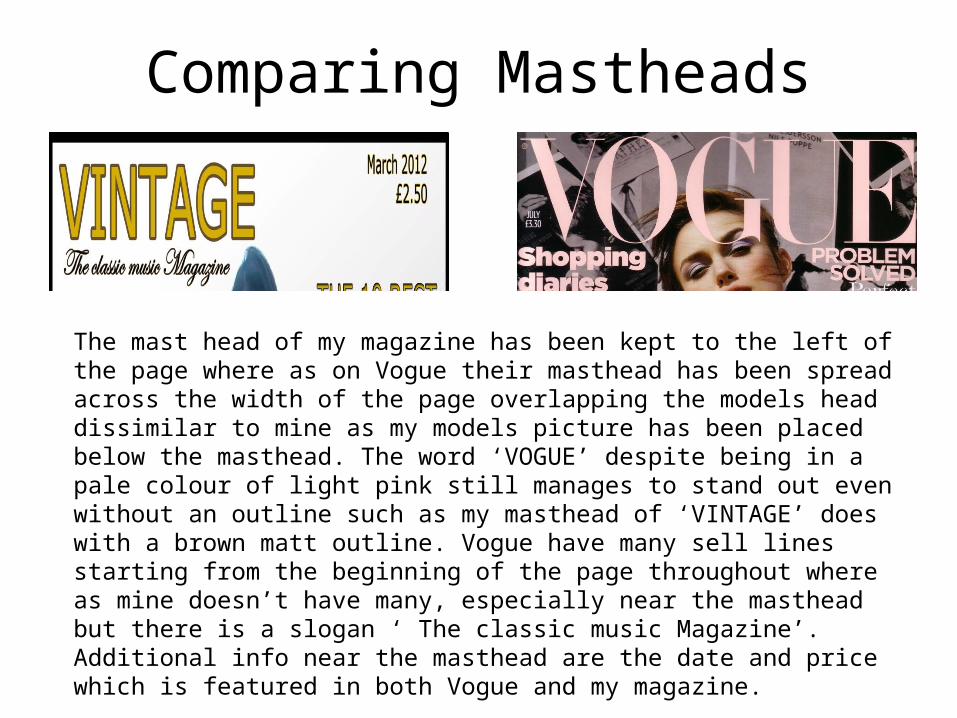
Comparing Mastheads
The mast head of my magazine has been kept to the left of the page where as on Vogue their masthead has been spread across the width of the page overlapping the models head dissimilar to mine as my models picture has been placed below the masthead. The word ‘VOGUE’ despite being in a pale colour of light pink still manages to stand out even without an outline such as my masthead of ‘VINTAGE’ does with a brown matt outline. Vogue have many sell lines starting from the beginning of the page throughout where as mine doesn’t have many, especially near the masthead but there is a slogan ‘ The classic music Magazine’. Additional info near the masthead are the date and price which is featured in both Vogue and my magazine.
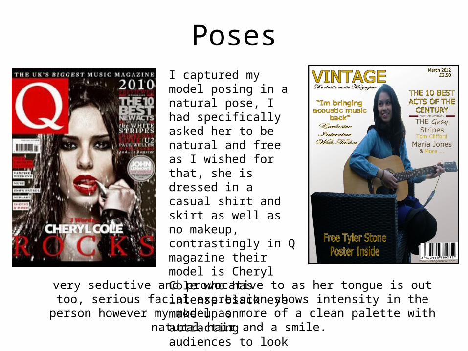
PosesI captured my model posing in a natural pose, I had specifically asked her to be natural and free as I wished for that, she is dressed in a casual shirt and skirt as well as no makeup, contrastingly in Q magazine their model is Cheryl Cole who has intense black eye make up on attracting audiences to look into her eyes in addition to deep red lipstick making this cover
very seductive and provocative to as her tongue is out too, serious facial expression shows intensity in the person however my model as more of a clean palette with
natural hair and a smile.
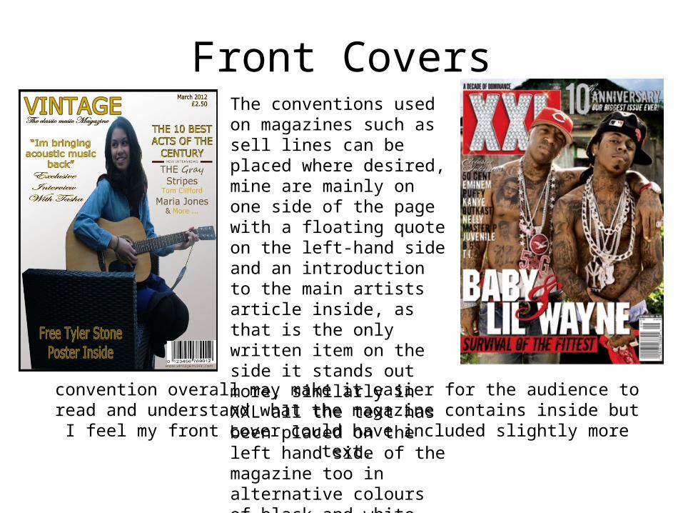
Front CoversThe conventions used on magazines such as sell lines can be placed where desired, mine are mainly on one side of the page with a floating quote on the left-hand side and an introduction to the main artists article inside, as that is the only written item on the side it stands out more, similarly in XXL all the text has been placed on the left hand side of the magazine too in alternative colours of black and white, this
convention overall may make it easier for the audience to read and understand what the magazine contains inside but I feel my front cover could have included slightly
more text.
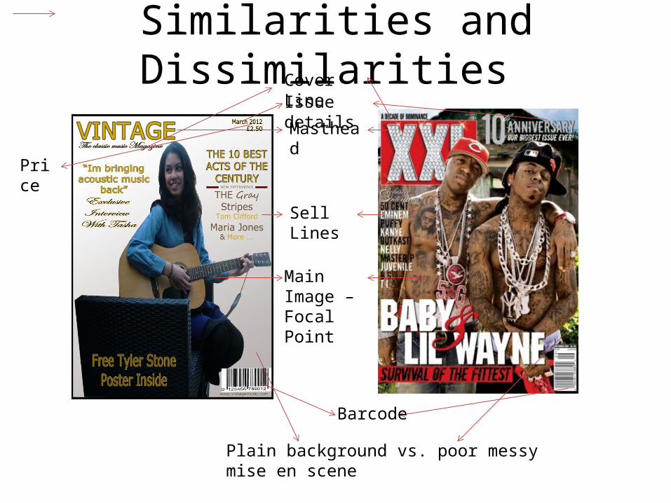
Similarities and Dissimilarities
Masthead
Sell Lines
Main Image – Focal Point
Barcode
Issue detailsCover Line
Price
Plain background vs. poor messy mise en scene

Contents PagesMagazines Logo
Issue details
Features
Regular Stories
Page numbers
Sub sections
Additional Images

Contents Page
The contents pages of my magazine and Q magazine have many similar conventions such as pointed in the slide previous. My magazine has many subsections clearly labelled enabling easy usage for the readers as oppose to the Q magazines contents page as other than the images the writing does. The film strip which I have used also clearly indicates specific images which I self taken.

Double Page Spread
Main Image
Faded Background
Drop Caps
Article Title

My Double Page Spread
Floating quote
Main Image Overlapping onto the next page
Film strip with additional images self taken as well as instructing the model to capture images through a front facing webcam.
Faint T in the background
Double page spread article
From both of the double page spreads which I have seen that even my double page spread is lacking page numbers, I had intended to insert them but seem to have forgotten which is a basic convention