Embed Size (px)
Citation preview

Flat Plan Feedback
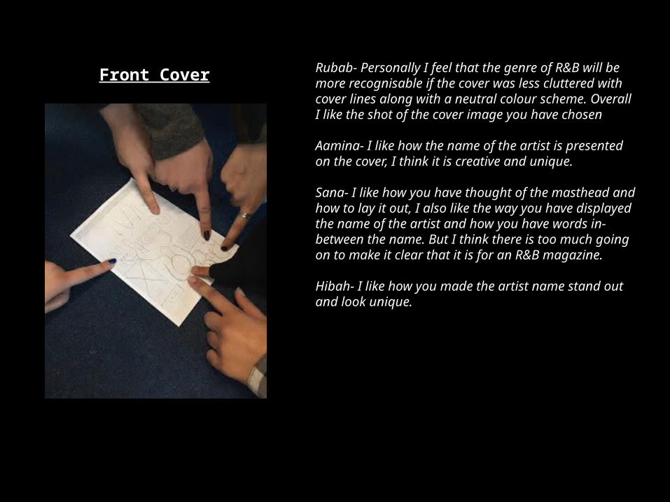
Rubab- Personally I feel that the genre of R&B will be more recognisable if the cover was less cluttered with cover lines along with a neutral colour scheme. Overall I like the shot of the cover image you have chosen
Aamina- I like how the name of the artist is presented on the cover, I think it is creative and unique.
Sana- I like how you have thought of the masthead and how to lay it out, I also like the way you have displayed the name of the artist and how you have words in-between the name. But I think there is too much going on to make it clear that it is for an R&B magazine.
Hibah- I like how you made the artist name stand out and look unique.
Front Cover
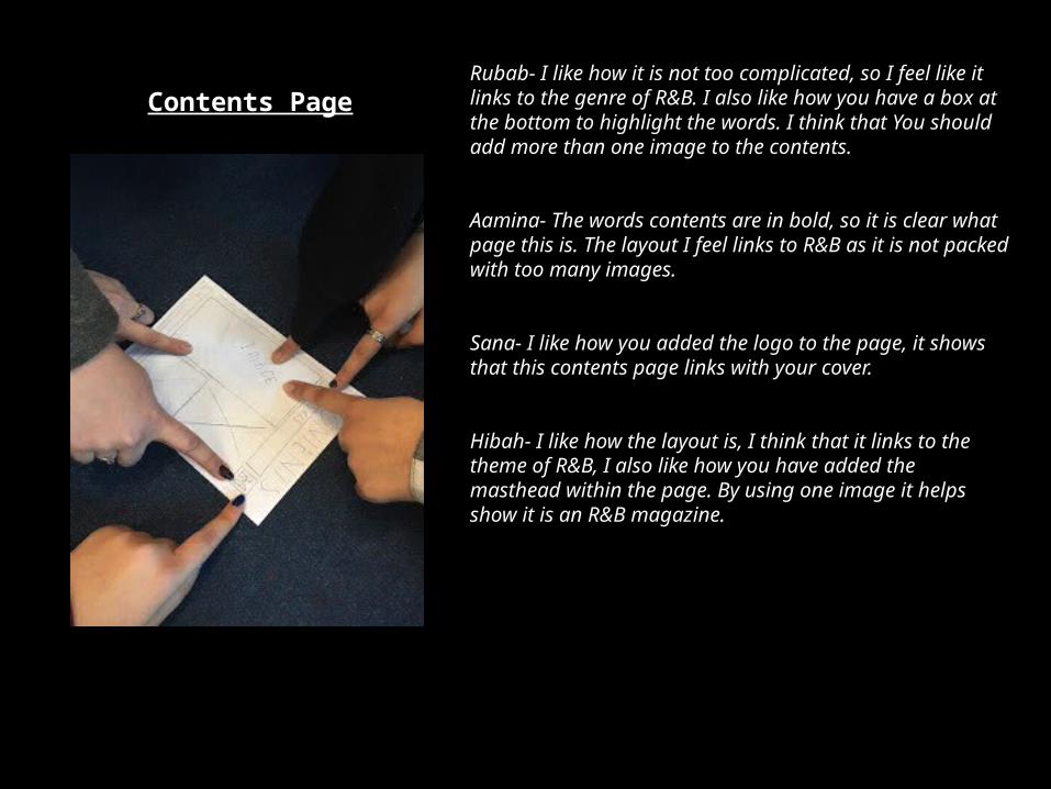
Rubab- I like how it is not too complicated, so I feel like it links to the genre of R&B. I also like how you have a box at the bottom to highlight the words. I think that You should add more than one image to the contents.
Aamina- The words contents are in bold, so it is clear what page this is. The layout I feel links to R&B as it is not packed with too many images.
Sana- I like how you added the logo to the page, it shows that this contents page links with your cover.
Hibah- I like how the layout is, I think that it links to the theme of R&B, I also like how you have added the masthead within the page. By using one image it helps show it is an R&B magazine.
Contents Page

Rubab- I think that links to the theme of R&B very well, it has a sophisticated feel to it. The image you have chosen shows the emotions of the artist and I think this works well with the other pieces of the magazine.
Aamina- I like how there are two images, it makes the pages more interesting to look at, the water mark in the background I think links to the theme of R&B this also makes the pages more interesting to look at.
Sana- I don't like the watermark on the page, I think it will make the words om the page harder to read.But I like how you have used a different shot of the artist from the cover image.
Hibah- The layout gives a sleek feel, I like how it looks over all.
Double Page Spread

The feedback I have received shows me that I need to consider the amount of writing that I will be
placing on my front cover. I see that logo for my magazine has given me some positive responses. So
within this project I will explore how I can create and present it, I will again be asking for feedback when it comes to making the logo. For my contents
page I will think about trying to add more than one image into the page. My target audience has
also commented on how they like the simplicity of the layout, so I will continue to base my magazine off of this layout as much as possible. For my
double page spread I had received comments stating that it is nice that I had used a different shot
compared to the front cover. With my magazine I will explore different shots and see how I
can incorporated them within my magazine.