Embed Size (px)
Citation preview

Final Images
Fusion Magazine – Unit 31
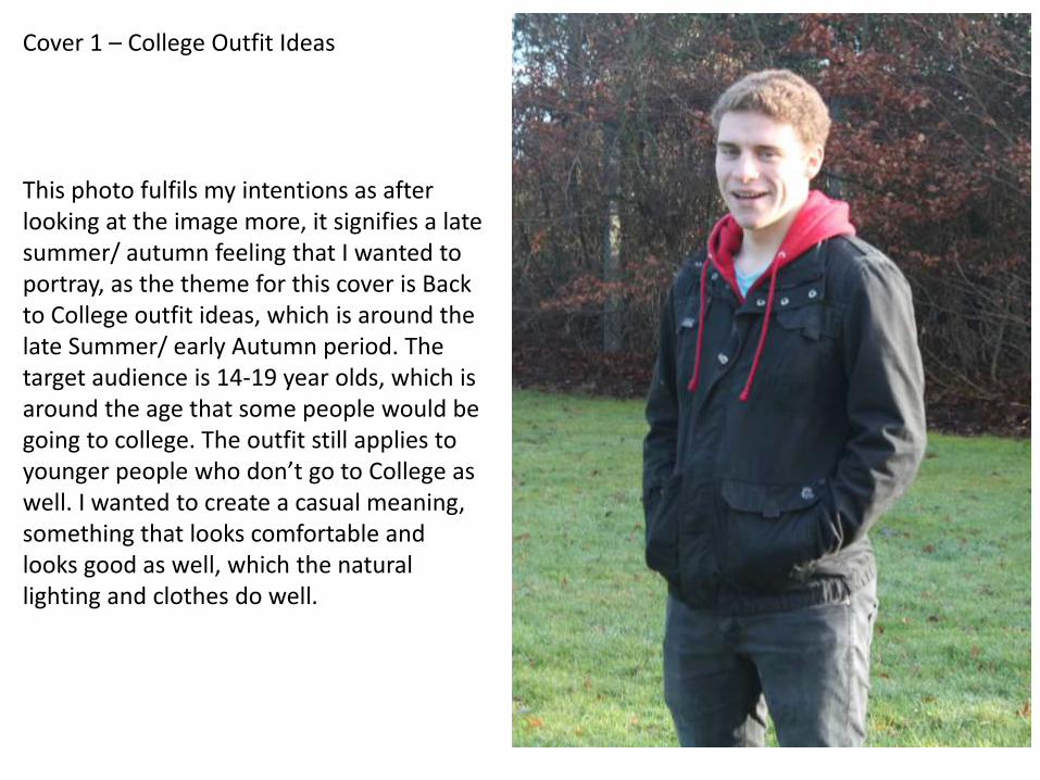
Cover 1 – College Outfit Ideas
This photo fulfils my intentions as after looking at the image more, it signifies a late summer/ autumn feeling that I wanted to portray, as the theme for this cover is Back to College outfit ideas, which is around the late Summer/ early Autumn period. The target audience is 14-19 year olds, which is around the age that some people would be going to college. The outfit still applies to younger people who don’t go to College as well. I wanted to create a casual meaning, something that looks comfortable and looks good as well, which the natural lighting and clothes do well.
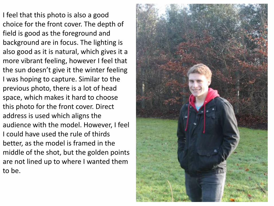
I feel that this photo is also a good choice for the front cover. The depth of field is good as the foreground and background are in focus. The lighting is also good as it is natural, which gives it a more vibrant feeling, however I feel that the sun doesn’t give it the winter feeling I was hoping to capture. Similar to the previous photo, there is a lot of head space, which makes it hard to choose this photo for the front cover. Direct address is used which aligns the audience with the model. However, I feel I could have used the rule of thirds better, as the model is framed in the middle of the shot, but the golden points are not lined up to where I wanted them to be.
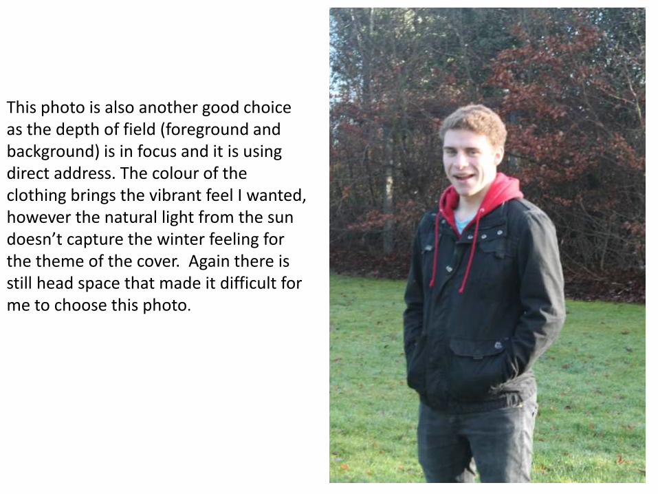
This photo is also another good choice as the depth of field (foreground and background) is in focus and it is using direct address. The colour of the clothing brings the vibrant feel I wanted, however the natural light from the sun doesn’t capture the winter feeling for the theme of the cover. Again there is still head space that made it difficult for me to choose this photo.
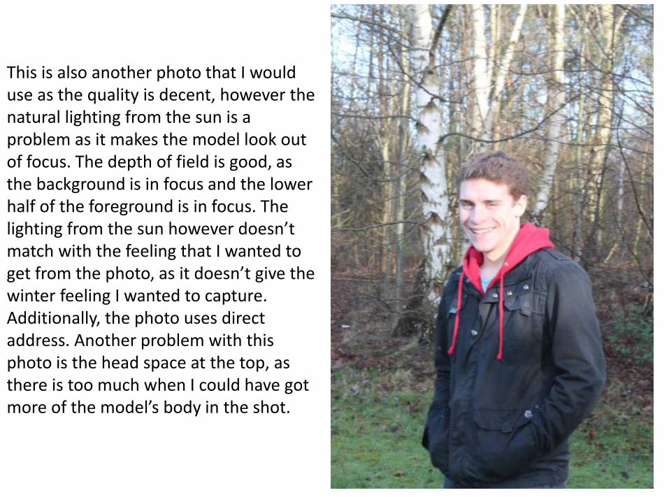
This is also another photo that I would use as the quality is decent, however the natural lighting from the sun is a problem as it makes the model look out of focus. The depth of field is good, as the background is in focus and the lower half of the foreground is in focus. The lighting from the sun however doesn’t match with the feeling that I wanted to get from the photo, as it doesn’t give the winter feeling I wanted to capture. Additionally, the photo uses direct address. Another problem with this photo is the head space at the top, as there is too much when I could have got more of the model’s body in the shot.
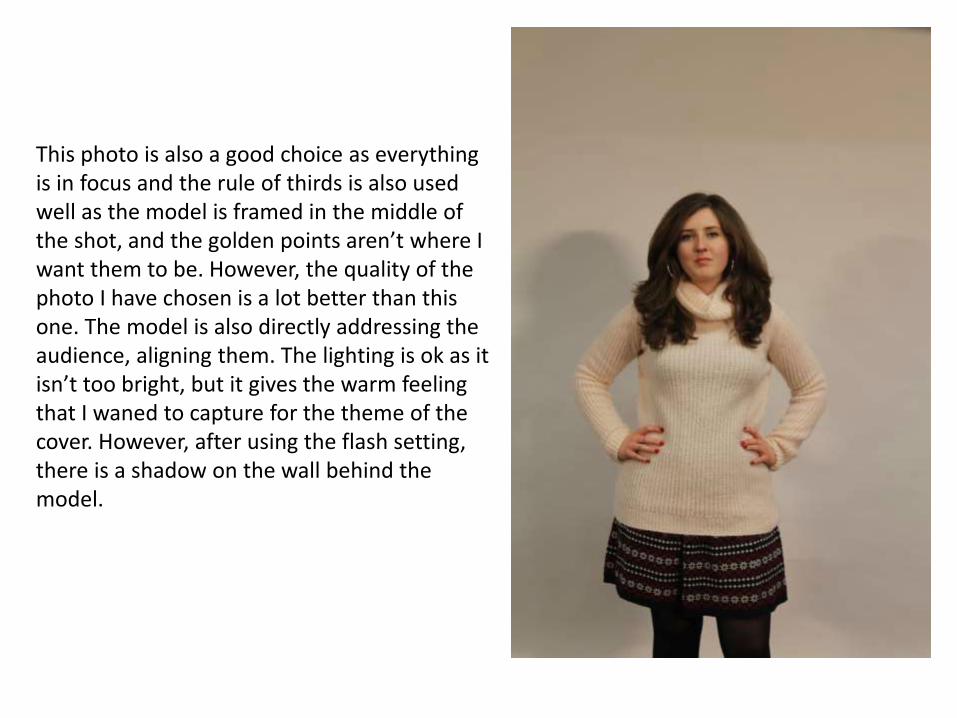
This photo is also a good choice as everything is in focus and the rule of thirds is also used well as the model is framed in the middle of the shot, and the golden points aren’t where I want them to be. However, the quality of the photo I have chosen is a lot better than this one. The model is also directly addressing the audience, aligning them. The lighting is ok as it isn’t too bright, but it gives the warm feeling that I waned to capture for the theme of the cover. However, after using the flash setting, there is a shadow on the wall behind the model.
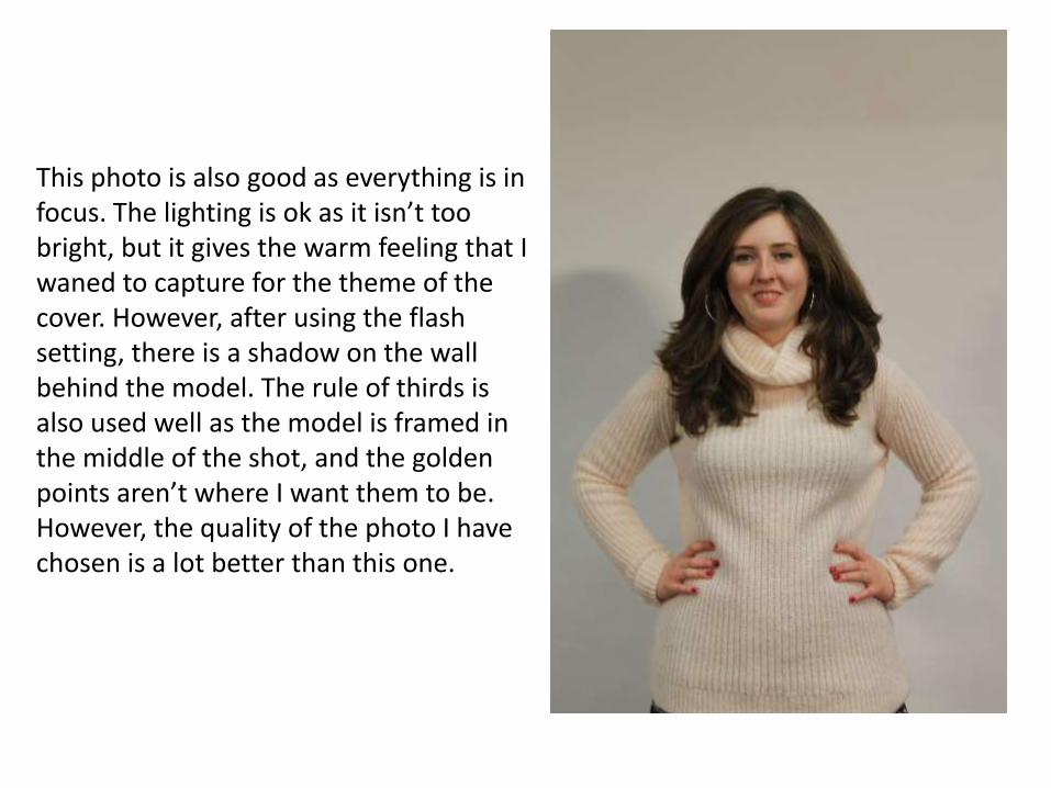
This photo is also good as everything is in focus. The lighting is ok as it isn’t too bright, but it gives the warm feeling that I waned to capture for the theme of the cover. However, after using the flash setting, there is a shadow on the wall behind the model. The rule of thirds is also used well as the model is framed in the middle of the shot, and the golden points aren’t where I want them to be. However, the quality of the photo I have chosen is a lot better than this one.
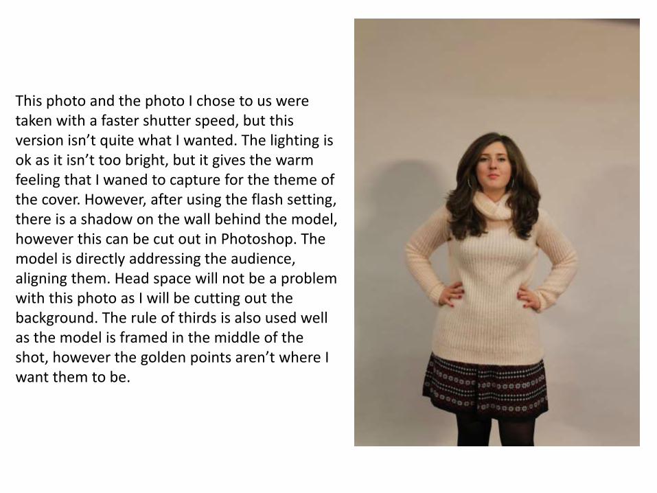
This photo and the photo I chose to us were taken with a faster shutter speed, but this version isn’t quite what I wanted. The lighting is ok as it isn’t too bright, but it gives the warm feeling that I waned to capture for the theme of the cover. However, after using the flash setting, there is a shadow on the wall behind the model, however this can be cut out in Photoshop. The model is directly addressing the audience, aligning them. Head space will not be a problem with this photo as I will be cutting out the background. The rule of thirds is also used well as the model is framed in the middle of the shot, however the golden points aren’t where I want them to be.
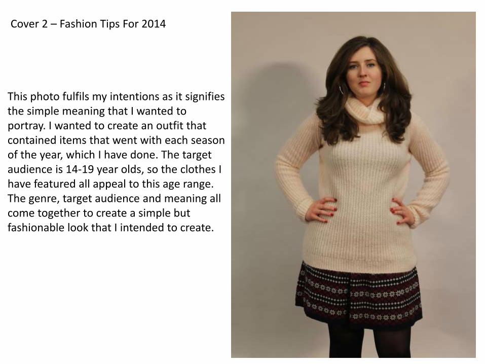
Cover 2 – Fashion Tips For 2014
This photo fulfils my intentions as it signifies the simple meaning that I wanted to portray. I wanted to create an outfit that contained items that went with each season of the year, which I have done. The target audience is 14-19 year olds, so the clothes I have featured all appeal to this age range. The genre, target audience and meaning all come together to create a simple but fashionable look that I intended to create.
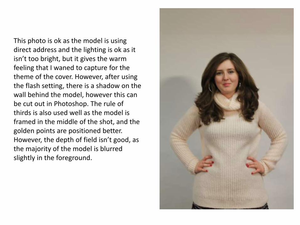
This photo is ok as the model is using direct address and the lighting is ok as it isn’t too bright, but it gives the warm feeling that I waned to capture for the theme of the cover. However, after using the flash setting, there is a shadow on the wall behind the model, however this can be cut out in Photoshop. The rule of thirds is also used well as the model is framed in the middle of the shot, and the golden points are positioned better. However, the depth of field isn’t good, as the majority of the model is blurred slightly in the foreground.
Cover 3 – Winter Wear Ideas 2014
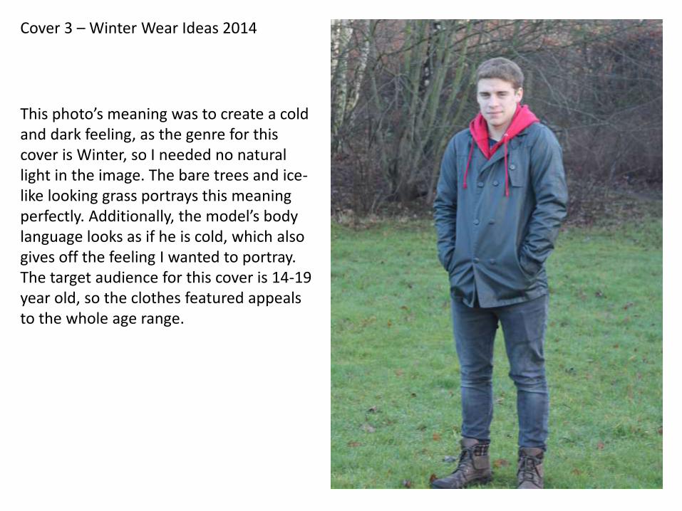
This photo’s meaning was to create a cold and dark feeling, as the genre for this cover is Winter, so I needed no natural light in the image. The bare trees and ice-like looking grass portrays this meaning perfectly. Additionally, the model’s body language looks as if he is cold, which also gives off the feeling I wanted to portray. The target audience for this cover is 14-19 year old, so the clothes featured appeals to the whole age range.
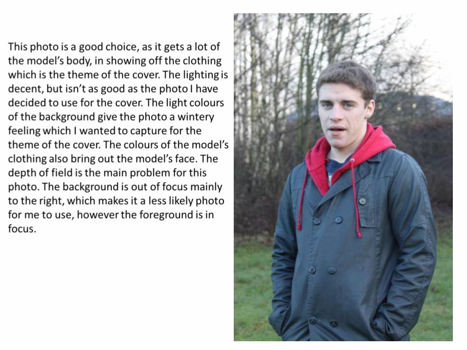
This photo is a good choice, as it gets a lot of the model’s body, in showing off the clothing which is the theme of the cover. The lighting is decent, but isn’t as good as the photo I have decided to use for the cover. The light colours of the background give the photo a wintery feeling which I wanted to capture for the theme of the cover. The colours of the model’s clothing also bring out the model’s face. The depth of field is the main problem for this photo. The background is out of focus mainly to the right, which makes it a less likely photo for me to use, however the foreground is in focus.
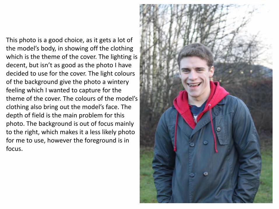
This photo is also another good choice, as it gets a lot of the model’s body, in showing off the clothing which is the theme of the cover. The lighting is decent, but isn’t as good as the photo I have decided to use for the cover. The light colours of the background give the photo a wintery feeling which I wanted to capture for the theme of the cover. The colours of the model’s clothing also bring out the model’s face. The depth of field is the main problem for this photo. The background is out of focus mainly to the right, which makes it a less likely photo for me to use, however the foreground is in focus.

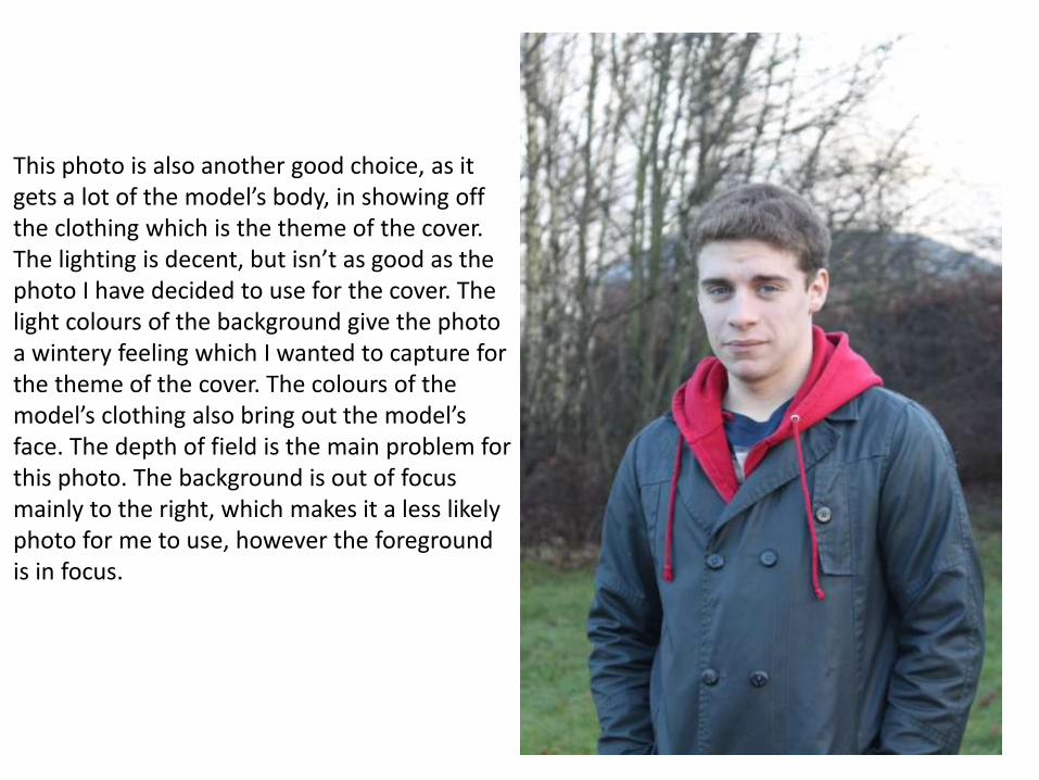
This photo is also another good choice, as it gets a lot of the model’s body, in showing off the clothing which is the theme of the cover. The lighting is decent, but isn’t as good as the photo I have decided to use for the cover. The light colours of the background give the photo a wintery feeling which I wanted to capture for the theme of the cover. The colours of the model’s clothing also bring out the model’s face. The depth of field is the main problem for this photo. The background is out of focus mainly to the right, which makes it a less likely photo for me to use, however the foreground is in focus.
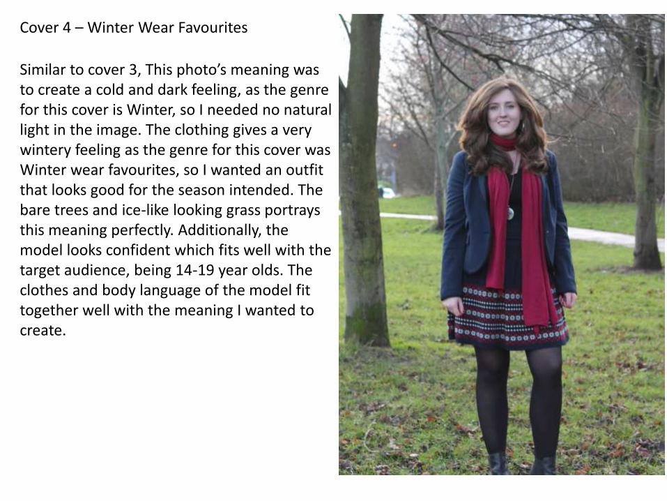
Cover 4 – Winter Wear Favourites
Similar to cover 3, This photo’s meaning was to create a cold and dark feeling, as the genre for this cover is Winter, so I needed no natural light in the image. The clothing gives a very wintery feeling as the genre for this cover was Winter wear favourites, so I wanted an outfit that looks good for the season intended. The bare trees and ice-like looking grass portrays this meaning perfectly. Additionally, the model looks confident which fits well with the target audience, being 14-19 year olds. The clothes and body language of the model fit together well with the meaning I wanted to create.
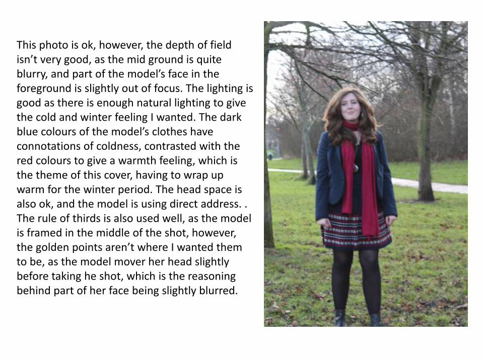
This photo is ok, however, the depth of field isn’t very good, as the mid ground is quite blurry, and part of the model’s face in the foreground is slightly out of focus. The lighting is good as there is enough natural lighting to give the cold and winter feeling I wanted. The dark blue colours of the model’s clothes have connotations of coldness, contrasted with the red colours to give a warmth feeling, which is the theme of this cover, having to wrap up warm for the winter period. The head space is also ok, and the model is using direct address. . The rule of thirds is also used well, as the model is framed in the middle of the shot, however, the golden points aren’t where I wanted them to be, as the model mover her head slightly before taking he shot, which is the reasoning behind part of her face being slightly blurred.
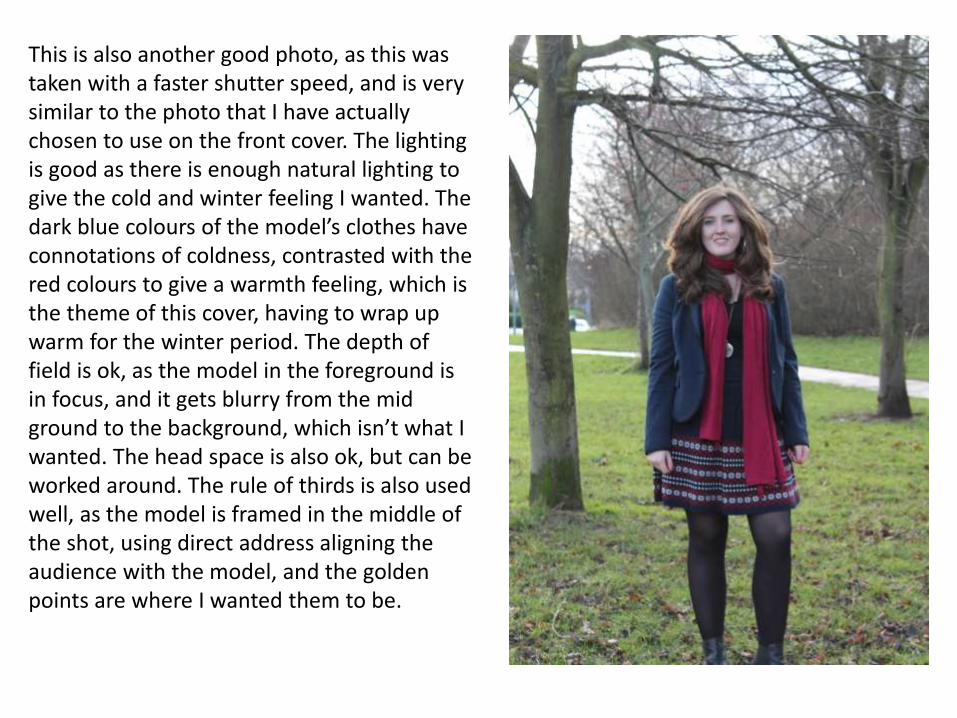
This is also another good photo, as this was taken with a faster shutter speed, and is very similar to the photo that I have actually chosen to use on the front cover. The lighting is good as there is enough natural lighting to give the cold and winter feeling I wanted. The dark blue colours of the model’s clothes have connotations of coldness, contrasted with the red colours to give a warmth feeling, which is the theme of this cover, having to wrap up warm for the winter period. The depth of field is ok, as the model in the foreground is in focus, and it gets blurry from the mid ground to the background, which isn’t what I wanted. The head space is also ok, but can be worked around. The rule of thirds is also used well, as the model is framed in the middle of the shot, using direct address aligning the audience with the model, and the golden points are where I wanted them to be.
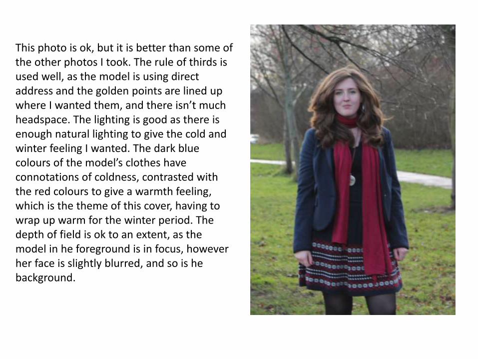
This photo is ok, but it is better than some of the other photos I took. The rule of thirds is used well, as the model is using direct address and the golden points are lined up where I wanted them, and there isn’t much headspace. The lighting is good as there is enough natural lighting to give the cold and winter feeling I wanted. The dark blue colours of the model’s clothes have connotations of coldness, contrasted with the red colours to give a warmth feeling, which is the theme of this cover, having to wrap up warm for the winter period. The depth of field is ok to an extent, as the model in he foreground is in focus, however her face is slightly blurred, and so is he background.
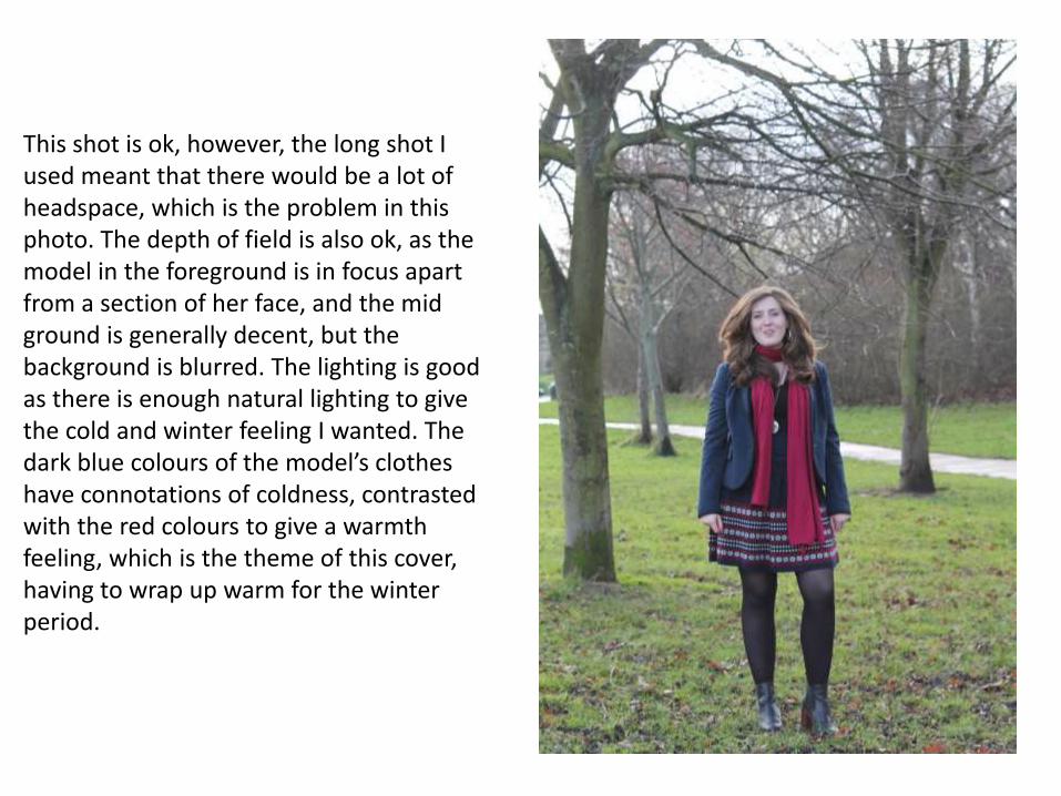
This shot is ok, however, the long shot I used meant that there would be a lot of headspace, which is the problem in this photo. The depth of field is also ok, as the model in the foreground is in focus apart from a section of her face, and the mid ground is generally decent, but the background is blurred. The lighting is good as there is enough natural lighting to give the cold and winter feeling I wanted. The dark blue colours of the model’s clothes have connotations of coldness, contrasted with the red colours to give a warmth feeling, which is the theme of this cover, having to wrap up warm for the winter period.