Embed Size (px)
Citation preview

Photograph Photograph analysisanalysis
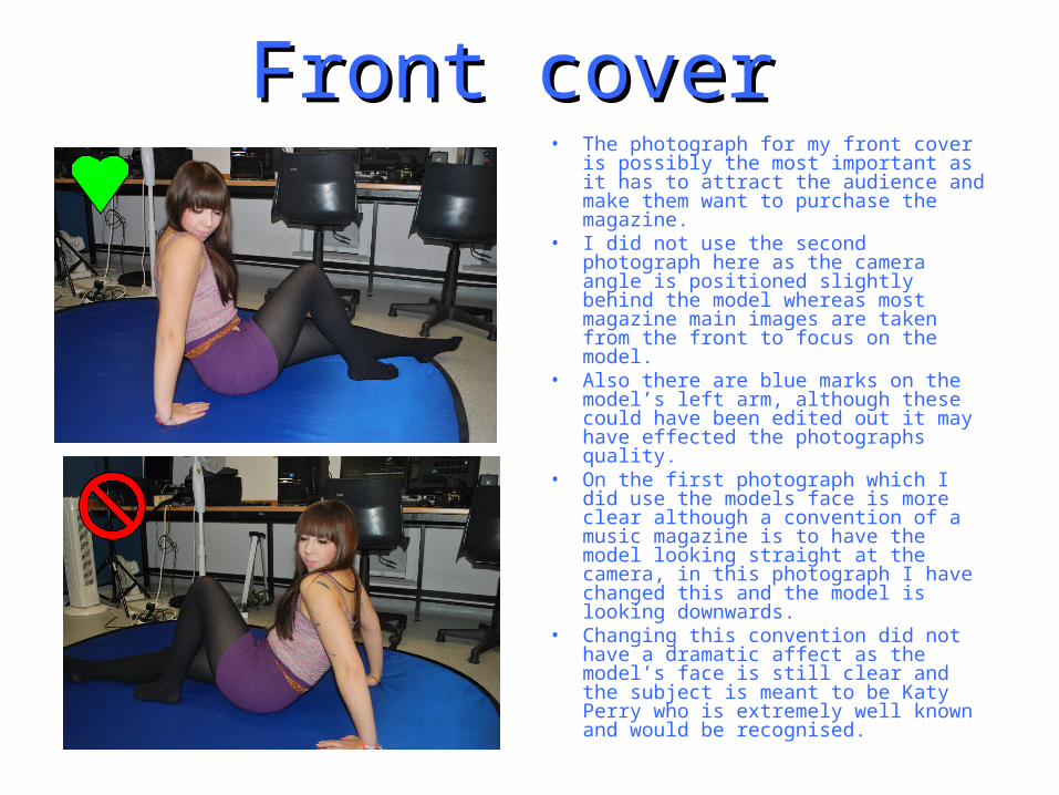
Front coverFront cover • The photograph for my front cover is
possibly the most important as it has to attract the audience and make them want to purchase the magazine.
• I did not use the second photograph here as the camera angle is positioned slightly behind the model whereas most magazine main images are taken from the front to focus on the model.
• Also there are blue marks on the model’s left arm, although these could have been edited out it may have effected the photographs quality.
• On the first photograph which I did use the models face is more clear although a convention of a music magazine is to have the model looking straight at the camera, in this photograph I have changed this and the model is looking downwards.
• Changing this convention did not have a dramatic affect as the model’s face is still clear and the subject is meant to be Katy Perry who is extremely well known and would be recognised.
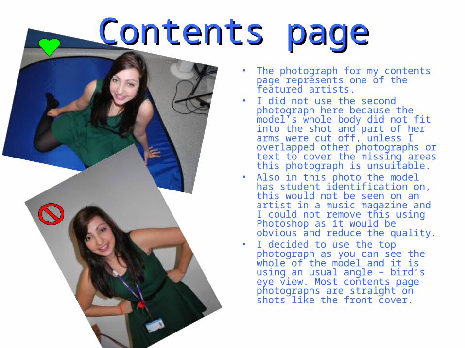
Contents pageContents page• The photograph for my contents
page represents one of the featured artists.
• I did not use the second photograph here because the model’s whole body did not fit into the shot and part of her arms were cut off, unless I overlapped other photographs or text to cover the missing areas this photograph is unsuitable.
• Also in this photo the model has student identification on, this would not be seen on an artist in a music magazine and I could not remove this using Photoshop as it would be obvious and reduce the quality.
• I decided to use the top photograph as you can see the whole of the model and it is using an usual angle – bird’s eye view. Most contents page photographs are straight on shots like the front cover.
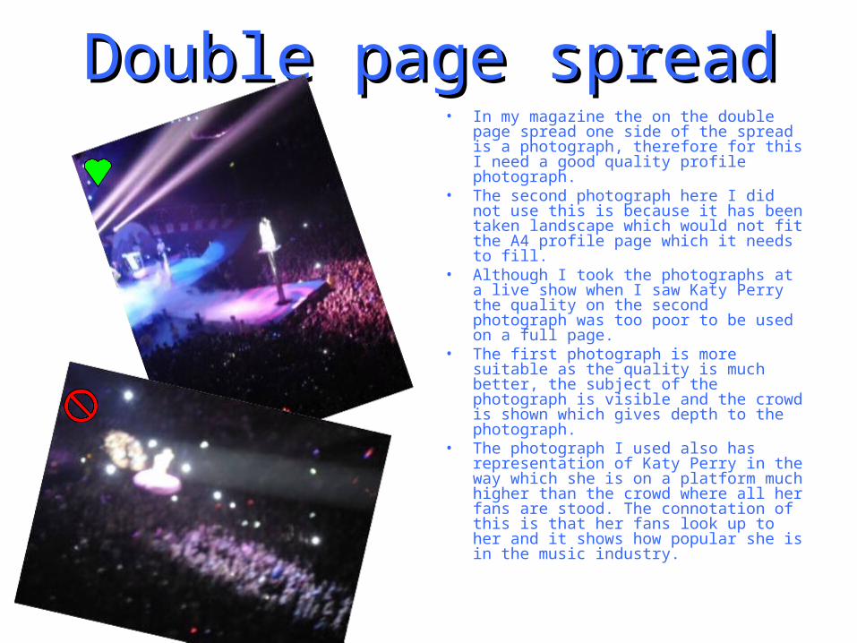
Double page spreadDouble page spread• In my magazine the on the double page
spread one side of the spread is a photograph, therefore for this I need a good quality profile photograph.
• The second photograph here I did not use this is because it has been taken landscape which would not fit the A4 profile page which it needs to fill.
• Although I took the photographs at a live show when I saw Katy Perry the quality on the second photograph was too poor to be used on a full page.
• The first photograph is more suitable as the quality is much better, the subject of the photograph is visible and the crowd is shown which gives depth to the photograph.
• The photograph I used also has representation of Katy Perry in the way which she is on a platform much higher than the crowd where all her fans are stood. The connotation of this is that her fans look up to her and it shows how popular she is in the music industry.
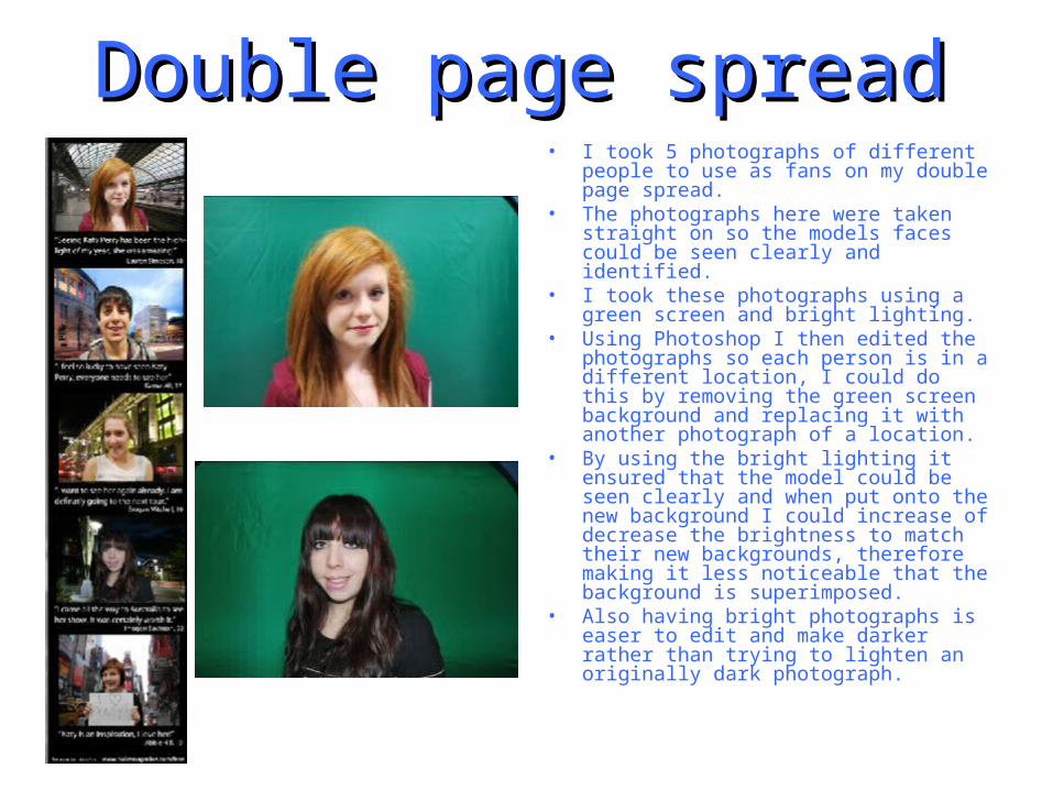
Double page spreadDouble page spread• I took 5 photographs of different people
to use as fans on my double page spread.
• The photographs here were taken straight on so the models faces could be seen clearly and identified.
• I took these photographs using a green screen and bright lighting.
• Using Photoshop I then edited the photographs so each person is in a different location, I could do this by removing the green screen background and replacing it with another photograph of a location.
• By using the bright lighting it ensured that the model could be seen clearly and when put onto the new background I could increase of decrease the brightness to match their new backgrounds, therefore making it less noticeable that the background is superimposed.
• Also having bright photographs is easer to edit and make darker rather than trying to lighten an originally dark photograph.